Month: July 2018

Energy Flows in The Netherlands 2016

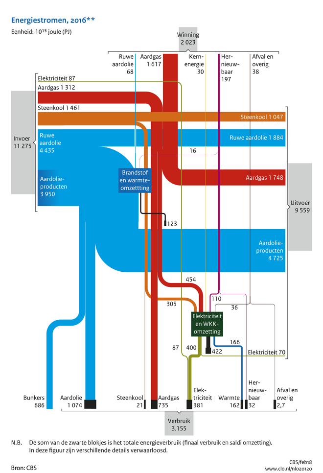
The below Sankey diagram depicting energy flows in the Netherlands in 2016 is very interesting. Actually it features two dimensions: energy production and consumption (from top to bottom) and energy imports and exports (from left to right). This is quite different from other national energy balances I have presented on this blog before (such as e.g. for Switzerland 2015, Chile 2015, Lithuania 2013, or Sweden 2014)

It can be found in the ‘Compendium voor de Leefomgeving’ (Environmental Data Compendium) a website run by the Dutch Government (Rijksoverheid) and is titled ‘Aanbod en verbruik van energiedragers in Nederland, 2016’ (Supply and consumption of energy carriers in The Netherlands, 2016).

Data for this Sankey diagram is from Centraal Bureau voor de Statistiek (CBS). Flows are in petajoule (PJ). Locally produced energy (‘Winning’) in 2015 was at 2.023 PJ, with a consumption (‘Verbruik’) of 3.155 PJ.
So, the Netherlands still had to import some 1.000 PJ to cover demand. However, it imported 11.275 PJ (‘Invoer’) and exported 9.559 PJ (‘Uitvoer’). In the first pace, the Netherlands seem to be an energy transit country. This is owed to the fact that Rotterdam is the largest oil port in Europe, and is a prime location for handling oil products (‘Aardolieproducten’).
Big Oil Climate Lobbying, InfluenceMap

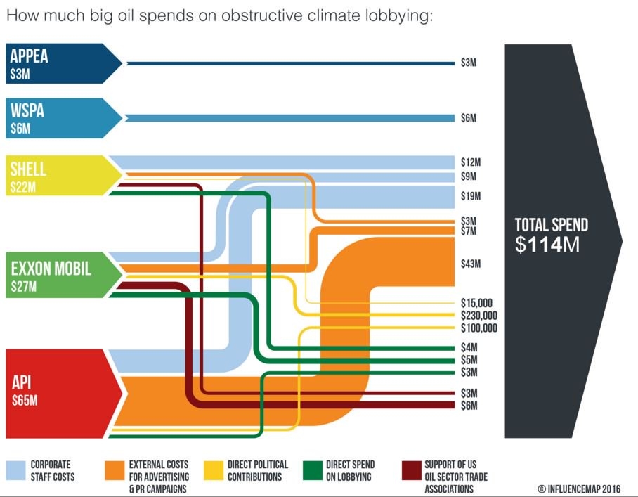
The UK-based non-profit Community Interest Company (CIC) called ‘InfluenceMap’ has produced the below Sankey diagram on obstructive climate lobbying of oil firms and interest groups. These are the spendings in US$ for an unspecified year (possibly 2015).


Source: InfluenceMap, Media Downloads
(via Hypergeometric blog)

Streams are color coded to specify the type of spending (e.g. staff cost, direct lobbying, party donations). Note that the yellow flows (in the range up to 230.000 US$) are not to scale with the others that are on a million US$ range. Some of the elements that represent the sources and the black sum arrow are also overemphasized, showing a height that is larger than the sum of the individual arrow magnitudes. So this is not fully adherent to the principles of a Sankey diagram … but to be fair: they never claimed that it is a Sankey diagram.

This is maybe the first Sankey diagram ever to be featured in the US Senate. Senator [D-RI] Sheldon Whitehouse (yes, that really is his name … you just have to love his “Whitehouse Statement on …” catchphrase) used it in a US Senate testimony in April 2016.

Watch the video how the Whitehouse does quite well explaining the streams of money and to underpin his message with the Sankey diagram. Jump in at 0:25 secs to see Sankey make its Senate appearance…

Global Food System Sankey

Food losses and food waste has been addressed in a number of scientific research papers in recent years. Peter Alexander et.al. write about ‘Losses, inefficiencies and waste in the global food system’ (In: Agricultural Systems, Volume 153, May 2017, Pages 190-200, doi.org/10.1016/j.agsy.2017.01.014)

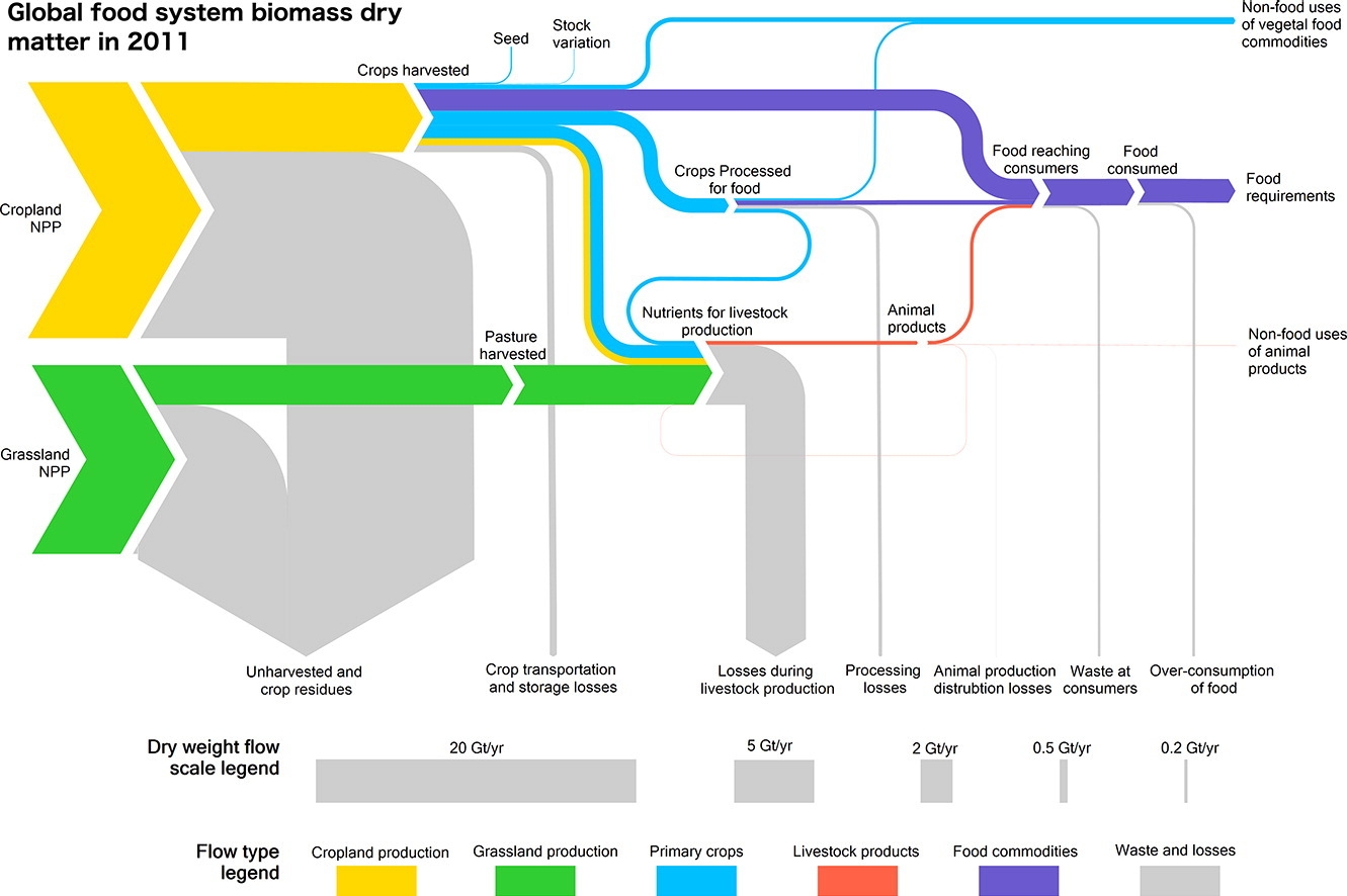
The article contains two beautiful Sankey diagrams. The first depicts the global food system in 2011. Flows are shown as dry mass. Flows are not individually labelled with the underling quantity, but rather a scale at the bottom shows 5 representative flow quantities and their corresponding width.


(under terms of Creative Commons Attribution 4.0 License (CC BY 4.0))

Crop (yellow) and grassland (green) net primary production (NPP) are shown as sources for the global food system. Losses are branching out as grey arrows. These “inefficiencies” of the system are described in detail in the article. The authors observe that “44% of harvested crops dry matter are lost prior to human consumption” and that “the highest loss rate can be found in livestock production”.

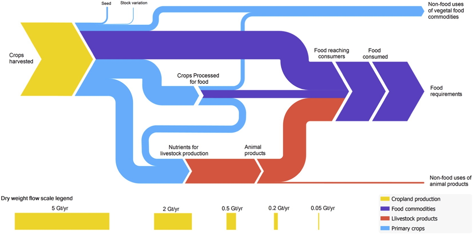
The second Sankey diagram shows a section of the above figure, just the dry matter flows from crop harvest and processing, without any losses. This is interesting because it allows us seeing the share of processed and non-processed food being consumed by humans worldwide, and the the share of crop-based food intake (dark blue) compared to animal-based food intake (red). You could call this the veggie / non-veggie split. Based on dry matter that is.


(under terms of Creative Commons Attribution 4.0 License (CC BY 4.0))

If you want to see the corresponding global food system wet mass, protein and energy Sankey diagrams check out this interesting article. A recommended read for all of us eaters.

Misc Sankey Diagrams Uncommented 18

Back from a summer break … sorry for neglecting the blog for a couple of weeks. The FIFA Worldcup 2018 prediction from my last post has already become outdated … 😉

Here is a black and white hand drawn Sankey diagram from a doctoral thesis (Giovanni Angrisani:’Experimental and Simulative Analysis of a Micro Trigeneration System based on an Air Handling Unit with Desiccant Wheel’. Doctoral Thesis University of Naples, year unknown).


Instead of color-coded Sankey arrows the different types of energy are shown with different patterns of the arrow head. We can see some typical flaws: width of the arrow changes when going from horizontal to vertical (see ‘Losses 3.24 kW’ arrow branching out to the top), flows not to scale (compare ‘Losses 3.24 kW’ arrow to ‘Losses 6.25 kW’ arrow), overemphasis of some arrows through massive arrow heads.

A retro-style Sankey diagram from the times you would hand-draw such figures.