Month: May 2019

UK Resource Flow 2014

This Sankey diagrams for the resource flows in the UK in 2014 can be found in the Digest of Waste and Resource Statistics – 2018 Edition. The report is published annually by UK’s Department for Environment, Food & Rural Affairs (DEFRA). This is for all mass flows nationwide, but excluding fossil fuels and energy carriers. Unit of flows is megatonnes (mt) per year.

That figure didn’t quite convince me. Apart from the the pixelated arrow segment borders where arrows don’t run vertically (see red arrow), I found that some flow quantities were missing. Further, I didn’t like that the blue recycling back flow was exaggerated (read: not to scale) and the 91 mt arrow as wide as the green 143 mt biomass flow (at least in some segments). To be fair, the footnote for the diagram warns “that the ‘pipes’ are not all to scale”, but my impression was that this effect was mainly used to emphasize the thinner arrows.

I did a quick redo of this resource flow diagram only to find out that it was impossible to determine some of the missing flow quantities. I could find some of them in the report, but was unsuccessful for others. So I had to estimate them (which is indicated with an asterisk in my version).


Warning: Some values based on estimates, please do not use the data from this figure.

As you can see the recycling stream is less wide in my remake. Didn’t fully hit the right color codes, but tried to stick to the original layout as much as possible.

sankey-diagrams.com – New Look

I had some downtime due to an unexpected issue with the blog, but everything is fine again now. Big shout-out to Chris who helped me with backup and recover.

The old theme didn’t work any more with the latest WordPress release, so I ended up with a new theme too. Still tweaking some of the font sizes and colors, but here we go.

After 12 years (since the first post in 2007) with the same look a refresh was probably justified.

Wood Flows in Auvergne Rhône-Alpes

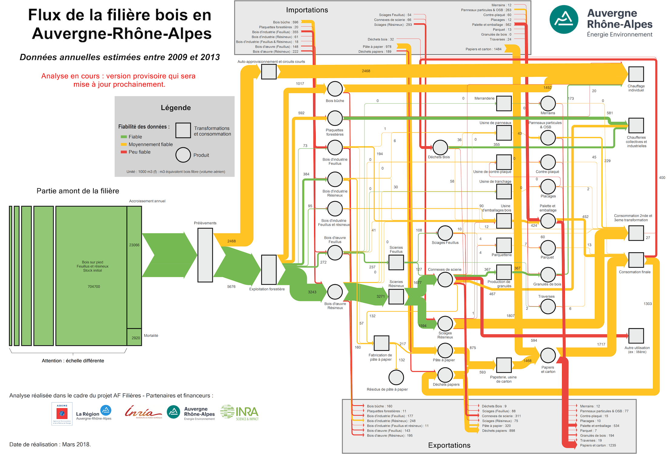
Following up to my post on energy flows from biomass in the Auvergne Rhône-Alpes region, here is another great Sankey diagram on wood flows by Auvergne-Rhône-Alpes Énergie Environnement (AUR-EE) agency.


Flows are in 1,000 m³ (f) wood fibre equivalents (read more about this unit here). The annual average of the years 2009 to 2013 in the region is visualized.

Wood is used for energy generation (top part), wood products (middle section), and pulp & paper (bottom part). Imports of wood or wood-based products come in from the grey box at the top, and export streams leave to the bottom grey box. Import and export in this case is from/to the area outside the Auvergne Rhône-Alpes region.

The green box on the left represents the existing standing wood stock (estimated at 704,700 thousand m³ wood fibre equivalents), which has an annual increase of 23,066 m³ (f) on average. Only 8,144 m³ (f) are removed from the forests per year.

The color coding relates to the data reliability (fiabilité des données): Green flows are based on reliable data, while yellow is for medium reliability and red for less reliable.

Losses in Fruit Production

Food loss or wastage has been a topic a previous posts here on the Sankey diagrams blog before (see here or here).

Here is another Sankey diagram from the dissertation ‘Environmental assessment of Catalan fruit production focused on carbon and water footprint’ by Elisabet Vinyes i Guix (p. 73). It visualizes losses in the production chain for apples and peaches in Catalunya.


For each kg of fruit arriving on the market (or at the point of sales), some 1.21 kgs of fruit are being cultivated. Losses occur in the farming process itself as well as along the retail system. Of the 1 kg fruit purchased by the consumer, only 83% is actually eaten. 17% turns into waste.

Spelling Variants Distribution

Interesting and fun example of data analysis and visualization of distributions using tree-like Sankey diagrams: The Pudding (“a digital publication that explains ideas debated in culture with visual essays”) has a post on the Gyllenhaal Experiment.

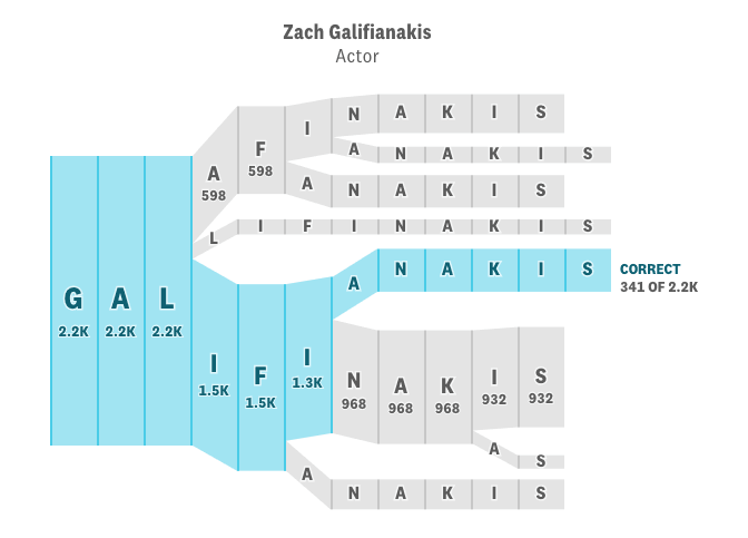
How do people spell the more or less difficult names of celebrities? Using occurrences of these names on reddit, they counted the spelling variants, then displayed them in this Sankey-style distribution diagram.

Here is one for the actor Zach Galifianakis (via TNW):


You can read this figure like branching pathways for alternative spellings. The blue path is the correct spelling. All people get the first three letters ‘Gal-‘ correct, but then they go on and spell it differently. Very quickly you get a great number of variations (which I am sure Galifianakis who has Greek roots is used to…).

Only the two main options (‘Galifinakis’ and the correct one, Galifianakis) show the absolute values, and the widths of the bands are apparently to scale. The other options with less hits only show two default widths. I also noted that the further downstream on a path, spelling variants, which would cause further branches, have been ignored.

I wanted to do one myself, and checked the underlying data. Turns out there are 2.632 spelling variants (many of which only have one count), so showing all of them in a tree-like diagram does not make much sense. One would have to either choose the 10 or 20 most common misspellings, and then decide to sum up the rest under “other” or drop them for good.


And here is what it looks like based on the top 10 spelling variants (n=15848). Flows are to scale and absolute numbers have been added. Less than 16% from this group spell the author’s name correctly, the most popular spelling variant collects more than 40% (click image to enlarge)


Maybe time for Zach to consider a name change 😉

European Copper Streams 2012

After all these colorful Sankey diagrams, here is something soothing for your eyes.

This b/w Sankey diagram shows European copper streams in 2012. It is taken from the 2017 dissertation by Simon Gloser-Chahoud of Technical University Clausthal in Germany with the woooh title ‘Quantitative Analyse der Kritikalität mineralischer und metallischer Rohstoffe unter Verwendung eines systemdynamischen Modell-Ansatzes’ (‘Quantitative analysis of the criticality of mineral and metallic raw materials using a system-dynamic model approach’ …thanks Google Translate!).

Flows are in kt. The dotted line references the geographical boundary of the EU-27 states. We can see that 1.100 kt copper concentrate was imported and 830 kt came from mines in Europe. Import and export of finished products containing copper is almost balanced. The overall addition of copper to the European stock (estimated at 90.000 kt) was at 3.200 kt. Copper in waste streams leaving this stock amounted to 2.500 kt, of which 1.750 kt were fed back into the copper production.