Interesting and fun example of data analysis and visualization of distributions using tree-like Sankey diagrams: The Pudding (“a digital publication that explains ideas debated in culture with visual essays”) has a post on the Gyllenhaal Experiment.
How do people spell the more or less difficult names of celebrities? Using occurrences of these names on reddit, they counted the spelling variants, then displayed them in this Sankey-style distribution diagram.
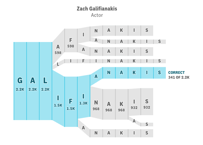
Here is one for the actor Zach Galifianakis (via TNW):
You can read this figure like branching pathways for alternative spellings. The blue path is the correct spelling. All people get the first three letters ‘Gal-‘ correct, but then they go on and spell it differently. Very quickly you get a great number of variations (which I am sure Galifianakis who has Greek roots is used to…).
Only the two main options (‘Galifinakis’ and the correct one, Galifianakis) show the absolute values, and the widths of the bands are apparently to scale. The other options with less hits only show two default widths. I also noted that the further downstream on a path, spelling variants, which would cause further branches, have been ignored.
I wanted to do one myself, and checked the underlying data. Turns out there are 2.632 spelling variants (many of which only have one count), so showing all of them in a tree-like diagram does not make much sense. One would have to either choose the 10 or 20 most common misspellings, and then decide to sum up the rest under “other” or drop them for good.
And here is what it looks like based on the top 10 spelling variants (n=15848). Flows are to scale and absolute numbers have been added. Less than 16% from this group spell the author’s name correctly, the most popular spelling variant collects more than 40% (click image to enlarge)
Maybe time for Zach to consider a name change 😉

