Month: October 2019

Energy Transition in Germany, Study

A great number of Sankey diagrams are coming out of Germany, don’t know why that is…

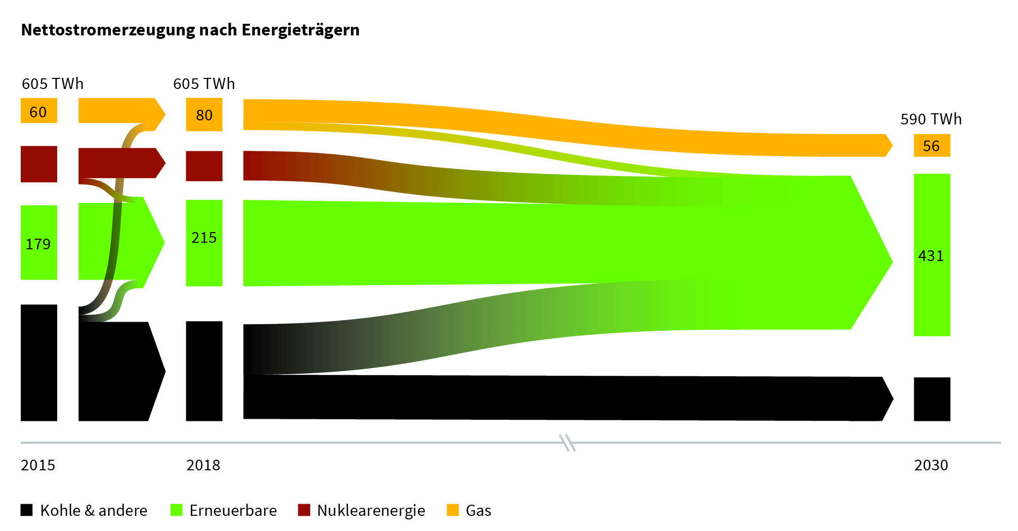
This one is from a study on the (stalling) progress of the ‘energy transition’ (some prefer to call it ‘energy turnaround’, ‘Energiewende’ in German). German Energy Agency (dena) and University of Cologne (EWI institute) have published an intermediate progress report. On climate change, Angel Merkel’s coalition has set the ambitious goal of reducing Germany’s greenhouse gas (GHG) emissions to 55% of the 1990 emission levels by 2030. One pillar of the energy turnaround is the increased use of renewable energy sources.

The study (PDF here, in German) contains a number of Sankey diagrams like this one:


The overall energy consumption of 605 TWh/year in 2015 hasn’t been reduced until 2018, but there is already a noticeable shift away from coal (black streams) and an increase in renewables. On the path to 2030 nuclear energy is to phased out completely and coal an gas are to be reduced significantly in favor of renewables with the overall consumption down to 590 TWh/year, mainly by means of energy efficiency measures.
Sankey Diagrams in Data Analysis Tools

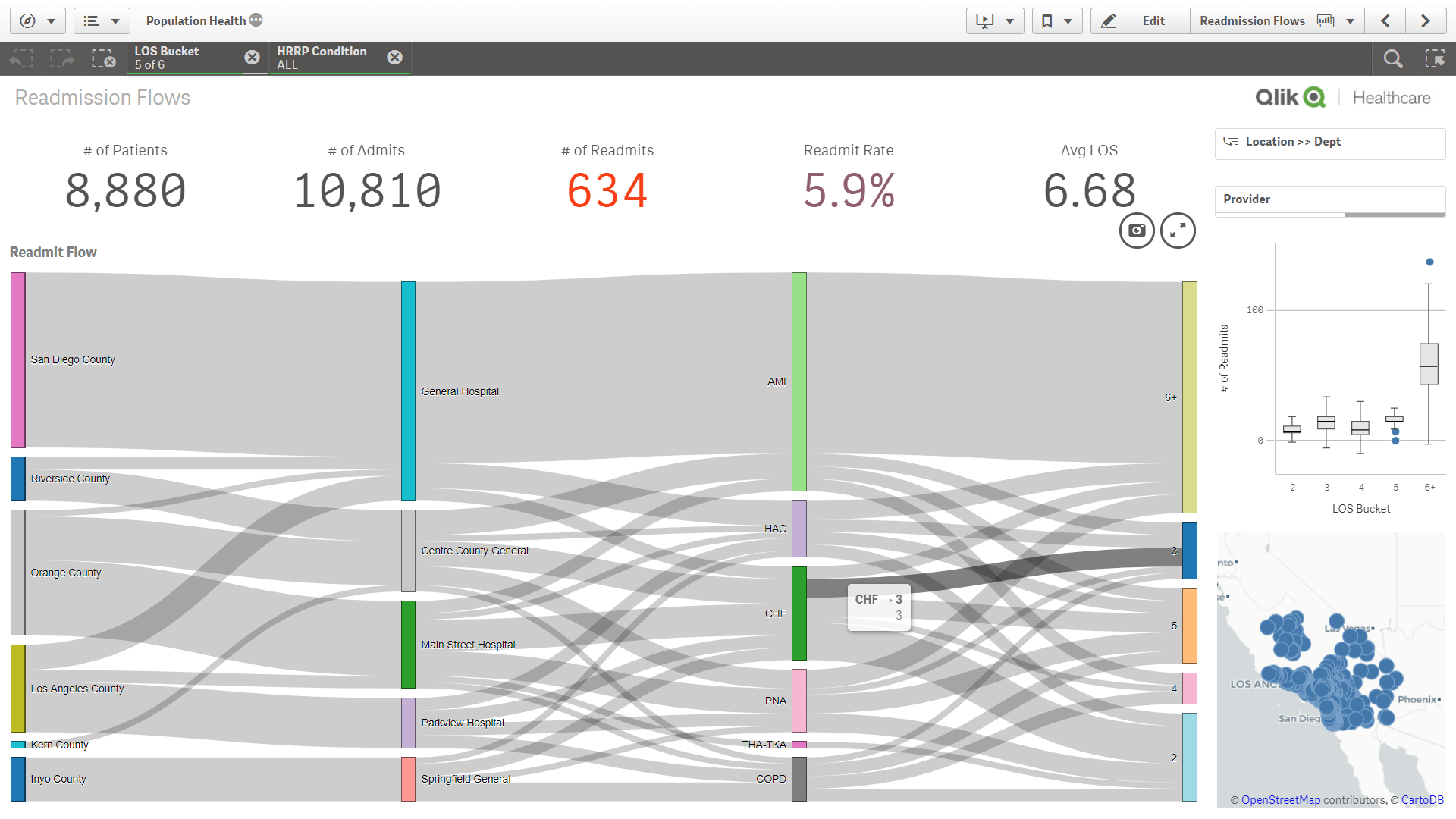
If you are using a big data analysis tool aka business intelligence (BI) visualization tool you are probably aware that many of them have added distribution diagrams (relationship diagrams), a specific subtype of Sankey diagrams. However, it is not always straight forward to produce them.

Qlik Sense users who need some background before producing their own graphs of this type might want to check out this blog article on ‘Visualizing Flows with Sankey’ on the Qlik blog. Or this one from the Qlik healthcare user group.


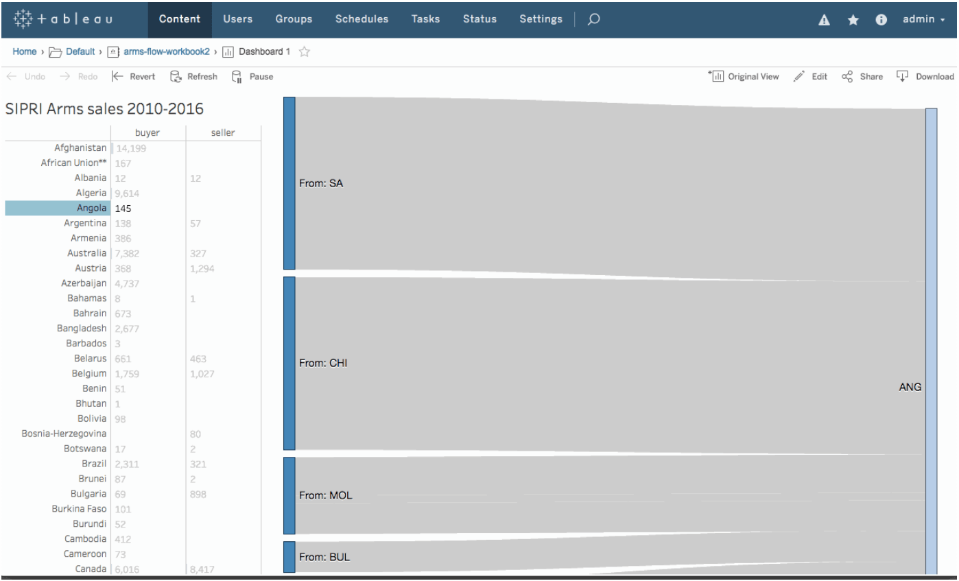
Users of Tableau can get an idea of how to do Sankey diagrams from this Tableau community board post and some detail background from Yoshi Arakawa’s blog here. I have mentioned the Sigmoid curves here on the blog in a December 2018 post.


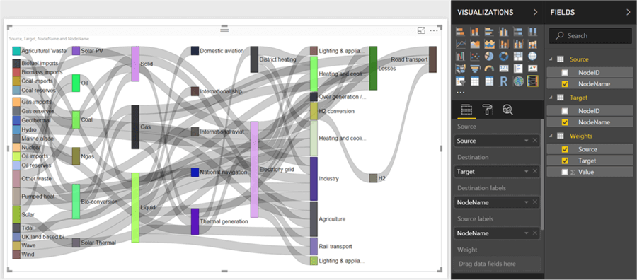
Microsoft Power BI also has category relationship diagrams, although they might “not [be] available by default in Power BI Desktop”. The post by Siddharth Mehta at MSSQLtips.com shows the 16 steps to produce your Sankey diagram from data managed in Power BI.


All three visualizations look very similar. This is because all three tools base their implementation on Mike Bostock’s d3-Sankey package.

Aircraft Crashes Cause/Phase Relationship

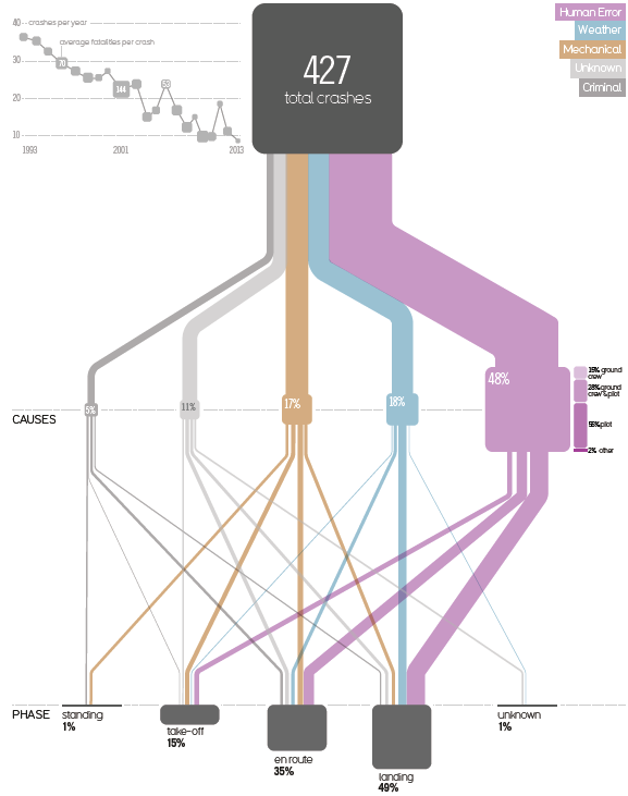
This one is from a very interesting 2015 blog post titled ‘Visualizing the causes of airline crashes’ by Rick Wicklin on the SAS blog.

The original graphic discussed is from David McCandless’ book ‘Knowledge is Beautiful’. Wicklin, a researcher in computational statistics at SAS has praise for the beauty of McCandless’ infographics, but criticizes the use of a Sankey diagram, points to two main issues with the diagram, and suggests to instead use a mosaic plot to convey the message.

The underlying data is for the time frame 1993 to 2013. The 427 aircraft crashes in that period are broken down in two categories: the cause of the crash (human, mechanical, weather, criminal) and the phase of flight when the crash occured (landing, en route, take off, standing on ground).

In addition to the width of the bands linking the nodes, the size of the nodes themselves are used to represent a percentage share. (This is BTW one of the problems that Wicklin identifies, read more here).

The inset at the top left should also be mentioned, as it shows that the absolute number of aircraft crashes over two decades has a downward trend… maybe a consolation to those that who are afraid of flying…