Month: June 2020

Passive House School Building in Germany

Sankey diagrams from Germany (and in German) can be found abundantly on the web (try a Google image search for ‘Energiefluss Sankey Diagramm’). So, when lagging behind or short of time I sometimes pick one for a Friday afternoon post.

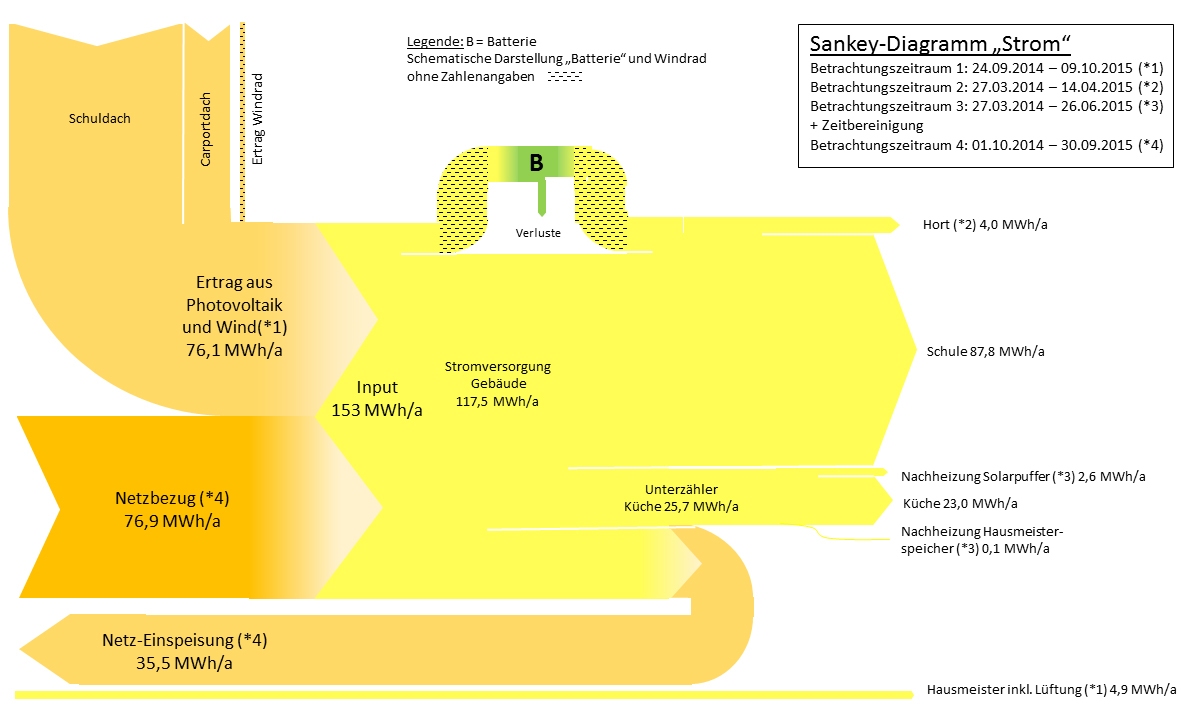
Here is one I found on the web page of ‘BINE Informationsdienst’, a resource portal for energy research and examples from practice. This Sankey diagram produced by Hochschule Magdeburg-Stendal.

This energy flow Sankey diagram is for the first school in Germany built in 2014 according to Passivhaus standard in Halle. Flows are in MWh aggregated over a 12 month period. Energy harvested from solar panels on the school’s roof and a wind turbine were 76.1 MWh, with energy from grid amounting to 76.9 MWh. However, 35.5 MWh could be fed back to the grid (Netz-Einspeisung).
Circular Zinc Flows

While some were indulging in an extended spring cleaning (this year labeled ‘quarantine cleaning’) I decided to take on some of the hard disks sitting on my desk.

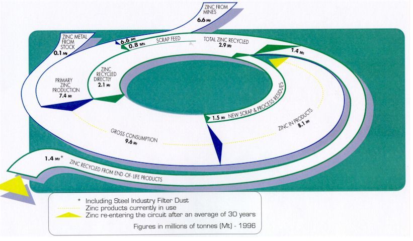
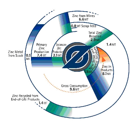
These circular zinc flow diagrams from 2011 survived the cleaning and are getting a new life here on the blog. They are more or less two versions of the same diagram, apparently with a Sankey diagram in mind.

The first is a top view and shows zinc flows in the economy (U.S. or world? … sorry, but I don’t have the accompanying text any more). Flows are in millions of tonnes (Mt) in 1996. The second one has the same numbers, but adds a 3D perspective…

Some tricky issues here: The ‘zinc in products’ stream of 8.1 Mt narrows down to zero, as the zinc sits in products, from where it later might be released into the cycle again. This does not help the attempt to draw them in a circle (to associate circularity of zinc flows). As a consequence the streams are not to scale (compare, for example the 0,8 Mt scrap feed flow right next to the 6,6 Mt flow for zinc from mines). The 3D perspective and the shadow effect don’t help in any way here…

Check out some more Sankey diagrams with the tag ‘circular’ and this post on radial Sankey diagrams.

Sankey Diagrams for Expressing Relevance

SaraVaca is a specialist on evaluation and data visualization. She runs the VisualBrains blog (check out the visuals CVs section!).

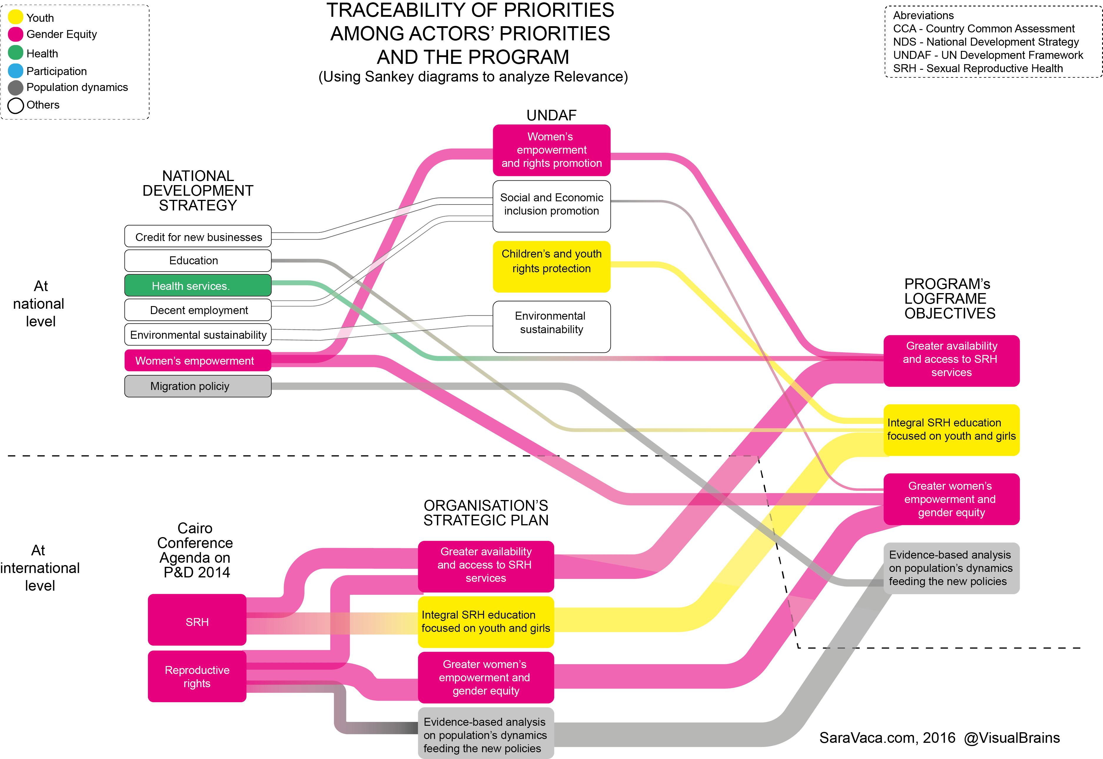
In a 2016 post she discussed using Sankey diagrams to express “Relevance” in evaluation. Having in mind a quantifiable flow perspective in Sankey diagrams, I was not sure how relevance could be translated. “Relevance in Evaluation is understood as the extent to which the aid activity is suited to the priorities and policies of the target group, recipient and donor”, she explains. So for a Sankey diagram that would mean expressing the “extent” or “suitability” in numbers. Which can of course be done either by assigning weight criteria or doing an ABC analysis.

Here is Sara’s sample:

We can see bands of four different widths. Additionally there is a color-coding for different categories for which the relevance is measured. Interesting approach. In 2017 she followed up with a post on ‘More inclusive (Sankey) diagrams to analyze Relevance’.