Month: March 2021

Household Packaging Waste Recycling

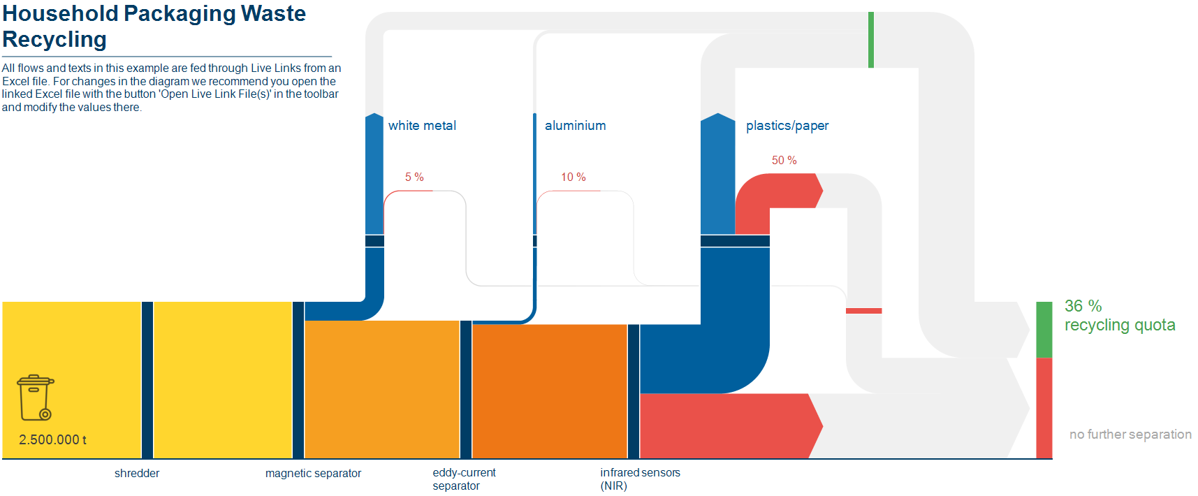
This Sankey diagram on recycling of household packaging waste is one of the sample files shipped with the new e!Sankey software release.


The overall household waste collected passes several processing/recovery steps where white metal, aluminium, plastics and paper are separated from the stream. These recovered materials add up to 36% recycled material.

Values seem to be fictitious, and flows are fed from an Excel spreadsheet, where you can modify the recovery quota for each material. The Sankey diagram reacts to values changing and updates the arrows accordingly. Nice !
Sankey Diagrams in Excel

Mark over at the Excel Off The Grid blog has a great new post on how to ‘Create a Sankey diagrams in Excel’.

Mark shows how to build a simple 2 category relationship diagram by using stacked area charts and reversed stacked bar charts. By layering the individual charts with mostly transparent colors (except the actual arrow), he manages to get a very neat diagram. It even allows changing the spacing between the start and end nodes, as well as the segment length of the horizontal first and and last arrow segment.

That is ‘big ass’-Excel usage!! Check out this video to see how the source data is prepared (some SUMIFs involved here) and the Sankey diagram is made. It is well worth watching all 18 minutes, in my opinion.

And if you want to try it out, you can download the template and start building from there. Read Mark’s post here.