Author: phineas

All the world in one diagram

This post on the Pinhead’s Progress blog makes my day (if not my whole weekend!). ptuft draws the attention to a slide presented by Wes Hermann from Stanford at the SciFoo 2007 conference. You can see the original photo on flickr and the presentation slides “Earth’s Exergy Resources – Energy Quality, Flow, and Accumulation in the Natural World” by Wes Hermann here.

Slide from a presentation by Wes Herman (uploaded to flickr by zippy)

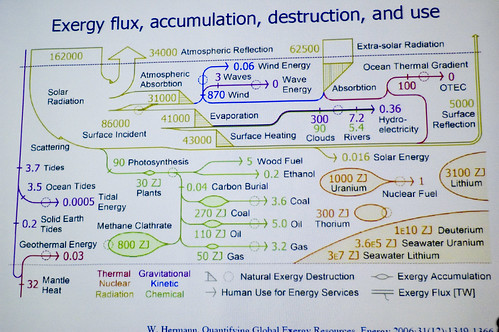
While I am not yet sure if this qualifies fully as a Sankey diagram, I find it really really fascinating! The diagram is titled “Exergy flux, accumulation, destruction, and use” and shows “where all the energy on the earth comes from, where it gets stored, and where it goes”. It distinguishes by colors the following exergy resources: Thermal, Nuclear, Radiation, Gravitational, Kinetic, Chemical.

The diagram type could be called a hybrid Sankey-Grassmann diagrams (see this post). The upper part is where radiation exergy is shown: 162000 TW of solar radiation and another 62500 TW of extra-solar radiation arriving on planet earth, being lost through atmospheric absorption, evaporation and surface heating. The green part (Chemical exergy) is what we focus on when we talk about energy consumption today. Hermann calls it “exergy destruction for energy services” (measured in ZJ). Accumulated exergy is shown with elliptic pouches on the arrow. Nuclear exergy features in the diagram as “bubbles”, most of it not accessible for human use as energy. One can find many other interesting details in this diagram.

I am tempted to challenge my e!Sankey tonight to see if I can draw this. Two different units (in this case TW and ZJ) can be displayed in one diagram. Biggest visualization issue will certainly be to handle the large differences in scale. Let’s see if I find the time, or if I prefer to enjoy radiation exergy of the summer sun at the poolside instead…

Using Sankey diagrams for visualizing web site performance

UK-based Stuart Brown at Modern Life in his latest post (“The Varying Virtues of Site Performance Metrics”) uses a Sankey diagram to visualize web site performance. This is a rather novel idea of using Sankey diagrams, but hey, why not?

This nicely done Sankey diagram – in this case without any absolute or relative numbers – shows where web site visitors come from (input flows from the left side), and if their visit can be considered successful (that is, meeting the “goal” of the site operator) or not as output flows to the right side. Returning visitors are shown with a “browsing loop” in the Sankey diagram.

I really like this Sankey diagram and I would love to see web site metrics being visualized in this way. It really is a good visualization and can show how a website performs, although Brown acknowledges that “there simply isn’t any single great method of gauging a site’s performance”.

Coming back to the Sankey diagram itself, it does however have a small flaw. Look at the grey arrows for “Bounce” and “Non-goal visit”. The latter does not connect to the “Page Load” node, but rather seems to dive under the “Bounce” flow and appears where this one branches of vertically.

I have created two alternative Sankey diagrams where these two flows set off from the “Page Load” box parallel (stacked), rather than in an overlay manner. The overall quantity represented by the flows on the output side should be equal to the number of visitors on the input side. The first diagram keeps the original idea of the browsing loop coming in from the top, the second one hooks it on the left side of the box.


Alternative version:

As for the colors of the two diagrams above, sorry Stuart, didn’t hit the right values right away…

Grassmann Diagrams

I have been asked whether ‘Grassmann Diagrams’ are the same as ‘Sankey Diagrams’, or what distinguishes them from Sankey diagrams. Frankly speaking, I only came across Grassmann Diagrams one or two years ago, and I hadn’t heard (or had I overheard?) this term during my studies. So here is a short summary of what I found out about this special type of diagram.

Grassmann diagrams are usually referred to as ‘exergy diagrams’. Exergy, in thermodynamics, are being “defined as a measure of the actual potential of a system to do work” (see Wikipedia entry), or the maximum amount of work that can be extracted from a system. (For those who are looking for a well-written introductory article on exergy, I recommend the first chapters of this one by Wall and Gong, which also shows links to LCA, economics and desalination).

Coming back to Sankey diagrams, they were in the very first place used to show the energy balance, or energy efficiency of a machine or a system. (Today, however, the use of Sankey diagrams has been extended beyond displaying energy flows, and they are also used for any kind of material flows, CO2 emission, value flows, persons, cars, pig halves, and the like).

Thus the difference between Grassmann and Sankey diagrams is mainly that the first depict exergy, the latter energy. Taking this, it is understandable that the width of the flow gets less at each stage, while in Sankey diagrams the width of the arrow at a process (transformation, machine) should be maintained, as energy is only being transformed, but never being consumed (First Law of Thermodynamics).

Let’s forget about the semantics and their primary use for a second, and look primarily to the visualization aspect of both diagram types. Then, in a more general perception of Sankey diagrams as flow diagrams that display arrow widths proportionally to the flow quantities, Grassmann diagrams could be understood as a special subset of Sankey diagrams. Indeed, some authors refer to them Sankey-Grassmann diagrams, or as an adaptation of Sankey diagrams, or as the counterpart to Sankey diagrams.

This article “On the efficiency and sustainability of the process industry” from Green Chemistry is recommended for further reading. It also and contains some nice Grassmann (- or should I say Sankey) diagrams. Enjoy!

Engine Efficiency of Cars

The U.S. Department of Energy (DOE) is funding research projects that target the increase of efficiency of car engine.

The Sankey diagram shown in this post on the Green Car Congress blog visualizes that only 25% (green arrow) of the energy from combustion is used as “effective power” for mobility and accessories, while 40% of the energy is lost in exhaust gas.

Projects are being carried out at John Deere, Caterpillar, Detroit Diesel and Mack Trucks, to name just a few.

“Seven of the twelve projects focus on advanced combustion technology with a heavy focus on HCCI (Homogeneous Charge Compression Ignition). There is also an diesel-compressed-air hybrid truck powertrain under development. The remaining projects deal with technologies to convert waste heat from engines to electrical or mechanical energy.”

The inefficient energy use of car engines and other vehicles are the main reason for the transport sector being (next to energy generation and transmission) the sector where most energy is being lost (see this post).

Guilty of Sankey Abuse?

The majority of Sankey diagrams I have come across so far show energy flow systems (see this post or this one) and material flow systems (my last post or this one). To a lesser extent the examples found on the web show flows of materials in process systems (e.g. a plant).

To show the number of people that have been accused of abuse of detainees in a Sankey diagram is a novel idea. The example below, originally published by the New York Times (and posted by Derek Cotter on Edward Tufte’s board ‘Ask E.T.’) features the distribution of the 600 cases and what the different outcomes were.

Diagram from N.Y. Times

The poster of the comment does criticize the inadequate diagram and says that “it might as well have been a pie chart instead”, however, the use of a Sankey diagram does give a kind of time line or at least a line of the decisions taken in the juridical system.

Choosing gray as the color rather than making it a colorful Sankey does reflect the topic adequately, I think.

Guilty of Sankey abuse? Or acquitted?

Lying with Sankey diagrams (2)

The below Sankey diagram of the ‘Material Flows of Japan in the FY 2000’ has been published by the Japanese Ministry of Environment (環境大臣) and has been reproduced in a number of publications and presentations (sample PPT). Similar charts, representing the inputs into the Japanese economy and the outputs are available for subsequent years.

When I copied the values of the Sankey diagram and re-designed it (see pic 1 below), it quickly became obvious that the inputs (2130 Mio. tons) don’t match the Outputs (2386 Mio. tons). After some research I finally detected the reason for the mismatch in a footnote to the diagram in a press release by the ministry. It said that, “due to intake of moisture, etc., total output shall be larger than total material input.” This footnote might have been dropped unintentionally when using the diagram in other publications. I wouldn’t really call this “lying” (as the title of the post implies), but maybe negligence. I wonder if anyboy doubted the numbers when looking at the diagram?

In the second diagram below I adjusted this difference of 256 Mio. tons on the input side.


Another rather surprising thing in this Sankey diagram is the fact that the domestic food consumption within Japan (127 Mio. tons/year in 2000) was almost as high as the total quantity of material being exported (132 Mio. tons). Taking into account, for example, the number of cars being exported from Japan, and their weight, this sounds a little unlikely. However, I think that many of the produced goods might be hidden in the “Net Addition to Stock”.

And for the readers who study Japanese … Sankey diagram : サンキーダイアグラム

Sankey Diagrams in Periodic Table of Visualization Methods

Remember having to learn the elements of the periodic table back in chemistry class?

Visual Literacy now presents a ‘Periodic Table of Visualization Methods’ that has been published by two scientists from the University of Lugano in Switzerland.

Each elements represents a visualization method, from ‘C’ like ‘continuum’ to ‘Sd’ like ‘spray diagram’. The Sankey diagram can be found as element ‘Sa’ in the periodic table. It is colored in green for being in the ‘Information Visualization’ category. Furthermore its characteristics are ‘Overview’ and ‘convergent thinking’.

You can see the full periodic table at visual-literacy.org and hover the mouse over to see an example for each visualization method. The original article (Lengler R., Eppler M. (2007). Towards A Periodic Table of Visualization Methods for Management. In: IASTED Proceedings of the Conference on Graphics and Visualization in Engineering 2007, Clearwater, FL, USA) and the table separately are available as PDF files.