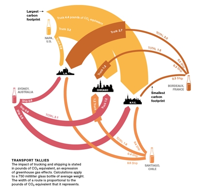
Dr. Vino on his blog presents a Sankey diagram of wine that was originally shown in National Geographic. To be exact, it is a diagram of greenhouse gas emissions associated only with the transport of wine from certain wine producing areas (Australia, Bordeaux, Napa Valley, Chile) to consumers in three U.S. cities (Los Angeles, Chicago, and N.Y.C). So the title should rather read as “Carbon Footprint of Wine Transport”. Neverhteless, an interesting Sankey diagram:
The rounded Sankey arrows are definitely not very common, but are used nicely here. The arrow magnitudes represent weighted emissions potentially contributing to climate change, measured in pounds of CO2-equivalents. The values are for an average 0.75l bottle being shipped. When an arrow get’s wider at a certain point (e.g. Bordeaux to L.A.), this means a change in transport mode (e.g. from ship to truck). The comments to Dr. Vino’s post are well worth reading to understand the diagram better. I am not sure whether it has been taken into account where the wine, typically being shipped in tanks, is filled into glass bottles (adding to the weight, and consequenty to the transport related emissions).
So from this Sankey diagram we can learn that Californian wine being consumed in New York has the highest (transport) carbon footprint, while the French rouge being savoured in the same city comes with the smallest footprint.
BTW, I heave heard that there are studies that look into the life cycle assessment and carbon footprint associated with wine production, e.g this one. Would be interesting to find a carbon footprint Sankey Diagram that combines both wine production, transport, and end-of-life climate change impacts, in order to compare the different phases and their carbon footprint.
Santé!

1 Comment
Comments are closed.