Category: General

Grassmann Diagrams

I have been asked whether ‘Grassmann Diagrams’ are the same as ‘Sankey Diagrams’, or what distinguishes them from Sankey diagrams. Frankly speaking, I only came across Grassmann Diagrams one or two years ago, and I hadn’t heard (or had I overheard?) this term during my studies. So here is a short summary of what I found out about this special type of diagram.

Grassmann diagrams are usually referred to as ‘exergy diagrams’. Exergy, in thermodynamics, are being “defined as a measure of the actual potential of a system to do work” (see Wikipedia entry), or the maximum amount of work that can be extracted from a system. (For those who are looking for a well-written introductory article on exergy, I recommend the first chapters of this one by Wall and Gong, which also shows links to LCA, economics and desalination).

Coming back to Sankey diagrams, they were in the very first place used to show the energy balance, or energy efficiency of a machine or a system. (Today, however, the use of Sankey diagrams has been extended beyond displaying energy flows, and they are also used for any kind of material flows, CO2 emission, value flows, persons, cars, pig halves, and the like).

Thus the difference between Grassmann and Sankey diagrams is mainly that the first depict exergy, the latter energy. Taking this, it is understandable that the width of the flow gets less at each stage, while in Sankey diagrams the width of the arrow at a process (transformation, machine) should be maintained, as energy is only being transformed, but never being consumed (First Law of Thermodynamics).

Let’s forget about the semantics and their primary use for a second, and look primarily to the visualization aspect of both diagram types. Then, in a more general perception of Sankey diagrams as flow diagrams that display arrow widths proportionally to the flow quantities, Grassmann diagrams could be understood as a special subset of Sankey diagrams. Indeed, some authors refer to them Sankey-Grassmann diagrams, or as an adaptation of Sankey diagrams, or as the counterpart to Sankey diagrams.

This article “On the efficiency and sustainability of the process industry” from Green Chemistry is recommended for further reading. It also and contains some nice Grassmann (- or should I say Sankey) diagrams. Enjoy!
Engine Efficiency of Cars

The U.S. Department of Energy (DOE) is funding research projects that target the increase of efficiency of car engine.

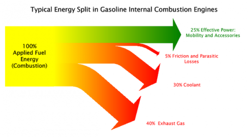
The Sankey diagram shown in this post on the Green Car Congress blog visualizes that only 25% (green arrow) of the energy from combustion is used as “effective power” for mobility and accessories, while 40% of the energy is lost in exhaust gas.

Projects are being carried out at John Deere, Caterpillar, Detroit Diesel and Mack Trucks, to name just a few.

“Seven of the twelve projects focus on advanced combustion technology with a heavy focus on HCCI (Homogeneous Charge Compression Ignition). There is also an diesel-compressed-air hybrid truck powertrain under development. The remaining projects deal with technologies to convert waste heat from engines to electrical or mechanical energy.”

The inefficient energy use of car engines and other vehicles are the main reason for the transport sector being (next to energy generation and transmission) the sector where most energy is being lost (see this post).

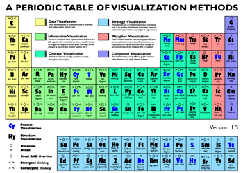
Sankey Diagrams in Periodic Table of Visualization Methods

Remember having to learn the elements of the periodic table back in chemistry class?

Visual Literacy now presents a ‘Periodic Table of Visualization Methods’ that has been published by two scientists from the University of Lugano in Switzerland.

Each elements represents a visualization method, from ‘C’ like ‘continuum’ to ‘Sd’ like ‘spray diagram’. The Sankey diagram can be found as element ‘Sa’ in the periodic table. It is colored in green for being in the ‘Information Visualization’ category. Furthermore its characteristics are ‘Overview’ and ‘convergent thinking’.

You can see the full periodic table at visual-literacy.org and hover the mouse over to see an example for each visualization method. The original article (Lengler R., Eppler M. (2007). Towards A Periodic Table of Visualization Methods for Management. In: IASTED Proceedings of the Conference on Graphics and Visualization in Engineering 2007, Clearwater, FL, USA) and the table separately are available as PDF files.

Sankey – the movie. Or: moving Sankey diagrams

Mark Barrett, director of a UK-based energy consultancy Senco, has developed several energy models.

The SEEScen model (Society, Energy and Environment Scenario model)…

…incorporates 11 energy end uses (motive power, lighting, heating etc.) across 15 sectors. Some of these end uses have physical models; for example, domestic space heating and cooling are estimated with a model of a house which allows the effects of parameters such as insulation and internal temperatures to be examined.

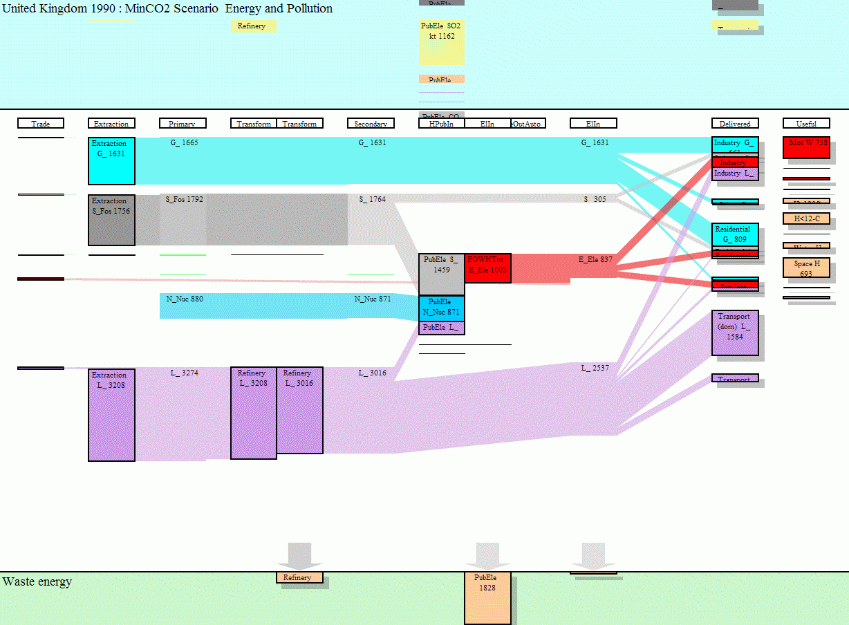
Sankey diagrams for several years have been put together to make a short “film” how energy requirements may change over the years, and what shifts might be expected between different ways of energy generation.

To view this animation click on the image (there are some seconds between the frames, be patient).

To be able to see the details, download the Flash move or the GIF from the SEEScen webpage. Make sure you watch the film in the original size.The website www.senco.co.uk has gone offline (?), go to Mark Barrett’s page instead.

This is a neat idea, and it gives a whole new dimension to Sankey diagrams! On a side note: as far as I am informed, there are only two software tools capable of handling timelines in Sankey diagrams, S.DRAW and SankeyVis.…

What is Sankey?

I do acknowledge that the term ‘Sankey diagram’ is not as common as a ‘pie chart’, and that many people don’t know it, even if they have a rough idea of this type of diagram. One might just call a Sankey diagram a ‘mass flow diagrams’ or ‘flow chart’, or ‘energy efficiency chart’. Or a ‘heat loss diagram’, as I have seen it once.

So, then: what is Sankey?

In times where “to google” is synonymously used for “to search”, a visit to Google will give you a first idea. I also recommend a query at Googlism, a site that has some very subtle answers to the above question (I very much like “Sankey is 7 or 7” and “Sankey is aboard” 😉 )

But seriously: Sankey is originally both a name of a locality in England, as well as a family name. Famous Sankey’s include Ira D. Sankey, a gospel singer and composer (1840-1908) and magician Jay Sankey. And of course the lesser known Captain H.R. Sankey, the first to publish an energy efficiency chart, and the reason why we call Sankey diagrams Sankey diagrams. I will try to aggregate some information on this personality, to honor his invention.

Energy Losses in Industrial Ceramic Furnace

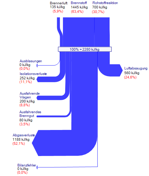
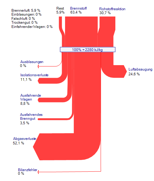
Here are two Sankey diagrams that show the energy losses in an industrial ceramic furnace. The diagrams are oriented top-down. The labels are in German.

The Sankey diagram in blue shows the energy use in an industrial ceramic furnace. The flows are shown in absolute values and in percentage values.

The second diagram in red is similar to the blue one, but it only show the relative flows in percentiles. Additionally the flows entering the diagram at the top have been separated to show their shares. Other flows (‘Rest’) have been grouped together and the individual contributions are shown on the label.

Sankey Diagrams – a new kid on the blog

Welcome to Sankey Diagrams, a blog about a special type of flow diagram, that allows to represent material, energy or cost flows.

We will be presenting samples of Sankey diagrams and tidbits of information on these flow charts, widely used in engineering, especially in the energy field.

Of course we welcome your suggestions and comments. Do you have a Sankey diagram to share with the readers of this blog? Feel free to contact us.