Category: General

Substances in Wastewater Treatment

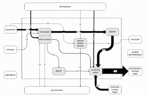
In the Wiki of the CD4WC (Cost Effective Development of Urban Wastewater Systems for Water Directive Compliance) project, I found an interesting Sankey diagram that I wanted to share with you.

This project, funded by the European Commission, deals “with optimising the efficiency of urban wastewater systems with regard to ecological consequences in natural water bodies and with regard to investment and operation costs.”

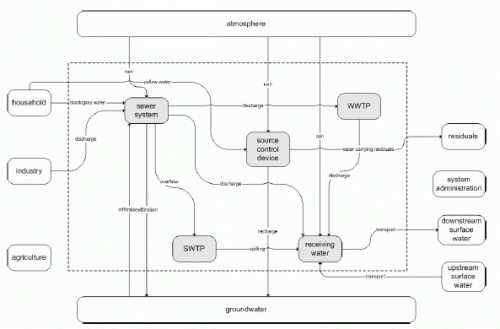
The waste water treatment process system is shown with a schematic flow diagram. For individual substances that can be found in the waste water, the diagram is then displayed with Sankey flows, that represent the quantity. Thus, Sankey diagrams are a possibility for the “determination of fluxes of substances per unit of time”. This presentation is part of a method is coined Substance Flow Analysis.

This presentation is very advantageous: The nodes in the system (the process blocks) remain at the same position, only the magnitude of the arrows changes, when switching to the substance flows view. Flows with large quantities substances are clearly visible.

It would also be a possibility to introduce as a third view (next to absolute water quantity, and substance quantities) the substance concentrations (impurities per m³ of waste water).
World Internet Bandwith Sankey

The cutting of two submarine internet cables in the Mediterranean Sea at the end of January, and another one in the Persian Gulf a few days later, was widely reported in the news. The cuts affected internet services and call center operations in large parts of the Middle East and India, sparking discussions about emergency backup plans for offshore software development.

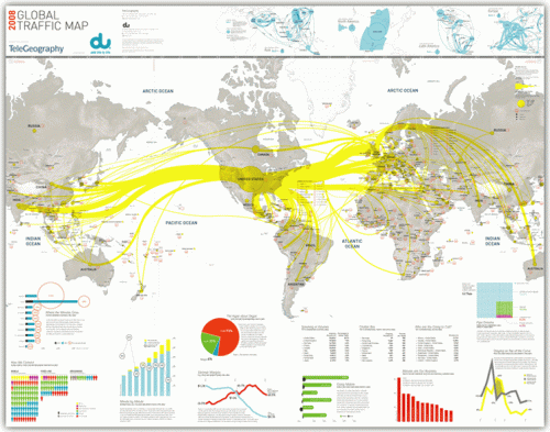
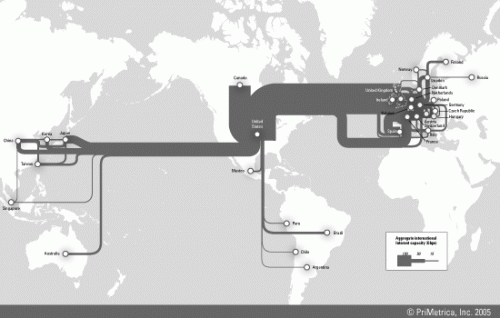
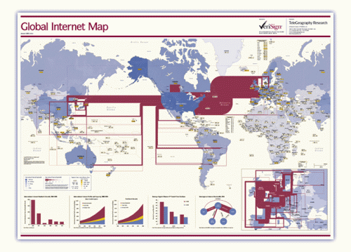
This reminded me of the internet traffic maps I had seen on the Web before. These are available as traffic load maps as well as bandwidth capacity maps of the backbone infrastructure.

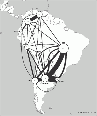
Indeed these maps can be considered as fine examples of Sankey diagrams, with bi-directional (or non-directional?) arrows whose magnitude represent the bandwidth of the transcontinental internet cables. Additional arrow colors could be used, for example, to represent ownership or operation of the cable by different companies.

At the same time the Sankey maps may also serve to indicate communication technology development in different world regions.

BTW, if you want to stick one of these maps prominently on your office wall, they are available as posters here.

Chemical Reaction Sankey

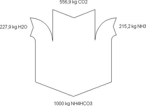
This rather simple Sankey diagram represents the idealized mass balance for making ammonium bicarbonate. The chemical reaction is H2O + NH3 + CO2 → NH4HCO3. It is taken from a Polish web page on chemical process technology.

The diagram is drawn with the freeware Sankey Helper. And it is nice to see that, while most of the Sankey diagrams are drawn with a left-to-right flow orientation, this one is top-to-bottom.

Sankey Diagrams with Visio

Chris Roth, the Visio Guy in his latest article focuses on the question whether and how Sankey diagrams can be drawn in Microsoft Visio.

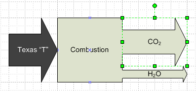
Can Visio do Sankey? While there are no Sankey Diagrams templates that ship with Visio, there are a few in-the-box shapes that can be used to create rudimentary Sankeys.

He identifies some problems with the Visio-supplied arrow shapes, and provides “a new version of the arrow shape which is more suitable to making Sankey diagram” for download. Really cool, Visio Guy!

In one of the follow-up comments Chris states that pre-built shapes can only cater for the most basic Sankey arrows, but “a proper, full-blown solution would utilize at least some code, if nothing else, for decent data-input dialogs, etc.”

Sankey Chart or Sankey Graph?

User ‘taqua’ at jfree.org comments on another topic:

there is a fundamental difference between a *chart* and a *graph* or diagram.

A chart is a map of some data (like a city map, but for mass-data). It is a graphical visualization of tabular data. Charts are used for statistical purposes. Charts may be helpful to make mass data more understandable.

A graph is a graphical representation of a relationship between some objects or concepts. (In other words: A graph is a drawing that explains how something works or behaves.)

It is a common property of human languages, that terms get mixed, so you will find the word ‘chart’ in classical graph types, like ‘flow-chart’. Nonetheless, by sticking to the definitions above, it is easy to see that a flowchart is no chart at all – its a graph.

Taking this into consideration, a Sankey diagram can be considered both, a Sankey chart and a Sankey diagram. The quantities represented by the magnitude of the flow could also be shown as tabular data, the direction of the flow, given by the arrow orientation between two processes indicates a ‘from-to’-relationship.

Cost Sankey Diagrams show Added Value

While browsing through some of my older bookmarks I discovered this page of what seems to be an information portal of one of a German federal ministry. The Sankey diagram for cost flows they show reminded me of a feature in the Umberto material flow management software, which I always wanted to inspect in more detail.

Using their 30-day trial version I worked with one of the simple demo examples they provide. Basically this software is a modeling tool for process systems and analysis of material flows within any kind of process system (production plant, supply chain, region, …). Sankey diagrams in Umberto are not the default view for material flows, but one can switch from the normal “Material Flow Network” view to the Sankey view.

Even though the Sankey diagram feature of the software would need some retouching, I was surprised and extremely pleased to see a “Cost Sankey” feature.

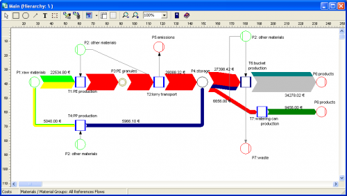
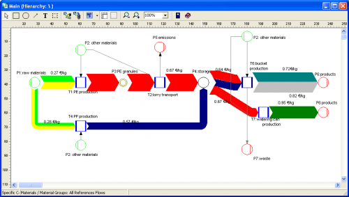
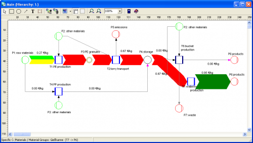
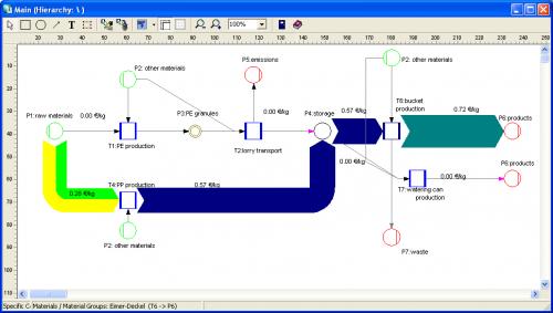
You can enter material direct cost for all materials (in the ‘bucket factory’ example of the demo all materials already have a “market price” property), as well as fixed and variable process costs. The variable process costs are spread over the process throughput using ‘machine hours’ or ‘work hours’ as cost drivers (i.e. to link cost creation to the material throughput). Thus, at every process (shown with blue squares in the flow diagram) the costs -or should I say: the value – increases. Going from left to right along the general flow direction in the Sankey diagram you can see clearly that the growing magnitude of the Sankey cost flows… a kind of ‘Value Added Sankey diagram’.


The above screenshots show the overall cost for the three products produced in the bucket factory (Fig.1), the cost per unit for each of the three products of the bucket factory (Fig.2).

The following two cost flow Sankey diagrams are for the individual costing units ‘plastic bucket’ and ‘watering can’ (Fig.3 and 4). Please note that on theses diagrams a part of the machines is not being used, so they don’t add any process costs to the costing unit (or don’t contribute to the value added). Unfortunately you can only display either mass or energy flows in one Sankey diagram, so the energy costs (from the circle labeled ‘other materials’) are not shown as a Sankey flow, even though they add to the price for each product.

Cardboard and scissors to make Sankey diagrams

The website of Nottingham City Schools offers a variety of materials that can be used by teachers in their courses. One of the key areas in the science field is ‘energy’.

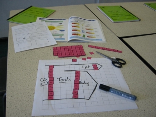
The site has a demonstration of how Sankey diagrams may be used to represent transfer of energy, including a PowerPoint and “stories”, for which pupils can create a Sankey diagram by using tokens cut from cardboard.

I think this is a great idea, as it supports the understanding of the energy topic with a haptic and, very importantly, a visual approach.