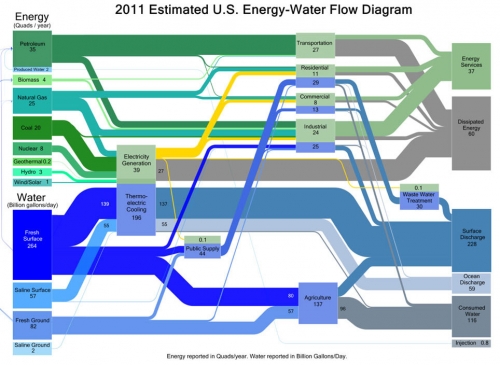
Via the EDF blog (no, not Electricité de France, but Environmental Defence Fund) comes this mixed Sankey diagram for energy and water flows in the U.S. in 2011.
Kate Zerrener explains in the post that energy generation and water consumption are deeply interwoven. The diagram shows which energy production and which consuming sector requires how much water.
“Water is measured in billions of gallons per day (BGD) and energy is measured in quadrillion British Thermal Units (Quads) per year. In the graphic above, water flows are represented in blue, energy in green.”
