Following up to yesterdays post on the supply chain visualization by TRUTHstudio. Imagine the concept described for the meat production sector blown up to cover the all sectors of the U.S. economy, and showing all the links between these sectors. There you are: Economy Maps, “an interactive visual map of the United States economy and its environmental impacts” by Jason Pearson.
In the first version the economy maps covered 24 major sector groups, and were apparently “static”. However, they already were beautifully designed Sankey-style maps of the environmental impacts caused directly or indirectly by these sectors of the economy.
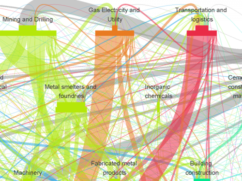
Here is an image from that first edition of Economy Maps:
Jason comments: “The CEDA database (from which Economy Map derives its data) was developed by Dr Sangwon Suh at UC Santa Barbara, and that image … was actually an illustration for an academic article by Dr Suh.”
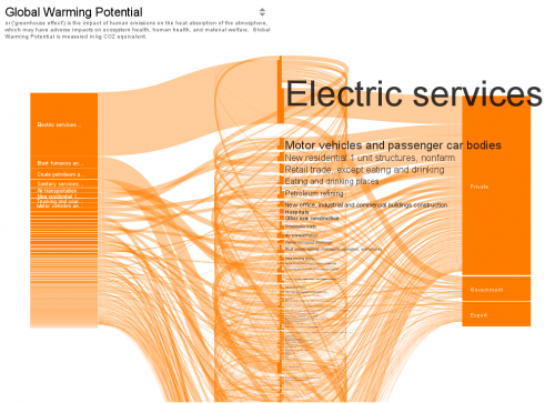
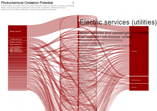
Development has continued and today in Economy Maps 2.0 beta is available as a fully interactive browser based Java application or a downloadable file for Mac or Win. It allows to view the environmental impact for several categories (such as global warming protential, ozone depletion, acidification, land use, freshwater aquatic exotoxicity potential and so on). Each diagram is presented in a different color but with the same structure: The first column are the goods obtained from the different sectors. The middle column contains all sectors that have an exchange of goods. The right column represents the consumers, both private and governmental. For each impact category users can visually grasp the relative contribution of each sector to an environmental impact category represented by the width of the band. Each sector is profiled according to three distinct perspectives on environmental impact as explained in yesterday’s post.
I have included a video of Jason explaining the economy maps below, it is wortwhile watching to fully understand the details.
The diagrams are based on statistical financial data and makes use of the economic input-output life cycle assessment (EIOLCA) method. “Financial data are drawn from ‘use’ tables published by the Bureau of Economic Analysis (BEA) at the US Department of Commerce. Environmental data are drawn from Sustainable Materials Management: The Road Ahead, a report from the US Environmental Protection Agency (US EPA). The report includes an economy-wide study that identifies the relative contribution of each industrial sector to major environmental categories. The study makes use of output from the CEDA 3.0 Life Cycle Assessment (LCA) Economic Input/Output (EIO) database”.
It should be noted that there are a lot of assumptions built into the methodologies used to calculate environmental impacts, and some of these methodologies are quite controversial. Also, the data is from 1997, and financial interaction between the sectors has most likely changed since. According to the author, Economy Maps at present should be considered a prototype, and users “should be careful in relying on Economy Maps for ‘answers’ at this point…”
Users can pull the nodes of the middle column apart and sort them in order to untangle the spaghetti and get a clearer picture of the economic interactions between the sectors and their associated direct and indirect environmental impacts in the different categories. The height of the economy sector node represents the magnitude of the environmental impact, the font size of the node name corresponds to the node size. The nodes move with a nice soft scroll effect as we love it. Try the online version of Economy Maps 2.0 or download the desktop version.
Economy Maps are “work in progress” and we can expect updates as data for more recent years become available.
Here is the 60 second video of Jason explaining the Economy Maps. For a longer video visit economymap.org.


