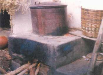
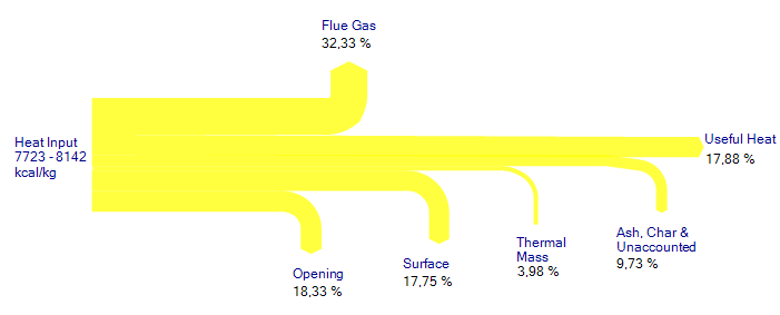
This article on the FAO website shows a comparison of several types of simples stoves and their energy balance using Sankey diagrams.
The Sankey diagrams show how the energy (typically from wood firing) is lost, and that only a small fraction of 12 to 20 % is actually being used as “useful heat”.
More of these “heat flow diagrams” can be found in chapter 4.2. of the article.
A rather special feature of the diagrams shown in this article is that the percentile values given for the flows cover a range (e.g. Ash and Char 5,97% – 12,15%), rather than a specific absolute value. This is rather untypical. Also, it can be noted, that the width of the arrows are not always to scale: compare, for example, the width of the “Surface” arrrow to that of the “Thermal Mass” arrow. It should be roughly four times wider.
The same Sankey diagram created with a Sankey software tool shows the arrow widths correctly.


