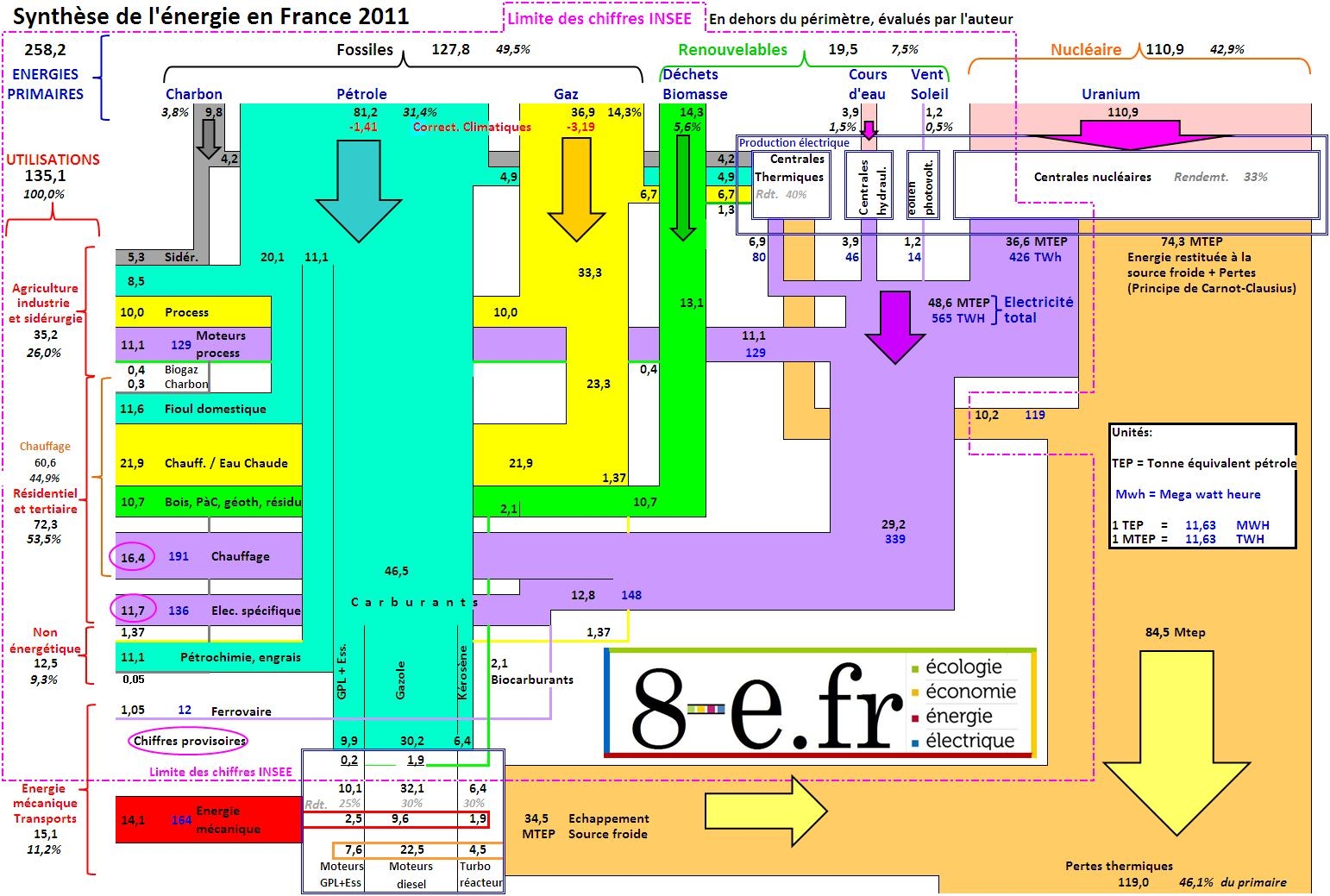
A Sankey diagram made up from rectangles is shown in this post on the blog ‘8-e.fr’ by MM.
The diagram is based on data for 2011 by the French national statistics bureau (INSEE) and the statistics observatory (SoES) of the Ministry for Environment and Sustainability. The author of the post comments that modifications were made in regard to the conversion of primary energy (“Nous corrigeons ce défaut de principe de l’INSEE pour mettre en relief les énergies primaires et secondaires réellement utilisées ou fournies.”) using average efficiency factors.
There are two sets of units: the black figures in MTEP (French for ‘million tons of oil equivalent’ MTOE) and the blue figures in MWh. Even though the flows are drawn with rectangles, one can grasp the general direction from top to bottom/top to left and losses to the bottom right by means of small arrows on the bands themselves. The width of flows seems to be pretty much to scale. The whole diagram a bit overloaded, with a high information density. Nevertheless, it caught my attention…
