A similar Sankey-style diagram to the one I presented in my last post can be found on the visualcomplexity.com website.
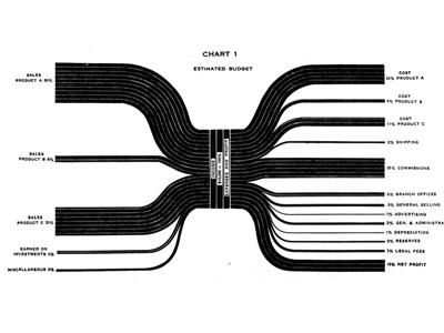
It shows the estimated budgeted costs and earnings and was published by IBM back in 1940 (original source: H. Arkin, Graphs: How to make and use them (Harper & Brothers Publishers, New York, ed. Revised, 1940).
I am not sure if this fully qualifies as a Sankey diagram, since the flows are not directional. The earnings from sales of different products are broken down into arrows of different magnitude from/to the left. Costs for producing the products and overhead costs are on the right side. This chart thus constitutes a graphical representation of an accounting system, with values given in percent rather than as absolute figures.
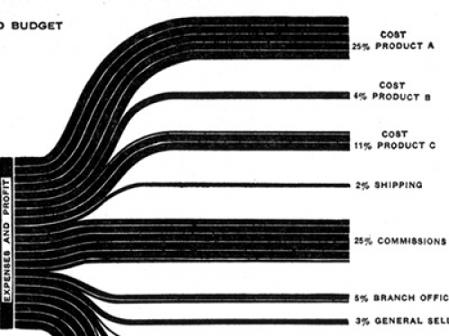
These distribution diagrams are also known as ‘Spaghetti diagrams’. See this detail:
Manuel Lima’s visualcomplexity website has more interesting diagrams, and one can spend hours browsing the projects. I will be presenting a few more of them that qualify as Sankey diagrams here on the blog in the future.


2 Comments
Comments are closed.