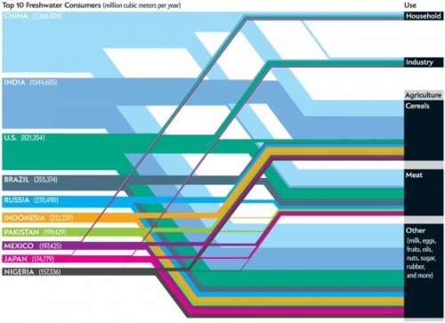
The below distribution diagram (aka ‘Spagehetti diagram’) was presented on flowing data. It shows the top 10 nations in regard to freshwater consumption on the left, and the sectors where water is consumed on the right (column “Use”).
The author of the diagram is Jen Christiansen and it was originally published in a Scientific American article by Mark Fischetti.
The unit is million cubic metres per year. Only the absolute water consumption per nation is given, no values for the water consuming activities. Many of the commentators of the post pointed out that a per capita consumption of water would give a different, a “fairer” picture.
I refrain from commenting the content of the graphic. But I like the clear layout with the bands running in parallel and nicely stacked.
