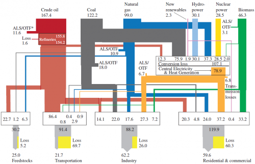
Blog reader Johannes sent an e-mail, advising me that the 2012 GEA Report (GEA, 2012: Global Energy Assessment – Toward a Sustainable Future, Cambridge University Press, Cambridge UK and New York, NY, USA and the International Institute for Applied Systems Analysis, Laxenburg, Austria) has many Sankey diagrams worth checking out. Thanks! I downloaded this 1865 page (!) report (link, caution large 188 MB file!) from the IIASA website.
Here is one of the Sankey diagrams featured in the report.
This is a diagram for global energy flows in exajoule (1 EJ = 10E18 joules) “from primary to useful energy by primary resource input, energy carrier (fuels), and end-use sector applications in 2005”.
Similar national energy flow diagrams I have featured here typically are left-to-right oriented, but the structure is similar. Flow quantities are mostly shown as entry flows on the nodes (boxes). Losses displayed in yellow next to the grey exits at the bottom.

2 Comments
Comments are closed.