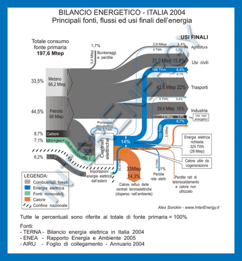
Came across the below Sankey diagram showing the energy balance for Italy in 2004. This diagram is from the website of the Italian company InterEnergy.
The setup of the Sankey diagram is similar to the other national energy flow diagrams I have shown in previous posts here on the blog, such as this one for Spain, these two for the United Kingdom, or here for the United States.
The breakdown on the left side shows the fuel types: natural gas (‘Metano’), oil (‘Petrolio’), coal (‘Carboni’), and the renewable energy sources in green. The separate grey flow shows energy imports. Both, percentage values in reference to the primary energy content, as well as absolute figures (in Mtep – million tons of petroleum equivalents, ‘milioni di tonnellate equivalenti di petrolio’ in Italian) are given. Part of the fuels is consumed directly in the different final use sectors (‘usi finali’), a part is used to generate electric energy (blue), and heat (orange). Some of the heat is used through cogeneration, but the major part is lost.

1 Comment
Comments are closed.