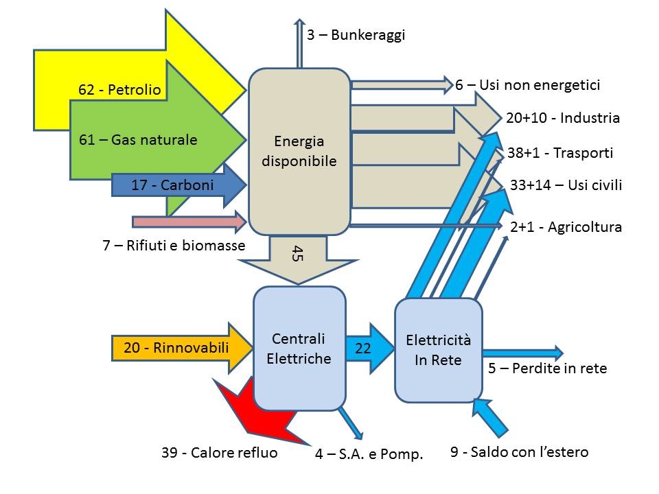
If you don’t use Sankey diagram software and only have Power Point at hand, this is probably what your national energy flow diagram turns out. 😉
Arrow widths are more or less to scale, which is good. But the overall aspect of this Sankey diagram is unorganized, due to diagonal and overlapping arrows. No flow units given.
