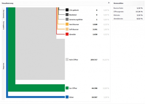
XQueue displays the success of mass e-mail campaigns and the behavior of the recipients in this Sankey-like way.
This could of course also be shown in a pie chart, but the further down the arrow branches out the closer to the goal (getting a click on a link in the e-mail).
Diagram in German but I understand the last three categories as ‘Non-Opener’, ‘Open Only’, ‘Clicks’.
