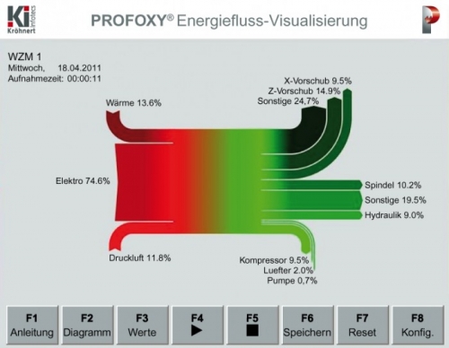
Energy flows are visualized on a machine touch screen panel, giving realtime information of energy consumption. This is from the PROFOXY system offered by Kröhnert Infotecs, a German engineering firm.
Basically two pie charts, one for the red part on the left side, and one for the green part on the right, would suffice (… I can’t believe I’m actually advocating pie charts here 🙁 ), but this Sankey diagram additionally gives a notion of “flow” and allows a grouping of consumers (on the right).
