Sankey Diagrams

A Sankey diagram says more than 1000 pie charts

Menu
Samples

Misc Sankey Diagrams Uncommented 16

phineasDecember 21, 2017December 22, 2017

The last weeks have been very busy, so I am just quickly firing off a few more Sankey diagrams from the depth of my hard disk before heading into the holiday season.

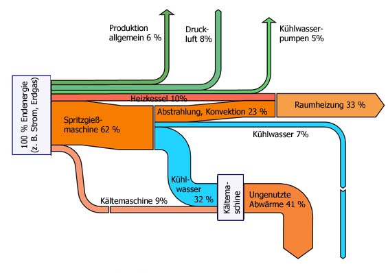
This one in German, showing the percentage breakdown of energy flows in a company. Haven’t noted the source, sorry.
Sankey_Metal_Energy

Tagsenergyproduction
Previous StoryIncome Statement Visualization, Wikipedia
Next StoryMisc Sankey Diagrams Uncommented 17

phineas

Pages

  • About
  • Privacy Policy
  • Sankey Definitions
  • Sankey Diagram Software
  • Who is this Sankey guy?

Categories

  • Fakes
  • General
  • History
  • Methodology
  • Publications
  • Samples

Tag Cloud

AustriabiomassbuildingCanadacarChinacircularcogenerationcostefficiencyenergyenergy balanceenergy efficiencyenergy lossEuropeexergyfinancefoodFranceGermanyGHGheathouseLatin AmericamapmetalMFAmoneyNetherlandsprocess technologyremakesoftwareSpainSwitzerlandtradetransportU.S.UKurbanverticalvideowastewaterwoodworld

Blogroll

  • ChartPorn
  • Density Design
  • EagerEyes
  • Flowing Data
  • Infosthetics Blog
  • InfoVis:Wiki
  • Junkcharts
  • MFA Diagrams
  • Visual Complexity
  • Visual Literacy
Sankey Diagrams, Proudly powered by WordPress. Privacy Policy