Have you ever heard of the city of Issaquah, WA? To be honest, I hadn’t heard of it until I read this post on the New Energy Cities blog.
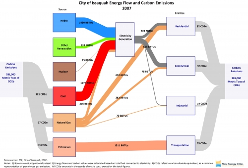
Issaquah is one of ‘New Energy Cities’ in the Northwest that has created an Energy Map and calculates the carbon emissions it is responsible for based on the fuels used. The role model for these Sankey diagrams are the ones published by the EIA.
Elizabeth, the author of the post, writes:
“Total carbon emissions are depicted in the gray flow lines, by both source and end use. The blue flow line represents hydropower energy used for electricity generation; the green represents non-hydropower renewable energy used for electricity generation; the brown represents nuclear energy used for electricity generation; and the red represents coal energy used for electricity generation. The orange flow lines represent natural gas used for electricity generation and direct heating. The pink flow line represents petroleum used for transportation. The dark gray flow lines represent electricity consumption by residential, commercial, and industrial user categories.”
Wow! I’ve seen those energy Sankey diagrams for the world, for nations and for federal states. But this one for Issaquah is definitely the one that covers the smallest geographical and administrative entity.
