Material Scarcity Visualized

This presentation from 2015 by Alicia Valero of the Spanish Research Centre for Energy Resources and Consumption (CIRCE, Zaragoza) is on critical materials, minerals scarcity, recycling and a “thermodynamic cradle-to-cradle approach”.

It features two Sankey-style diagrams depicting the mineral balance of the European Union (UE).

This first one is a Sankey diagram for the mineral balance without fossil fuels (‘Diagrama de Sankey para el balance mineral de la UE sin combustibles fósiles’).

Data is for the year 2011, Flows are shown in tons. Iron and limestone dominate the picture with 77% of the input. Limestone is produced (extracted) mainly within Europe, while iron is mostly imported.

The second Sankey diagram is a scarcity diagram (‘Diagrama de rareza para el balance mineral de la UE sin combustibles fósiles’) and takes into account thermodynamic exergy to obtain (mine) the minerals. Although it depicts aluminium, gold, ion, nickel and the likes, flows are shown in an en(x)ergy unit (Mtoe).

Iron and limestone which seemed to be the most important mass-wise only constitute some 10% of the input. Aluminium and potash seem to be much more difficult to produce. Rare earth elements (REE) are not included in this diagram.

The author points out that it is important to not only look at materials from a mass perspective. Looking at materials availability taking into account thermodynamic exergy paints a different picture of the real cost and scarcity.

For those interested, please check out the presentation (in Spanish) here.
Gold Market: Demand and Supply

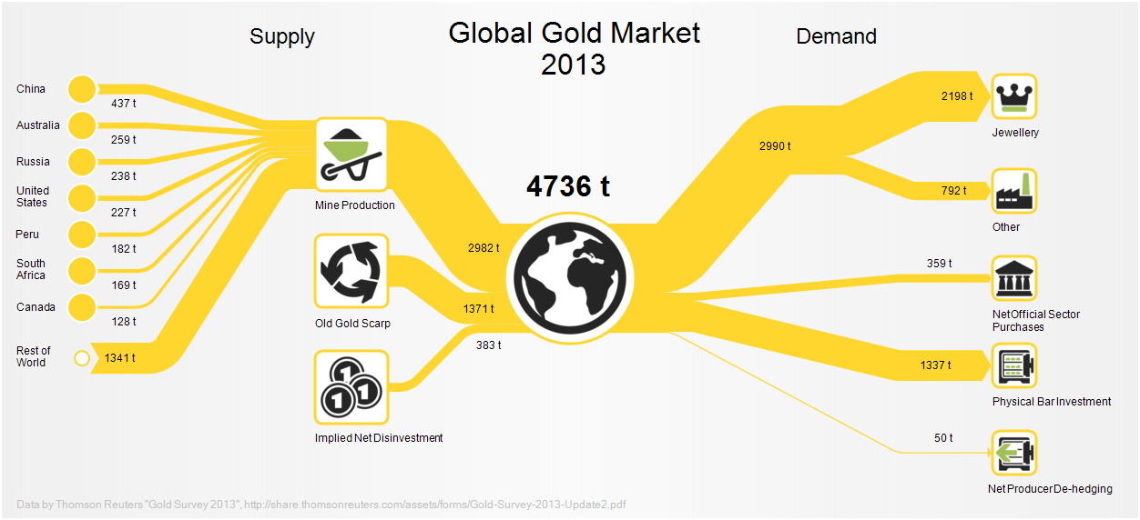
Taking it easy with a casual Friday post. This Sankey diagram shows the world wide gold supply and demand in 2013.

This is from a post in the e!Sankey forum and available as sample file in their new release.

Data is from the ‘Thomson Reuters Gold Survey’. 4,736 tons of gold were traded that year with roughly 3,000 tons production from gold mines. Largest demand was from jewelry makers (2,198 tons) followed by people who purchased gold bars (1,337 tons).

Recovering Energy of Train Braking

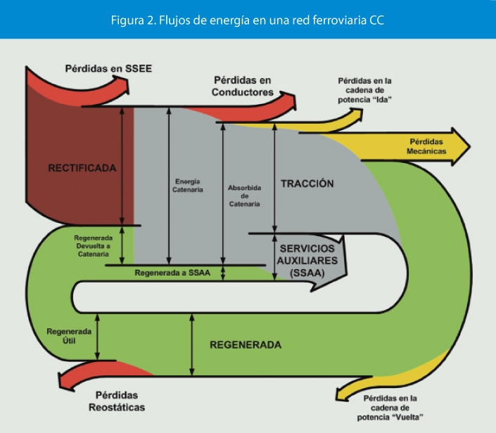
The article ‘Aprovechamiento de la energía procedente del frenado regenerativo en ferrocarriles metropolitanos’ by Álvaro López López published in the Spanish journal ‘Anales de Mecánica y Electricidad (May/June 2013)’, pp 12-18 has the following Sankey diagram.

No absolute numbers are given here. Still, we understand that from the motion energy during braking of the train a part (green flow) can be recovered and is being used for secondary systems (‘SSAA’) as well as being fed back into the overhead wire (‘cantenaria’).

Not sure though whether this Sankey diagram is a representation of the energy recovery during braking action only, or of the energy flows on a typical train ride.

P2G: better done at home or offshore?

Great find by a follower of this blog who send me a link to this report in German available on the website of the German EPA (‘Umweltbundesamt’). The title translates as ‘Climate protection and regeneratively generated chemical energy carriers – infrastructure and system adaptation for the supply of regenerative chemical fuels from domestic and foreign regenerative energies’.

The report contains Sankey diagrams on 40 pages (!) like the two shown below. All of them are structured the same way with a vertical layout: a certain amount of energy available at production site, losses branching out to the right, and useful energy available on site shown as the remaining arrow at the bottom (colored in green).

From the management summary in English we learn that “this project aims at gaining first insights into the potential of renewable chemical fuels from renewable energy sources both domestic and abroad as well as the associated transport requirements. (…) [P]otentials and transport infrastructure for using renewable energy to provide storable energy carriers were analysed, being followed by a systematic comparison of the import routes of renewable gases, namely hydrogen (eH2) and methane (eCH4)”.

The assumption is that there are countries (e.g. Norway) that may have wind energy in excess, and regions (e.g. Turkey, Spain) where there is abundant potential for solar energy (PV). This electricity could be used for methanisation (power-to-gas, P2G). Gas from renewable energy could be stored in the German gas grid. The Sankey diagrams then show power-to-gas transformation on site and transporting the gas through pipelines to Germany, compared to the scenario of transporting electricity on the grid (with the associated losses) and to produce methane in Germany.

‘Klimaschutz und regenerativ erzeugte chemische Energieträger – Infrastruktur und Systemanpassung zur Versorgung mit regenerativen chemischen Energieträgern aus in- und ausländischen regenerativen Energien’ by Stefan Schütz of DBI Gas- und Umwelttechnik, Leipzig and Philipp Härtel of Fraunhofer-Institut für Windenergie und Energiesystemtechnik, Kassel. Report published Aug 2016 by German EPA (Umweltbundesamt, UBA). Download full report PDF here.

Thanks Axel from Germany for pointing me to this.

Switzerland Energy Flows 2015

This Sankey diagram for energy flows in Switzerland 2015 is by Max Blatter of energie-atlas.ch.

Flows are in TJ. The diagram has a consistent color coding: electricity in light blue, oil and derivates in orange, natural gas and biogas in yellow.

Sectors where energy is used are shown at the bottom right with private housholds, industry, services, traffic and agriculture.

Interesting to see that Switzerland’s electricity exports and imports were about equal size in 2015 (blue arrows to/from the top).

A 2007 energy flow Sankey diagram for Switzerland was presented in this post.

RenewIT Project: Green Data Centres

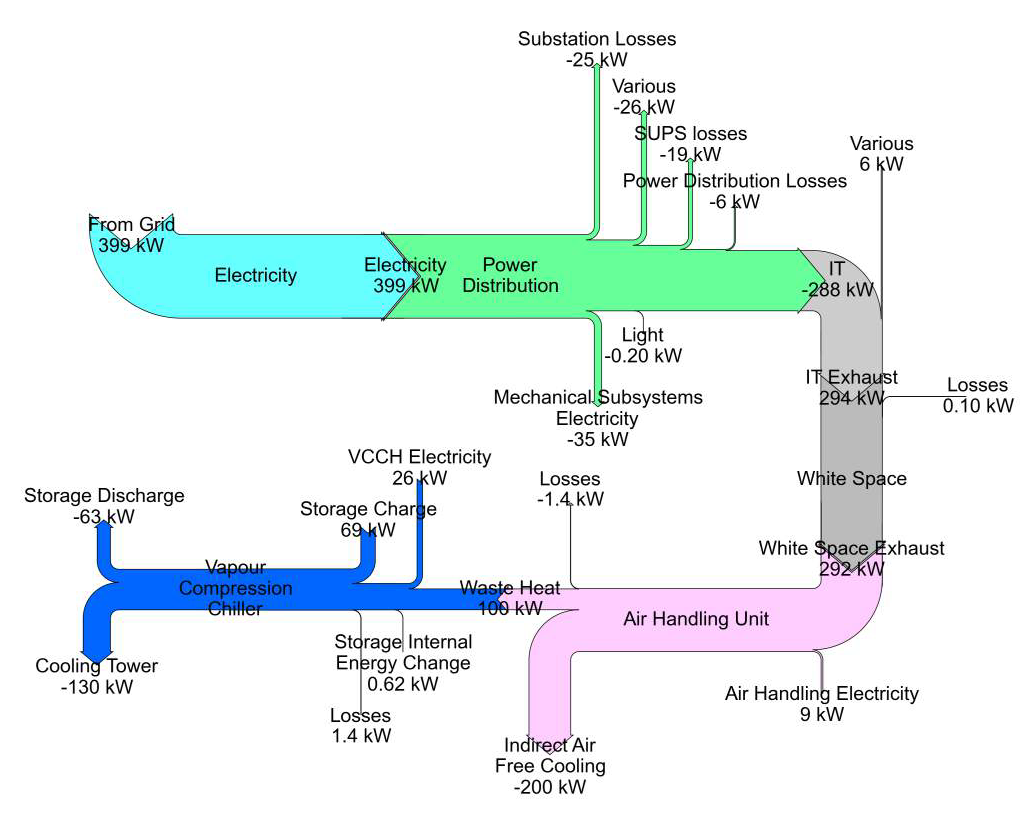
The European R&D project RenewIT studied energy concepts for renewable energy supply of data centres. The project partners from Spain, Italy, UK, Germany and The Netherlands looked at 18 different energy models.

In the final project report each of the concepts are described, accompanied by a Sankey diagram.

The above is figure 3.53 from p. 177 of the report showing the “Sankey chart for the distribution of average energy flows per year within different subsystems of concept 7 for scenario 3”.

Many more equally beautifully crafted Sankey diagrams can be found in the report, check chapter 3.5 Simulation Results of the publication Deliverable D4.5 Catalogue of advanced technical concepts for Net Zero Energy Data Centres. Authors: Nirendra Lal Shrestha, Noah Pflugradt, Thorsten Urbaneck (TUC); Angel Carrera (Aiguasol); Eduard Oró, Albert Garcia (IREC); Hans Trapman, Gilbert de Nijis, Joris van Dorp (DEERNS); Mario Macías (BSC) (get it here)

Zero Emission Coal System Sankey Diagram

From a July 2013 article titled ‘Energy and exergy analyses of a Zero emission coal system’ by Linbao Yan, Boshu He, Xiaohui Pei, and Chaojun Wang of Beijing Jiaotong University, available at Researchgate. This Sankey diagram is for “the exergy flow of the improved Z[ero] E[mission] C[oal] system at benchmark condition”.

Note: Image not available anymore

All flows are in kJ. The individual process steps if the system are only labeled with acronyms. They are explained in the article: GF is gasifier, CL is cleaner, RF is a reformer, and CH is a CO2 heater. The article also features the energy flow Sankey diagram.