Australian Metal Flows

The Australasian Institute of Mining and Metallurgy (AusIMM) is an association of the minerals industry. In this AusIMM Bulletin article titled ‘From Waste to Wealth’ they talk about metal recovery and recycling in Australia.

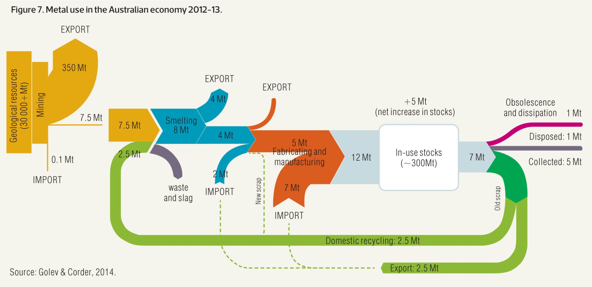
This Sankey diagram (actually two Sankey diagrams) from the article visualizes metal flows in Australia in 2012/2013 based on data from Golev & Corder (2014).

The smaller yellow diagram section on the left actually just shows mining activities in Australia and the fact that the largest portion of mining output (ores) are exported. Only 7.5 Mt are processed within Australia. This Sankey arrow is then blown up and corresponds to the yellow input stream into the second diagram [a similar solution to decouple diagrams with different scales was presented in yesterday’s post].

In the metal production process there are losses, and material is being exported and imported. The annual increase to the Australian ‘in use stocks’ (i.e. metals being used infrastructure, buildings and products) is 12 Mt, possible only thanks to 7 Mt metals imports. Some 7 Mt of metals are also released annually from ‘in use stocks’.

The dotted lines signal that there are possible routes, but either outside the scope of the Australian market or no reliable data is available (new scrap from the manufacturing step being fed back to the smelting).
Sankey Diagram of Sugar Production

An interesting Sankey diagram of sugar production can be found on p. 23 and p. 24 of the 2002 report ‘Möglichkeiten der Wertschöpfungssteigerung durch Abfallvermeidung (biogener Reststoffe) und Nebenproduktnutzung – Feasibilitystudy’ by Austrian researchers Herbert G. Böchzelt, Niv Graf, Robert W. Habel, Johann Lomsek, Susanne Wagner, Hans Schnitzer (all of Joanneum Research).

Why interesting? Because the diagram wouldn’t fit on one page in the report the authors decided to cut it in two parts. Two streams of the first diagram are continued in detail in the second Sankey diagram shown on the next page.


All flows are in mass percent based on an input of 100% sugar beets (‘Rübenschnitzel’, with -schnitzel apparently meaning ‘chips’). The output of 16 mass-% ‘Presschnitzel’ (pressed beet pulp) and 4.18 mass-% ‘Melasse’ (molasses) is further detailed in the second diagram.

Mind that arrow width is different in the two diagrams, so that they two can not be compared directly. Because water dominates the first diagram, the smaller mass flows of the second diagram would be barely visible, if the two were at the same scale.

Building Thermal Energy Model, Sankey Fail

A Swiss software company features a screenshot on their website, depicting a thermal energy model for a building. I’m not mentioning the source, because it is a bit embarassing…

Despite the general good impression of the diagram and the tech labelling of the arrows, the width of these arrows seems completely arbitrary. Well, to be fair … they don’t call it a Sankey diagram.

Europe Energy Flows 2013

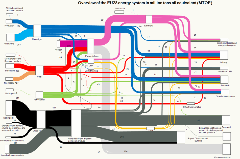
An updated Sankey diagram for the energy flows in Europe (EU-28 countries) is available on the website of the European Environment Agency (EEA).


Copyright holder: European Environment Agency (EEA).

I have reported previously about the energy picture with data for 2012. The Sankey diagram structure is almost identical, just the values have been updated to reflect 2013 data. Minimal changes only, compare for yourself…

World Petrochemical Balance, Sankey

The International Energy Agency (IEA) is a good source for reports on energy, both with a focus on global energy, but also breaking it down to the national level. I have featured their Sankey diagram website that allows to access national energy balances for many countries in this post back in 2013.

Browsing through their reports also sometimes reveals Sankey diagram gems. In their report on ‘Tracking Industrial Energy Efficiency and CO2 Emissions’, however, I found the diagrams on aluminium, steel, pulp/paper and petroleum not particularly sexy.

This is a schematic block diagram. Arrows are labeled with the quantity in Mt/year.

I decided to redo this as a Sankey diagram, maintaining the general structure of the original diagram. The width of the Sankey arrows immediately exhibit where most of the mass (crude oil) is…

I chose three colors: blue for the actual products from petrochemical industry, yellow for recycling streams and losses, purple for the precurors or feedstock (I actually thought I should do away with these, since the ‘hydrogen energy’ flow gave me some headache…). Also decided that the head of the arrow representing 115 Mt/year of post-consumer waste leading towards (!) net additions to stock in the original diagram is erroneous and thus turned the arrow around.

Didn’t spend much time on graphic aspects or fine tuning. I am sure this can be done quite nicely. But even like this I think a Sankey diagram is the better way to get the message across.

Yard Waste & Biowaste in Germany

What happens to yard waste and biowaste in Germany? This Sankey diagram from a 2014 PowerPoint presentation titled ‘Flächendeckender Ausbau der Biotonne in Deutschland’ by Peter Krause and Rüdiger Oetjen-Dehne (u.e.c. Berlin) shows how these flows were distributed.

In 2012 there were 14.5 mio. tonnes of yard waste andd 6.6 mi. tonnes of bio waste (kitchen/food waste) were disposed of in Germany. Much of it was collected and treated or – such as in the case of yard waste – composted (7.8 mio. tonnes).

In addition to the absolute quantities the labels along the Sankey arrows show the average per inhabitant (kg/E, a).

A large potential is still in bio waste (orange-coloured arrow) being disposed of in regular household waste (“Restabfall”). Calls for separate collection of bio waste for energy recovery are being made.

Iran Electricity Production, Consumption

Following up on my previous post on Iran’s Energy Balance, here is another Sankey diagram from p. 54 the latest edition of ‘Iran and World Energy Facts and Figures, 2012’ by the Ministry of Energy (MOE) of the Islamic Republic of Iran.

Unfortunately the overall national energy balance of Iran is not depicted in the 2012 edition of the report any more.

This Sankey diagram focuses on electric energy only. Flows are in GWh per year (in 2012). Fuel sources for electricity generation are broken down in thr first arrow. Losses branch out at the ‘pow plant’ node as a blue arrow. The generated electricity is further broken down in the vertical arrow into consuming sectors. The overall efficiency of the power plants is at approximately 34%. Note how the small arrow head peeking out to the left is not to scale, and understates the 63.6% transformation losses.

Nuclear energy is less than 1% of the overal electricity production. In 2011, the first year of production 327 GWh were produced from nuclear fuel, upping to 1847 GWh in 2012. See p. 50 of the report.

Iran Energy Flow 2009, Sankey Diagram

Stimulated by the media frenzy and the focus Iran gets in recent days (nuclear deal, lifting of sanctions, Iranian oil production and effects on the world market, U.S. navy boats in Iranian waters) I thought it would be wise to look at the country from my narrow Sankey diagram perspective.

Any Sankey diagrams from Iran on the web? Of course!

The Ministry of Energy (MOE) of the Islamic Republic of Iran has been publishing the Energy Balance of the country: here is the Sankey diagram for 2009. This is from p. 67 of the bilingual report ‘Iran and World Energy Facts and Figures, 2009’ available on their web page.

Flows are in Mboe (Millions of barrels of oil equivalent). Out of the total 2587 Mboe primary total energy source, the largest chunk is oil (1585 Mboe), followed by gas (866 Mboe). More than half of the petroleum is exported (blue arrow). Total final consumption is 1144 MBoe. Note that nuclear energy is not shown in this energy balance. Apparently electricity production from nuclear power plants started in 2011 only.

Flows are not always perfectly to scale in the lower range: comparatively thin arrows have been left at a minimum width it seems. At the branch-offs of some wider arrows (oil, petroleum products) the gap has been color-filled, which makes the arrow look wider than it should be. A funny hump of the mauve arrow bridging the refinery node…

I confess I admire the Perso-Arabic script.

I have two more Sankey diagrams from another Iranian report, but these are for another post … soon.