Extended LLNL Sankey diagram

Blog reader Johan Land submitted the Sankey diagram below. “As I am interested in the energy field I especially was fascinated by the LLNL graph over US energy consumption. I spent the weekend on further enhancing the LLNL graph using a trial version of e!Sankey (and data that I have gathered the last few years). I’m attaching the PNG-file for this graph. Feel free to share it if you like the graph!”


(click image to enlarge)

The typical LLNL graph has been extended by the red section on the left that shows a world energy breakdown. Only the U.S. energy consumption is traced further.
The second extension is the pink section. Here, Johan has broken down the energy use sectors ‘Residential’, ‘Commercial’, ‘Industrial’ and ‘Transportation’ in one or two further steps.

All flows are in TWh, data is from 2005 to 2009. The author used several additional data sources and recompiled the data, so that “figures may differ from Lawrence Livermore Laboratory estimations”. See notes for further information.

Good Sankey diagram, and definitely a great job Johan did here. The only suggestion I have, is to add percentage figures to the regional energy breakdown (red section on the left). Unfortunately, the watermark spoils the overall impression, but this is owed to the fact that he used a free trial version.

Johan also mentioned that he is working on forecasts up to 2050, and an animated GIF “running it over time since 1950 up until 2008”. Hope to be able to show you these here on the blog someday.
Sounds cool … looks uncool

I have been presenting “bad examples” of Sankey diagram before (like this one, or this one), and I have a few more in my collection.
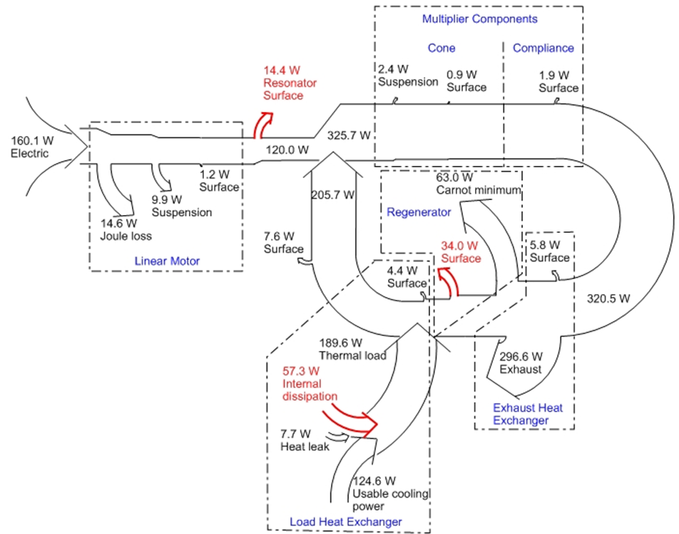
The following one from an PowerPoint presentation by someone from PennState. The topic of the presentation is actually quite interesting: thermoacoustic refrigeration – using sound waves for cooling. It describes the results of a research project.

Unfortunately, this Sankey diagram has some shortfalls, which qualify it as being a “bad example”. These are:

  • Sankey arrow widths are not always to scale (see for example the flow of 7.6 W in the middle labelled “surface”, which is definitely not half the width of the 14.6 W flow marked “Joule loss”)
  • Arrows branching out of the main flow are shown as short stubs, just as if the quantity is represented by the length (!) of the arrow, rather than its width. A completely new concept for Sankey diagrams. Have a look at the 0.9 W mini-stub “Surface” in the cone area, and at the 1.2 W stub “Surface” in the linear motor box.
  • The diagram uses dotted-dashed frames to mark sections in the diagram, at the same time it uses white arrows with a simple border line for the Sankey arrows. Either colored or grey areas, or colored Sankey arrows would have helped enormously.
  • Arrows branch off orthogonally, and to accomadate for the reduced quantity in the remaining flow, the border of the arrow on the opposite side curves in. This is not wrong as such, but rather uncommon, and can best be observed in the linear motor section at the left. Same phenomenon for arrows joining the main arrow. The arrow heads just overlap rather than actually joining the other arrow graphically. The receiveing arrow bulges out on the other side.
  • The section between the exhaust heat exchanger and the regenerator is awkward, and probably wrong. How can you branch off 296.6 W and 5.8 from a stream of 320.5 W, and are still able to have a flow of 63.0 W lead away from the remaining flow. I have not yet figured out what the problem is, but possibly the “Carnot minimum” flow was supposed to be drawn the other way round.

When I get to figure out the last issue I might draw this Sankey diagram myself, and post it here.

Excelling in Excel

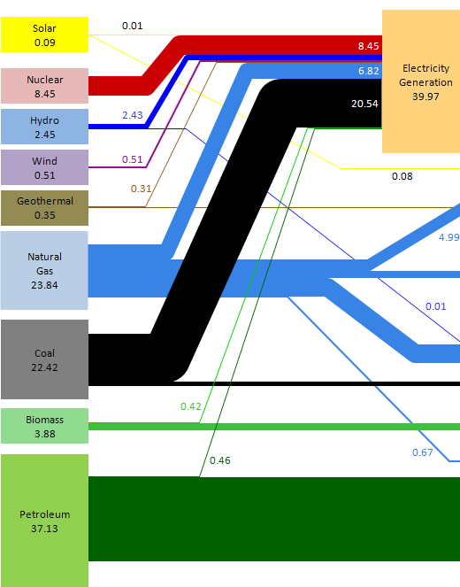
Does it take a hero like Daniel Ferry from the Excelhero blog to do a Sankey diagram in Excel? Well, you may not have to be a hero, but as Daniel puts it, this is “… seriously tedious work, as Excel has no native chart type to do what is required automatically.”

Daniel used the LLNL 2008 U.S. energy flow charts as model for his Sankey diagrams in Excel. Here is what he came up with (clipped section):

Actually the result is quite close to the original Sankey diagrams, with similar colours, arrow routing, and even the same fonts.

Daniel explains:

“I lightened the colors on the input boxes (had to do it), but otherwise I think my rendition is faithful to the original. I may have stayed too true to flow pipe proportionality. Some of them are so thin they do not print well. This should be addressed. While my pipes are seemingly lined up, they will not survive the chart being resized vertically without some small errors, either gaps in a pipe stack, or overlap.
(…)
An interesting project would be to create an Excel addin that would allow you to specify category box locations and have VBA do all of the grunt work in lining up the flow pipes, automatically creating the chart. (…) In it’s current form no VBA was used. “

So, if you wish to draw a Sankey diagram with the Microsoft Office package installed on your computer, and enjoy using VBA, you might want to give it a shot. Gabor Doka’s Sankey helper (an Excel macro) is another option. Dedicated Sankey diagram software tools are available. It would recommend one of those, if you need to produce more than one Sankey diagram, or wish to make updates to your diagram and layout adaptations more comfortably.

BTW, here is the story on the man behind the Sankey diagrams at LLNL.

Trefis: Sankey-Style Stock Price Modeling

I recently discovered Trefis and their Sankey-style diagrams as a visualization. Trefis models are used to determine the target stock price for companies, by looking at their product portfolios and playing around with the expected growth rates and market shares. Well, there is a whole model behind these interactive graphics, but the interesting part is that the share of the companies turnover is broken down by products, and is shown with proportional Sankey-like arrow magnitudes.

At the tip of the joint arrow head you can see the target share price, which is calculated as “the result of mathematically combining all of our forecasts for a company into a single number representing the per share value of the company.” When playing around with the parameters, this value will adapt accordingly.

Here are some examples:


Forbes, techCrunch and the New York Times all reported about what the latter calls “America’s Next Top Stock Model”, but none of the mentioned Sankey diagrams though.

Have fun playing around with the models … they have fancy Web2.0-silverlightish animations too. But don’t blame me if the share doesn’t reach the forecasted price 😉

Biochar Slow Pyrolyis Process

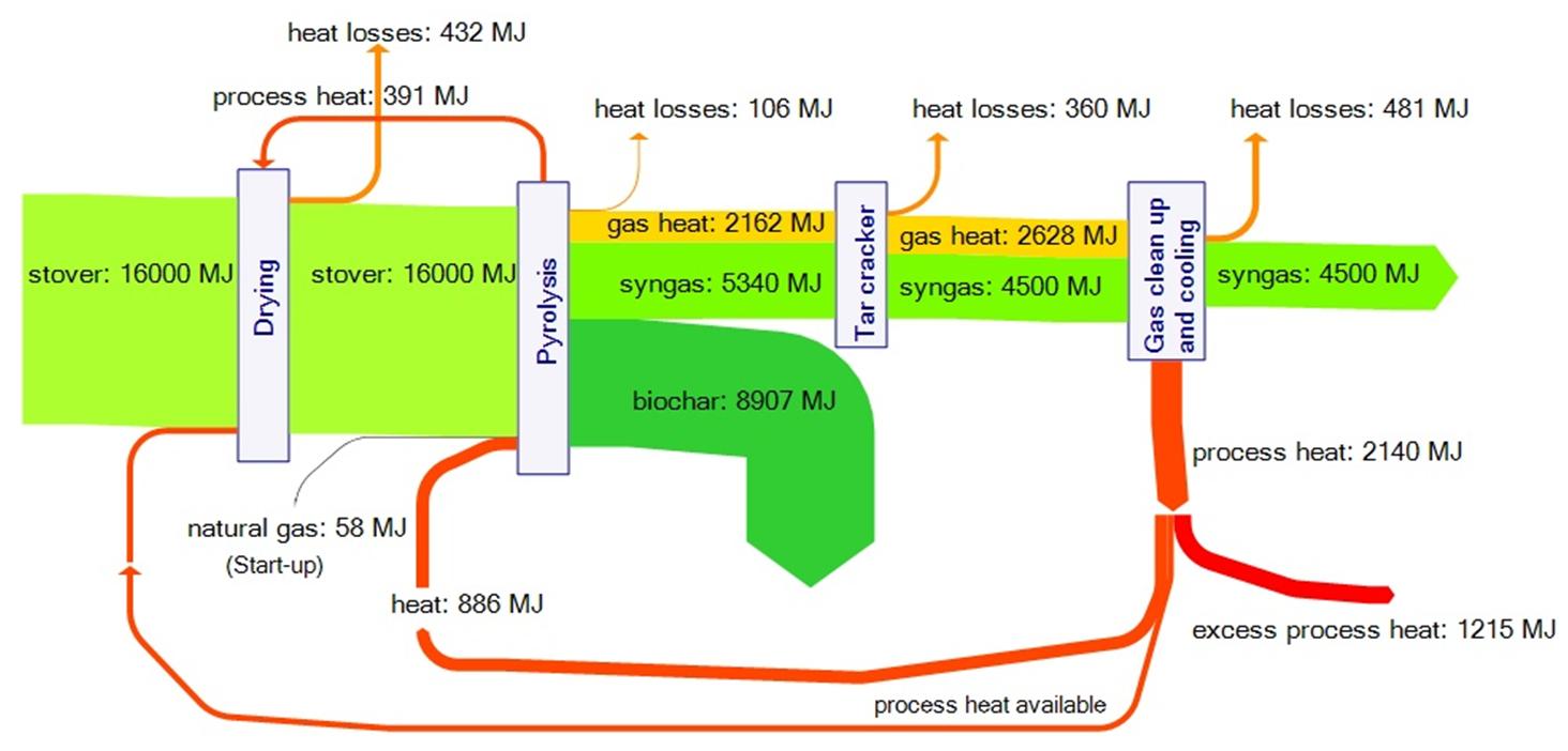
This one is from a presentation (download) by Roberts et.al. from Cornell University titled “Life cycle assessment of biochar production from corn stover, yard waste, and switchgrass” held in in Boulder, CO in August 2009.

I admit it is all new to me and I had to lookup stover and biochar on Wikipedia to understand what it is all about. So, apparently the slow pyrolysis process has several advantages: It works with waste biomass (waste management), it produces biochar that can improve soil, it produces energy (syngas) and it captures carbon.

The Sankey diagram in the presentation shows the energy flows: 16,000 MJ of energy is contained in a tonne of stover; more than a fourth of it can be approved of as syngas from the pyrolysis process. The main objective however seems to be carbon dioxide capture, and biochar presents a viable alternative to other (more energy intensive) carbon sequestration technologies.

The diagram has a slight downwardish slope and some of the arrows have superfluous bends. Heat flows and heat recovery are in orange, losses in yellow, the feedstock and syngas in green.

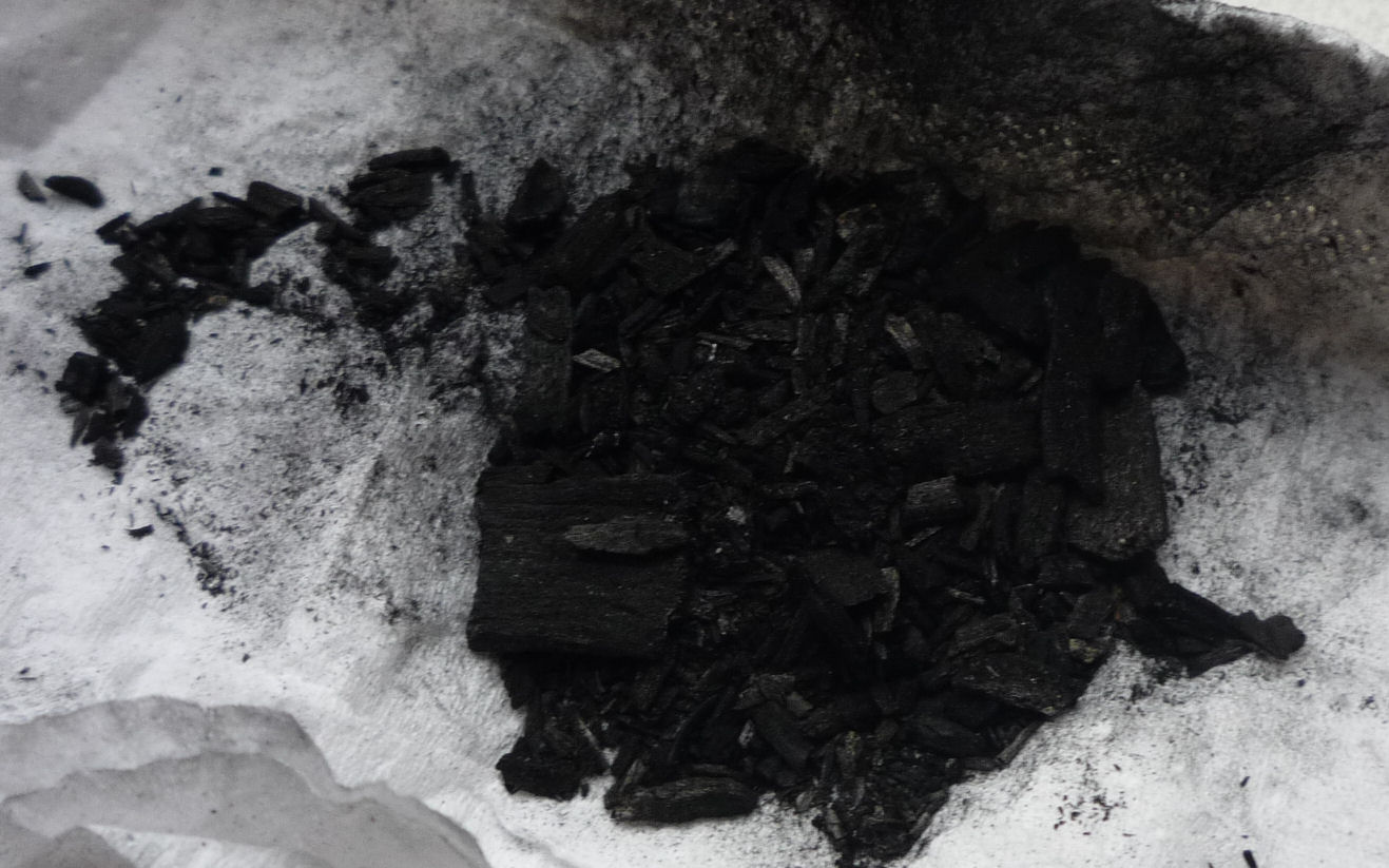
Edit: I received a sample of biochar from a friend. Looks like small pieces of coal indeed. After taking the photo I disposed of the biochar in one of the flower pots on my balcony…

A sample of biochar

Transport Sankey Diagram

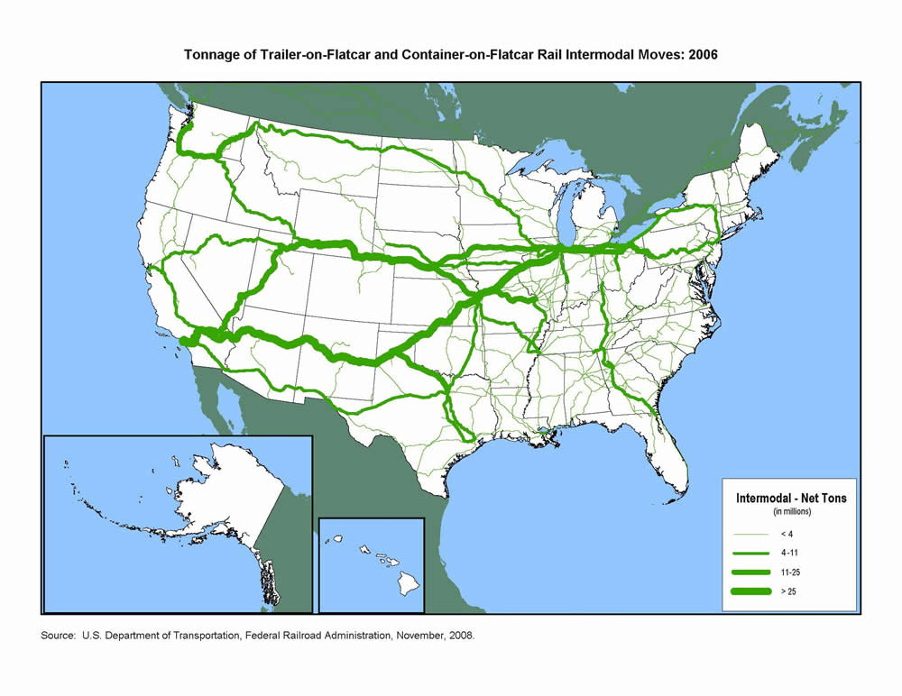
A reader of the blog pointed me to some Sankey diagrams available on the U.S. Department of Transport (DOT) Federal Highway Administration (FHWA) website. Sankey arrows are shown as a U.S. map overlay.


The first transport Sankey diagram shows the net tons of goods being transported on flatcars (either as trailer-on-flatcar, or container-on-flatcar) on the U.S. railway systems. The transport volume quantities are clustered into four groups shown with four different arrow widths. It is nice to see how in the eastern part you still have many railroad tracks, but with significantly less transport on them, while to the west coast you basically have 3 main lines, two of which carry more than 25 mio tons of freight per year.

The second one represents freight transport on railroad (bright red), inland waterways (blue) and national highways (dark red). Values also in million tons per year. I am not sure whether flows are to scale, or if transport quantities are also clustered into groups as in the first diagram. I can distinguish at least five different arrow magnitudes, even though only three sizes are given in the legend. A great transport Sankey diagram, as it shows that the East has most of the cargo, and has a much denser transport infrastructure. The reason why railroad transport on this second Sankey diagram differs so much from what is shown the first one, is probably due to the transport of bulk materials not shown in the intermodal transport quantity map.

Flows are not directional in both diagrams, so I assume that quantities for both directions have simply been added.

Can anybody confirm that the massive stream out of Wyoming by rail is coal?

SankeyTurtle

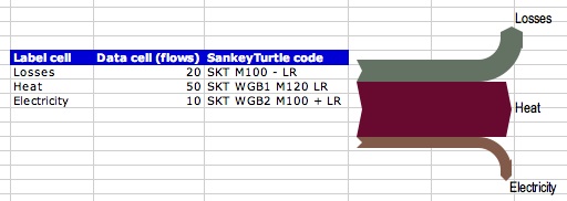
Gabor Doka, developer of SankeyHelper is currently working on SankeyTurtle, the implementation of a simple language for arrow routing in his Excel macro-based diagramming tool SankeyHelper. SankeyTurtle is currently being beta-tested.

The idea of SankeyTurtle code is to give each Sankey flux – each data cell – an accompagnying instruction how to draw the flux exactly in terms of path and geometry. The SankeyTurtle syntax is based on the vintage Logo TurtleGraphics drawing language, where you tell an imaginary turtle with a pen attached to it’s tail commands like “Move Forward” and “Turn Right 90°” and record the trail of the pen.

This will definitely an exciting improvement for all users of the SankeyHelper freeware … sorry, Sankeyware.

I’ll keep you posted about the progress and any official release.