Hydrogen Generation Path Sankey Diagram

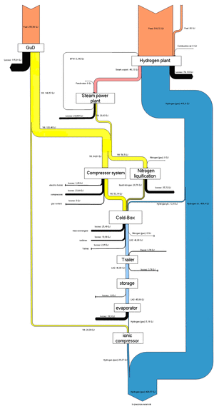
The below Sankey diagram is shown on a webpage of HAW University of Applied Sciences. It shows the generation path of hydrogen from natural gas, and the overall energy yield.

Unfortunately the diagram is too small to grasp the details. The Sankey arrows represent energy content. Losses are shown as black arrows. This seems to have been the result of a study project dealing with a fuel cell driven boat (ZEMSHIPS).

Infographics Experts on Sankey Diagrams (Part 2)

Following yesterday’s post with the translation of a blog post by Chiqui Esteban from infografistas.com here is the translation of the post “Caudales, erogación… ¿flujo?” of April 5, 2009. Again, I left some words in Spanish in square brackets.

— translation start —

Volume flow, distribution… flux?

A new chapter in the discussion [polémica] about the ‘scientific’ name of the “little arms” graphics [‘gráficos de bracitos’].

Xocas came up with the name ‘volume flow’ diagrams [‘gráficos de caudales’] and my vote was for ‘distribution diagram’. Other suggestions were thrown in: Xoán G. made reference to Minard and his ‘capacity diagram’ [‘gráfico de aforo’]. Herminio J. Fernández voted for cosmography diagrams [‘cosmografías’] as refered to by Stovall [Infographics by James Glenn Stovall, Allyn&Bacon, Massachussetts, 1997]. Many others voted for ‘flow diagrams’ [‘gráficos de flujo’], although Xocas discarded this suggestion because “the term flow diagram normally refers to a very specific type of visualization of process [flows]. It could be used as a generic term, but has interference with another model”.

Now, there is a new player in our conversation. It is Mario Tascón, who also believes that the correct denomination is ‘flow diagrams’. His justification:
“According to Harris (Information Graphics) and Bruce Robertson (How to make Charts and Diagrams) these graphics are called flow diagrams, and are of the type in the same category which are used as decision diagrams in informatics [computer science]. The latter are more in fashion now [Por motivos de modas], but the former have always [sic!] existed (a historic example is the one of Napoleons troops)”.

Suggestions are welcome in the comments.

— translation end —

I hope I got it more or less correct. It is not easy to find the right translation for the sometimes subtle differences between the terms. For those of you who can read Spanish, please check out the original post and the full discussion thread on Xocas’ blog.

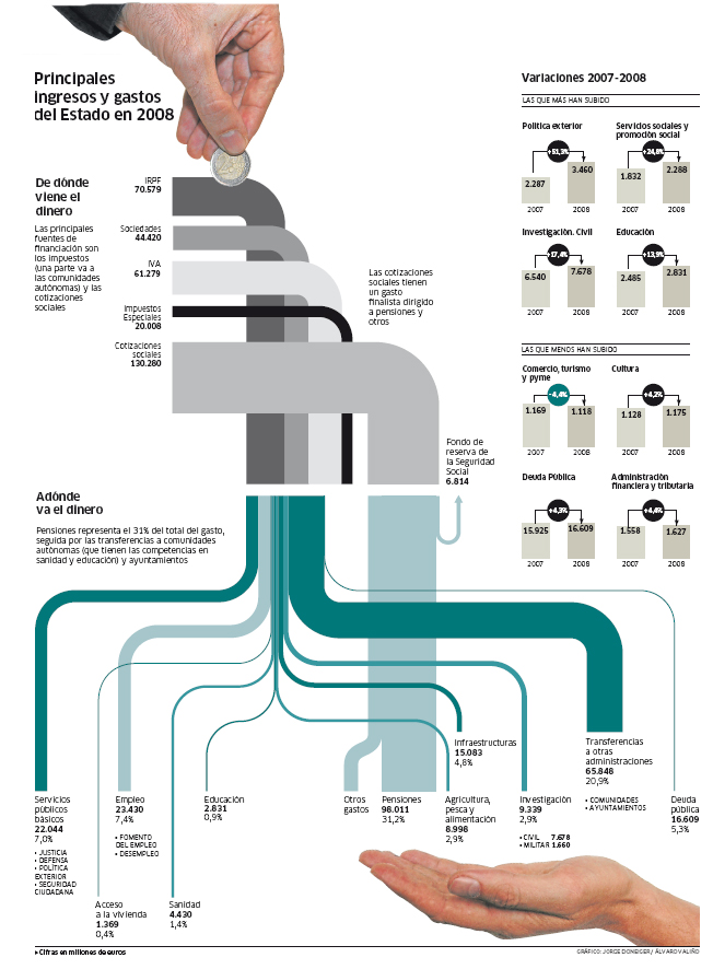
The post is decorated with this beautiful Sankey diagram.

It shows the main earnings and spendings of Spain in 2008 and was produced by Jorge Doneiger and Álvaro Valiño for the daily newspaper Publico in 2007. Values are in million Euros. Flows are not always to scale as for as I can see: the ‘impuestos especiales’ in dark black and the ‘deuda pública’ (at the bottom on the right side) are examples.

The top part shows the sources of funding, the bottom part the beneficiary sectors. The fact that the stacked width in the middle is wider than that of the funds distributed suggests that the Spanish state is actually piling up its money, but probably this has to do either with the list of recipients not being complete, or with earnings received in 2008 but not distributed in the same year.

The hand with the coin supports Chiqui Esteban’s vote for naming it a ‘distribution diagram’. Toss a coin in the coffee dispenser and wait for your coffee to be poured… errh, did we have ‘dispenser diagram’ already? 😉

I save the ‘best of comments’ and my reasoning why I still call them Sankey diagrams for another time…

Note (Aug 19): A case of DYRF, do your research first! I just detected that Chiqui himself has an English version of his article here. So, now you got the choice between two versions!
Infographics Experts on Sankey Diagrams (Part 1)

Chiqui Esteban who runs the Spanish blog infografistas.com had two posts back in March/April about a discussion he had with his colleague Xocas on how to name Sankey diagrams. Or, to be more precise: how a certain type of diagram that is more and more used in infographics should be named correctly.

They are absolutely funny, so I am trying to give you a translation of these two blog posts. This is part 1 for a post from March 17 titled “Gráficos de erogación”. I left some words in Spanish and my comments in square brackets.

— translation start —

Distribution Graphics

A couple of months ago, Xocas and I discussed via GTalk what the name, or what should be the name of the diagrams with the little arms [‘gráficos de bracitos’]. As it turned out, the winner name was volume flow graphics [‘gráfico de caudales’].

Today, we decided to withdraw our proposal and we are going to call them ‘distribution graphics’ instead [‘gráficos de erogación’].

This is because of the coffee. The coffee machine of my new employer www.lainformacion.com (click the link, we are already up running), shows the message ‘distributing’ [‘erogando’] while you wait for your cup to be filled. Looking in the RAE [note: Real Academia Española], the verb ‘erogar’ is defined as:

(Del lat. erogāre).

1. tr. Distribuir, repartir bienes o caudales. [distribute, share the goods or funds]
2. tr. Méx. y Ven. Gastar el dinero. [México and Venezuela: spend money]

This definition is spot on. So we shouldn’t continue to call them ‘little arms’ [‘de bracitos’], ‘tubing’ [‘de tubería’], ‘squid’ [‘de pulpo’], ‘tree-roots’ [‘raíces’] or whatever diagrams any more. But don’t say that we didn’t work hard in finding the correct nomenclature. As we have to do. So Tufte will… [‘A Tuftear’].

— translation end —

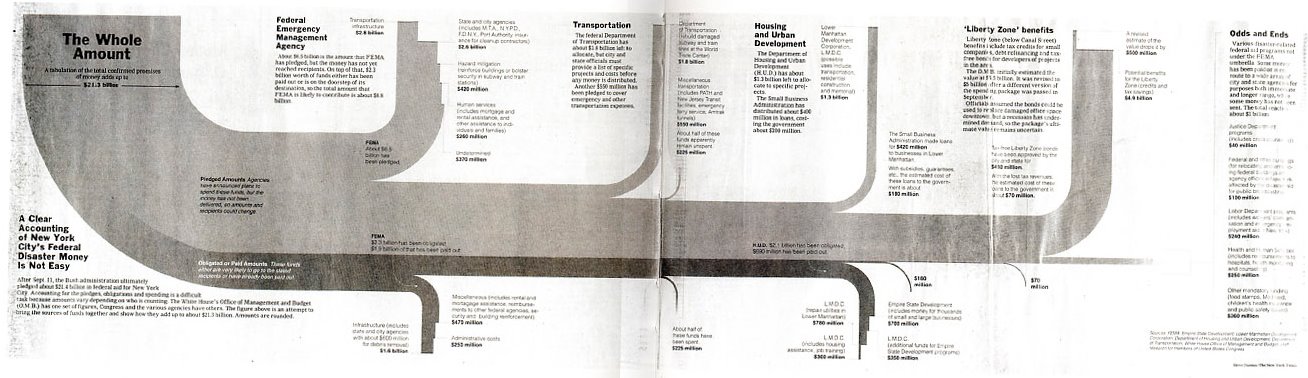
The accompanying Sankey diagram apparently is from the New York Times and shows how 21.4 billion $ in federal aid for NYC after 9/11 were distributed (hey! there you are, a ‘distribution diagram’ 😉 ). Funny enough, the caption says: “The figure above is an attempt to bring sources of funds together and show how they add up (sic!) to $ 21.3 billion”.

So what is distribution for one, is “adding up” from another perspective.

Part 2, the translation of “Caudales, erogación… ¿flujo?” and a summary of the comments to follow.

Note (Aug 19): A case of DYRF, do your research first! I just detected that Chiqui himself has an English version of his article here. So, now you got the choice between two versions!
Sankey Diagram for Artifically Closed System

I really had doubts, whether I should present the following Sankey diagram I found on John Locke’s Gracefulspoon blog [aesthetic photos there, have a look!]. Finally decided to feature it, because I want to show the whole spectrum of application fields for Sankey diagrams, and I am trying to put my focus more on the graphical aspects of the diagram rather than the explicit content of the diagrams.

The Sankey diagram featured in this post is for “life support in an artifically closed system” or in other words, a prison cell. John explains:

“a sustainable prison cell unit for future Beijing. Because of their high population density, prisons are actually prime contenders for tests of renewable energy methods, such as waste to energy, and water recycling features. … each prisoner generates energy for their own confinement, but also send excess energy back to a central grid, acting like capacitors.”

The Sankey diagram has four interconnected “cycles”, each with their individual units: the energy flows (kWh), the water cycle (Litres), the waste cycle (kg), and food flows (lbs). The four subsystems thus must be interpreted relative to each other and not with their absoulute values. The main input that “feeds” the system is solar energy, the main output is recovered energy. Apart from a freshwater input flow and some comparatively small waste output flows (branching out vertically), the system seems fully closed. It is of course an idealistic assumption that prisoners can be fed solely on genetically modified micro-algae…

If you look at the Locke’s ‘Global Panopticon’ study project “conceived more as a sci-fi narrative”, let’s just hope that such ideas never turn reality.

Sankey Diagram for Regasifier Plant

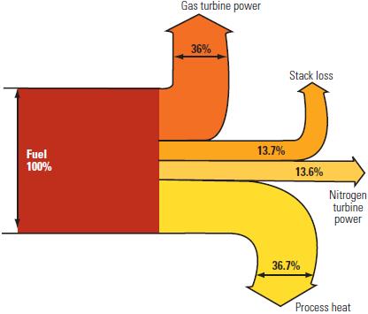
This post on the Power Industry News blog features a Sankey diagram “for a dual Brayton cycle regasifier plant [that] shows how the fuel is consumed”. The article describes possibilities of improving the energy efficiency of the liquefied natural gas (LNG) reevaporation process.

I quite liked the Sankey diagram for its simplicity, being to scale and color coding. The fact that the arrows for “process heat” and “stack loss” branch out in a slightly curvy way larger than 90° is uncommon, but hey, it gives the whole thing a special touch.

Sankey Diagram in Visual Reports

I was very delighted to see a blog post on visual reports on Arup’s fieldofactivity.com blog with an embedded video that has Sankey diagrams.

Arup Australasia’s Digital Innovation Team is working on interactive reporting technologies. They say that “… not everyone reads technical reports, so this is the beginning of what’s next – visual reports.”

Check out the video, it is interesting, and watch out for the Sankey diagram seconds 0:15 to 0:21

What we see is a Sankey diagram unfolding in an animated sequence. One step further would be animated Sankey diagrams, like the research project I posted about that came up with a Java/Quicktime animation on energy flows, and this Sankey animatedGIF on CO2 and energy from 1990 to 2015.

Any other animated Sankey diagrams out there…?…

Gold Flows in United States

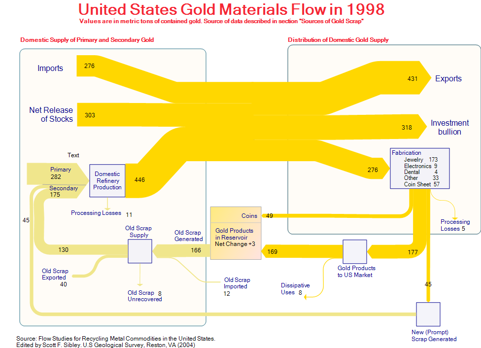
This Sankey diagram was posted as a sample on the e!Sankey Forum. It shows the gold flows in the United States in 1998. The original data is from ‘Flow Studies for Recycling Metal Commodities in the United States’ (edited by Scott F. Sibley. U.S Geological Survey, Reston, VA (2004)). Values are in metric tons of contained gold.

The left part of the diagram shows domestic supply of primary and secondary gold, as well as imports to the U.S., the right part distribution and use of gold. The U.S. is a net gold exporter. 318 metric tons gold bullion went to Fort Knox (presumably) that year. 276 metric tons were fabricated into products, mainly jewelry. At the same time 175 metric tons of new and old gold scrap were recycled. Along with the 282 metric tons out of primary production they are fed back into the production cycle.

The diagram has gold/light brown colored Sankey arrows that go along well with the topic. A text label has been forgotten in the left part.

Energy Loss Simulation for Students

Heading off for the week-end, but wanted to share a fun game for students I recently discovered on the website of Nelson Thornes, educational publisher from the U.K.

This Flash simulation teaches students “how we lose energy to the environment” and “what is the effect of maintaining a constant body temperature”.

Go ahead and try it: You have to choose whether you are a herbivore or a carnivore, whether you are cold-blooded or hot-blooded, and your activity level.
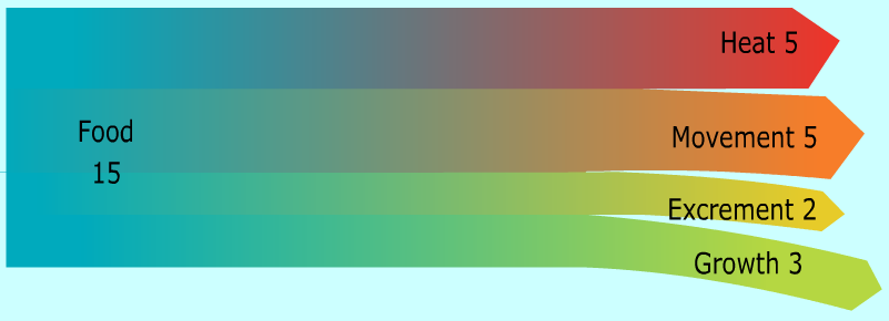
Here is the image that was created for me (couldn’t choose mixed diet though, so opted for meat).

When you’re done, just click on the button labeled “Sankey” and you will get a Sankey diagram that shows how the energy from your food is used for movement, growth, body off-heat and …. well, see for yourself!

A great idea, and a good idea to teach students about energy transformation and loss, and to get them acquainted to Sankey diagrams as alternative to pie charts.

(Images reproduced with permission of Nelson Thornes from http://www.nelsonthornes.com)