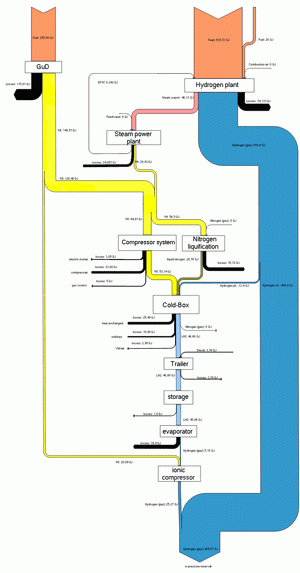
The below Sankey diagram is shown on a webpage of HAW University of Applied Sciences. It shows the generation path of hydrogen from natural gas, and the overall energy yield.
Unfortunately the diagram is too small to grasp the details. The Sankey arrows represent energy content. Losses are shown as black arrows. This seems to have been the result of a study project dealing with a fuel cell driven boat (ZEMSHIPS).
