Tag: Argentina

Misc Sankey Diagrams Uncommented 20

Uuh-uh, already Friday afternoon… Here is another quick, almost uncommented Sankey diagram, just to not leave you without one for the weekend.

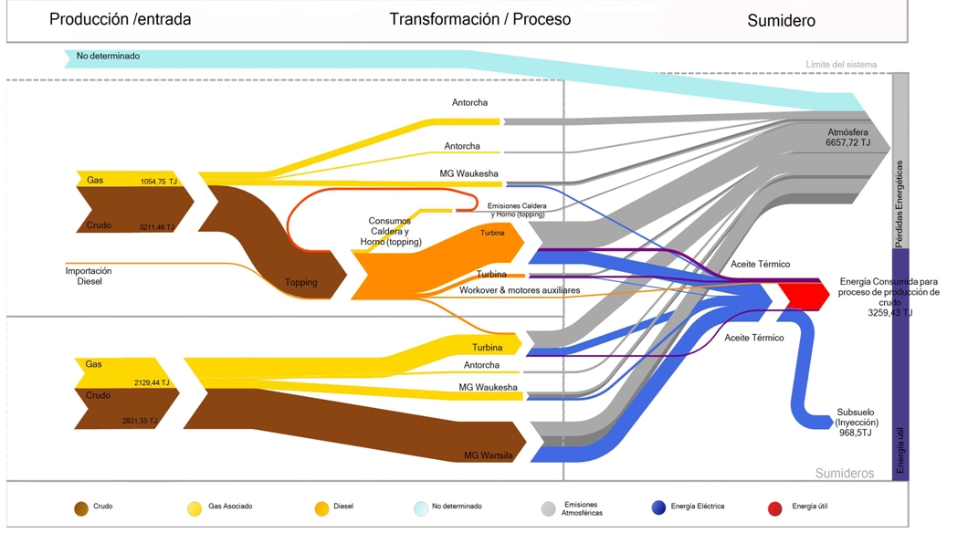
Argentinian environmental consultancy and engineering firm Neoambiental uses this Sankey diagram on its website (go to section 4) to market their professional experience in energy efficiency studies.


Flows are in TJ. Feedstock is crude (brown arrows) and associated gas (yellow). Grey flows are losses or unused energy, while red represents the actual used energy.

LatAm BEN – Argentina

Recently I have been reading about energy policies in Latin American countries. Quito-based OLADE, the inter-governmental Organización Latinoamericana de Energía plays a key role in coordination and cooperation between countries in regard to energy.

OLADE has also established the SIER (Sistema de Información Energética Regional), and one of their products is SieLAC (Sistema de Información Energética de Latinoamérica Latina y el Caribe) where energy data for 27 countries can be accessed.

For all countries the national energy balance (Balance Energético Nacional, BEN) can be produced as Sankey diagrams for the years 2005 through to 2010. Further, these energy flows can also be shown for regions, such as the Caribbean, the Andean countries or the “Southern Cone”.

Here is the one for Argentina in 2010.

To try for yourself, just go to the sieLAC page and click on ‘Balance Energético Resumido’. Then select country, year and the unit.
Unfortunately, data for more recent years is not available at this time.

This work of OLADE has inspired me to start a loose mini-series of posts titled ‘LatAm BEN’ where I will be showing Sankey diagrams representing national energy balances from the region. Don’t worry, they will not all be from SieLAC, and will show how differently BENs can look like.
Swimlane diagram for political parties

Stumbled across a number of swimlane diagrams developed by Andy Tow in 2012.

As he describes on his blog these were created during a “Hackathon de Visualizaciones” in Buenos Aires. Andy used ‘Sankey by tamc’ (see Sankey software list) to create several diagrams like these.

This one is for the Santa Cruz province and covers elections 1983 through 2011. More images like these for the Chaco, San Juan and Jujuy provinces are available. These are sample screenshots from the ‘Electoral Atlas’ (see below).

Each node represents elections, with the height of the block representing the percentage of votes/seats received. The “leading” party is always at the top. So the bands between two blocks are basically electoral behaviour and (may) visualize political shifts. When two bands join, there seems to be a coalition.

In this special type of Sankey diagram the nodes are of greater importance. The bands represent quantities, however there is a temporal rather than directional aspect to the flows.

This is similar to the Political Parties in Slowakia diagram and to these.

Check the interactive version of the ‘Electoral Atlas’ by Andy Tow, where you can hover the mouse over the diagram to highlight details.