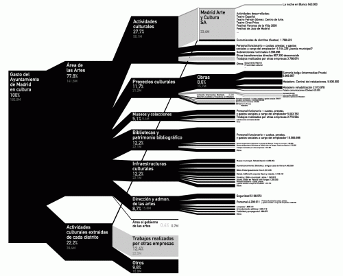
kulturometer.org presented a fantastic diagram that shows the municipality of Madrid’s spendings in cultural activities in 2009. By compiling data from numerous tables, tender calls, and administrative bulletins, they managed to stunningly visualize what one commenter called an ‘information overload’ (‘apagón informativo’). Click on the diagram to enlarge.
This is a breakdown diagram, or ‘diagrama de brazos’, that shows the distribution of the overall cultural budget (182 Mio Euros in 2009) by sectors, sub-sectors, and even into individual types of activities or projects.
It somewhat reminds me of Nicholas Rapp’s AIG bailout diagram, even though less colorful…
Each branch of the diagram is labeled with the relative weight in percent, as well as the absolute value in millions of Euros. The color scale indicates the reliability of the data, either non detailed estimate (light grey), published estimate (grey), or published budgeted data (black).
– Here is the full diagram in large scale (PDF) with an additional breakdown of one particular section (Medialab) at another scale and full legend and annotations
– Watch a slide show to learn more about the diagram (starting p 19)
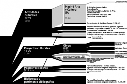
– And finally, a blowup detail of a diagram section:

