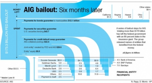
Nathan at FlowingData – Strength in Numbers presented a Sankey diagram by AP’s Nicolas Rapp and Damiko Morris (originally from this post on Nicolas’ blog). It shows where the $173 billion AIG received from government went to.
I especially like the inverse waterfall arrow endings and how they intersect with the grid of beneficiaries.
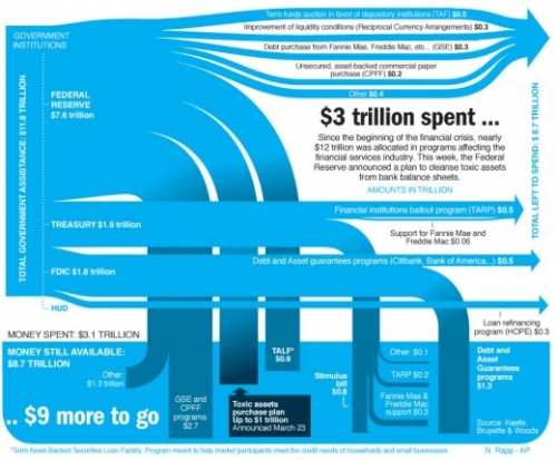
Nicolas, who works in Information Graphics for Associated Press, later presented another Sankey diagramm, displaying how the “nearly $12 trillion that was allocated in programs affecting the financial services industry” were used.
The author says “I spent the day researching and realizing this graphic” (@Nick: how much time was the research, how much the drawing?)
He adds “Fun stuff”, a comment which probably refers to the Sankey graphics part rather than to the content depicted… 🙁


2 Comments
Hi there Phineas,
Actually the research was not so bad, and I had even way more details than displayed here. The complicated thing was to decide what to group together, recalculate, and come up with explanation of each branch that will be more clear to people, rather than acronyms.
Fun stuff, as you suspected, referred to the happiness of the artist (myself) when he found the right way of displaying all these figures. But stay tuned, there will be more to come, probably this week. Same subject, same style.
Comments are closed.