Tag: distribution

Sankey Charts in Tableau

Found an interesting blog post over at TabVizExplorer, a casual blog maintained by Mithun Desai. Data visualization is one focus of his work.

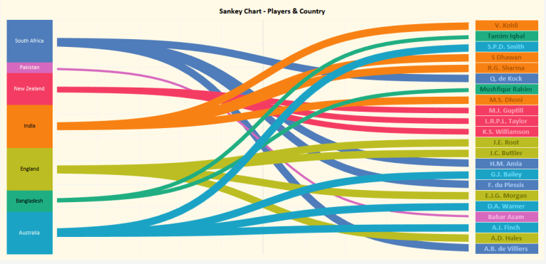
He uses Tableau to draw Sankey charts (I prefer to call them relationship diagrams, alluvial diagrams or even Spaghetti diagrams). Here is a rather simple one, showing the relation between top 20 cricket players and their country of origin.


The diagram has two data categories. The country of origin shown in the left stacked column in no particular order, and the top 20 players ordered according to their ICC ranking score.
In between are the streams or bands (or ‘Spaghettis’ for the sake of it) color coded by country of origin.

Now, it is not up to me criticizing the choice of diagram type for conveying this specific information. The author seems to have chosen the cricket topic just as a sample, to explain how to do Sankey charts in Tableau in general. Actually the colored list of top 20 (right column) already tells us all we need to know and you wouldn’t even need the left column and the streams.

The main reason I am not happy with this diagram is the fact that it does not stick to the most important characteristic of a Sankey diagram. The post itself comes with the definition: “Sankey diagrams are specific type of flow diagram in which the width of the arrows is shown proportionally to the flow quantity.”

So, what is the flow quantity here? I was thinking of net worth in $$$ of each player, or at least a translation of the ranking score to the width of the bands. But then Babar Azam, who ranked 4th with a score of 846 wouldn’t be shown with a band narrower than the one of E.J.G.Morgan coming in 20th with a score of 650. My guess is, that the the widths of the streams are chosen deliberately…

Where the bands merge, they overlap rather than merge to show the sum of the flow quantities. This makes for a very odd visual effect, at least in terms of Sankey diagrams.

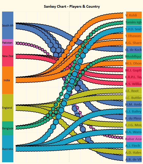
The blog article gives away some of the math behind the curves, so called Sigmoid curves, which is interesting.


This capture taken from the embedded Tableau graph shows how the curves are made up and how the width is maintained along the routing of each curve: You do it with cricket balls 😉 … or christmas bulbs.

Other implementations of relationship diagrams use Beziers curves (which sometimes come with another downside, read here). But that’s for another time…
Careers in Science, Diagram Remake

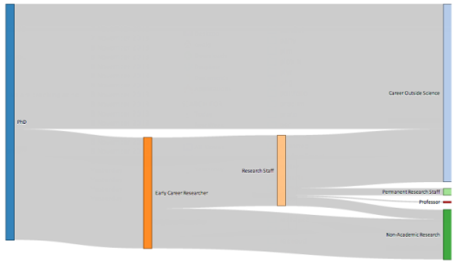
Merian who runs the Boreal Perspectives blog posts on a Sankey diagram that visualizes academic career paths.

This was originally shown in a 2010 Royal Society policy report entitled “The Scientific Century: securing our future prosperity”. Merian raises concerns about the quality of the diagram. She goes: “So what’s so bad about the chart? Some obvious issues:

  • It is unclear what goes in on the left and to a lesser degree what is covered by the end points. The report indicates in a footnote that the term “science” is used “as shorthand for disciplines in the natural sciences, technology, engineering and mathematics,” but the three documents used for input categorise the fields in different ways, and there is no indication which fields exactly would have been selected.
  • Line thickness is not proportional to percentage weight. The 26.5% and 30% streams have the same thickness, and the 17% stream is much less than half the thickness of either. The 3.5% stream is more than half the thickness of the 17% stream.
  • Why does “Permanent Research Staff” not end in an arrow? And why does the arrow from “Permanent Research Staff” to “Careers Outside Science” bend backwards (to suggest it is a step back in one’s career, that is, an implicit value judgement?) and then not even merge with the output stream?
  • Does it really mean to suggest that no one goes from “Early Career Research” (that is, a post-doc) to “Career Outside Science” (or to industry research)? In my experience, watching post-docs, that is quite a common choice for post-docs precisely because non-academic jobs may be offering better pay and conditions, or because they don’t have a choice at that stage.”

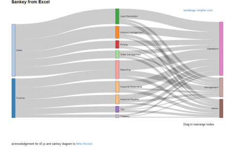
She then presents a remake of the above diagram made using the Sankey plugin for d3.js

Indeed, the distribution diagram without the arrow heads seems to be better suited. The overall appearance is much more calm.

Merian, however, concludes “no graph would have been more useful”.

Distribution Diagram from Excel Data

Bruce from http://ramblings.mcpher.com writes about “how to free your Excel data from your desktop and take advantage of web capabilities such as Docs, Maps, Earth, Gadgets, Visualizations and a whole bunch of other services”. His last contribution is on Sankey Diagrams from Excel, for which he uses d3.js and some work previously done by Mike Bostock.

While I don’t fully agree with Bruce’s definition of Sankey diagrams (“What are Sankey Diagrams? They are designed to show the movement in a network over time.”), this sure is good stuff and great work. You can download the VBA code from his page directly.

Distribution Diagrams (aka ‘Spaghetti Diagrams’) can be created directly from Excel. The interactive version (follow link above image on this page) allows to rearrange the nodes within the same column, and individual bands are highlighted on mouse over.

Why don’t these fully qualify as Sankey diagrams, in my opinion? Why would I rather call them distribution diagrams? It is exactly the fact that these are not directed flows, but rather quantities that are distributed over categories (or dimensions). There is no time relation in them, neither are there flows “from” (e.g. Finance) “to” (e.g. Reporting) or the other way round. These are bands hooked between nodes rather than arrows leading from one node to another. Each category could be represented by a pie chart as well … which would be more boring, of course. No unit given for the value of the flow (I guess it could be US$), but this is not even necessary, as the sum of the bands add up to 100% (like in a pie chart). For those of you interested, I recommend to read on the Parsets page.

Have added Excel to Sankey (based on d3.js) to the software list.