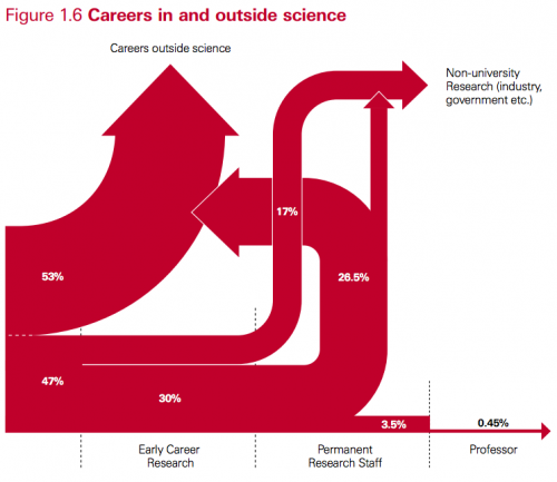
Merian who runs the Boreal Perspectives blog posts on a Sankey diagram that visualizes academic career paths.
This was originally shown in a 2010 Royal Society policy report entitled “The Scientific Century: securing our future prosperity”. Merian raises concerns about the quality of the diagram. She goes: “So what’s so bad about the chart? Some obvious issues:
- It is unclear what goes in on the left and to a lesser degree what is covered by the end points. The report indicates in a footnote that the term “science” is used “as shorthand for disciplines in the natural sciences, technology, engineering and mathematics,” but the three documents used for input categorise the fields in different ways, and there is no indication which fields exactly would have been selected.
- Line thickness is not proportional to percentage weight. The 26.5% and 30% streams have the same thickness, and the 17% stream is much less than half the thickness of either. The 3.5% stream is more than half the thickness of the 17% stream.
- Why does “Permanent Research Staff” not end in an arrow? And why does the arrow from “Permanent Research Staff” to “Careers Outside Science” bend backwards (to suggest it is a step back in one’s career, that is, an implicit value judgement?) and then not even merge with the output stream?
- Does it really mean to suggest that no one goes from “Early Career Research” (that is, a post-doc) to “Career Outside Science” (or to industry research)? In my experience, watching post-docs, that is quite a common choice for post-docs precisely because non-academic jobs may be offering better pay and conditions, or because they don’t have a choice at that stage.”
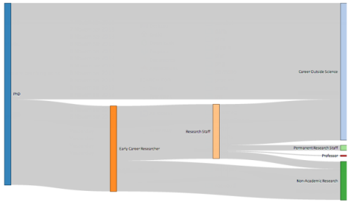
She then presents a remake of the above diagram made using the Sankey plugin for d3.js
Indeed, the distribution diagram without the arrow heads seems to be better suited. The overall appearance is much more calm.
Merian, however, concludes “no graph would have been more useful”.

