Tag: efficiency

Misc Sankey Diagrams Uncommented 01

I was busy with work, so hardly published any Sankey diagram related posts in the last two weeks. My cache of diagrams on my hard disk is very large, but the problem is to find time to discuss them and show them here. I have therefore decided to launch some miscellaneous Sankey diagram findings without much commenting…

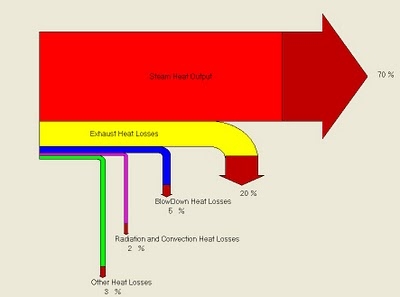
Notes: Boiler Efficiency Sankey Diagram. Uncommon arrow head colouring. Percentage breakdown. Source: Energy Efficiency Analysis and Practices Blog. This Sankey is apparently produced by a software on boiler efficiency (BIOEFF v1.07), further analysis needed.

Data Center Electrical Efficiency Sankey

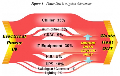
The 2007/2008 White Paper #154 Rev 1 published by APC explains “Electrical Efficiency Measurements for Data Centers”. The author points out that DCIE (Data Center Infrastructure Efficiency), defined as ‘IT Load Power’ divided by ‘Total Data Center Input Power’ is a good metric to analyse data center efficiency.

In fact, as can be seen from the Sankey diagram shown in the paper, the majority of electrical energy consumed in a data center is for cooling, UPS and other supporting infrastructure equipment.

No typical DCIE is given, but the samples shown suggest that it ranges between 30 and 50 %. Several constraints have an impact on the actual DCIE, such as the IT load itself and the outside temperature, and thus should be reported along with the measurement.

A nice idea to present the breakdown on electricity consumption as a Sankey diagram, rather than as a (boring?) pie chart, especially when speaking of “power flows”.

Download the WP #154 from APC’s website.

Efficiency Diagram for Ship Engines

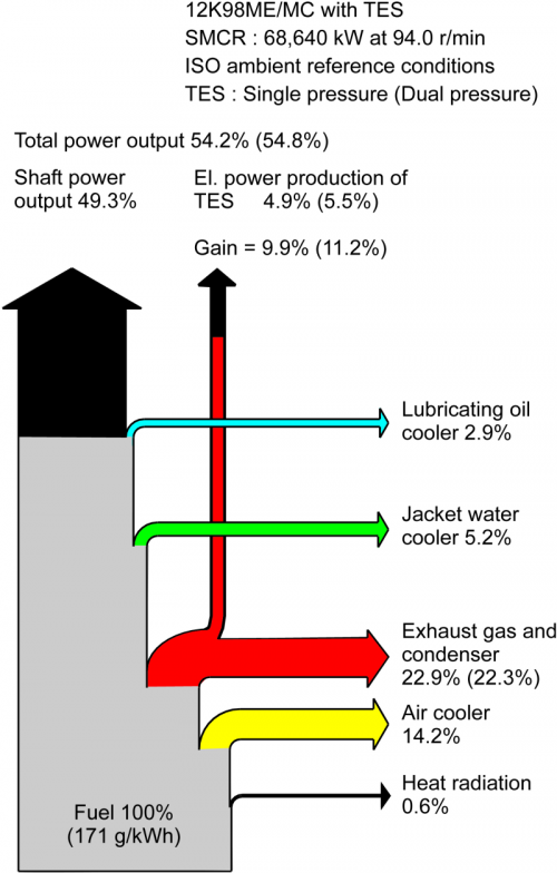
MAN Diesel, a renown producer of marine and power plant diesel engines, has been working on improving fuel efficiency of its engines. Today, the fuel energy efficiency is about 50%. The MAN Turbo Efficiency System (TES) allows to recover of heat from the exhaust gas, which is responsible for about 50% of the energy losses.

Here is a Sankey diagram that shows the recovery of energy from exhaust gas.


Download a description of the TES here (PDF, 291 KB)
or view a high resolution version of the above Sankey diagram from their press picture gallery.

3D Sankey Diagram from WBCSD

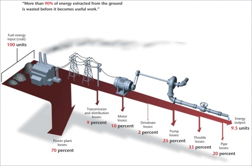
The World Business Council on Sustainable Development (WBCSD) in an article on “Making Tomorrow’s Building’s More Energy Efficient” features a great three-dimensional Sankey Diagram, to illustrate that “more than 90% of the energy extracted from the ground is wasted before it becomes useful work”. The article calls for green buildings where energy is produced onsite, and losses are minimized.

The Sankey arrows representing the losses bend down sharply, they remind me of the Iguazu Falls. Neat 3D images of the equipment are placed on the diagram to visualize the process steps where energy is lost. The whole thing hovers over the ground throwing a faint shade. The graphic designer who did this really merits an applause.

If ever I launch a ‘Best Sankey Diagram Award”, this one will have good chances to win it. Any sponsors out there? Any volunteers for the award jury?

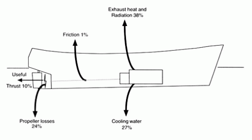
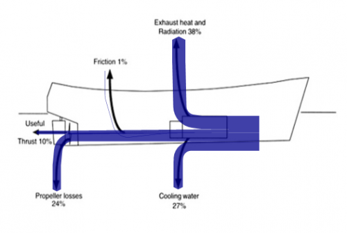
Energy Losses in Small Fish Trawler Operations

In a report on “Fuel and financial savings for operators of small fishing vessels” by J.D.K. Wilson from Maputo, Mozambique (available on the FAO website), the author explains that in a small slow-speed vessel, only approximately 35% of the energy created from the burning of fuel can actually be utilized to run the propeller, thus can be “spent on useful work such as pulling the net”.

I have “translated” the given values into a Sankey diagram, using the original image as a background layer. This works quite fine, apart from the very thin (1%) flow of friction losses.

On a side note: this is the first time I am presenting a right-to-left oriented Sankey diagram on this blog.

The author concludes, that energy can be saved on the engine and transmission, however the mode of operation (e.g. to reduce the effect of wave resistance), and hull maintenance also play a role. Read more interesting details.

Diagramas de Sankey? Si Se Puede!

The Mexican National Commission on Energy Saving (Comisión Nacional para el Ahorro de Energía (CONAE) present several success stories (casos exitosos) on their website.

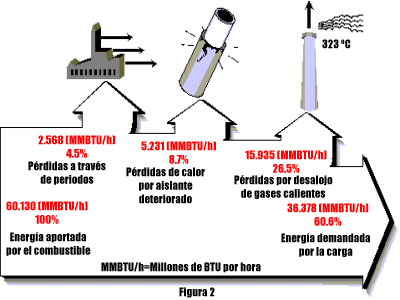
One success story dates back to 1997, and describes how an energy efficiency study of fired heaters (i.e. boilers) was carried out in a Nafta producing facility in the Veracruz state of Mexico. As a result of the study, several suggestions for optimization were implemented. Fuel consumption could be reduced by 23-24 %, while the efficiency of the ovens could be raised by 13% (calentador BA-2001 B) and 16% respectively (calentador BA-2001 A).

Para los hispanoparlantes: el título oficial del proyecto fue “estudio técnico económico e ingeniería conceptual realizada a los calentadores a fuego directo BA-2001 A/B de la planta hidrodesulfuradora de naftas, del C.P.Q. “La Cangrejera”, ubicado en Coatzacoalcos, Veracruz” (otro candidato para el concurso mundial de titulos largos).

The heat losses are shown as Sankey diagrams. The first describes the optimal situation, with an energy efficiency of 82,4 % “as guaranteed” by the maker of the fired heater.

The two other Sankey diagrams show the energy balance of the heaters A and B before the implementation of the measures. They run with an efficiency of 60,6 % and 62,35 %, a “real world situation of one fired heater” /

The arrows branching off at the top show the heat losses. I like the fancy icons that show how energy is lost through the walls, because of deteriorated or insufficient insulation, and heat energy in the effluent gases. The flows are given in MMBTU/h (millions of BTU per hour).

Unfortunately two of the diagrams are not to scale: The arrow to the right in the second diagram should be roughly 2/3 of the width on the left side. It is about 4/5 (or 80 %) of the width, similar to the width in the first Sankey diagram. This is a visual exaggeration of the inefficiency. However, I refrained from featuring this in my informal “Lying with Sankey diagrams” series. 😉

Edit 05/2015: the web pages are not acessible any more. I had to restore the image from a local copy, and removed references to two other diagrams I had references to. -Phineas

What it takes to power a bulb

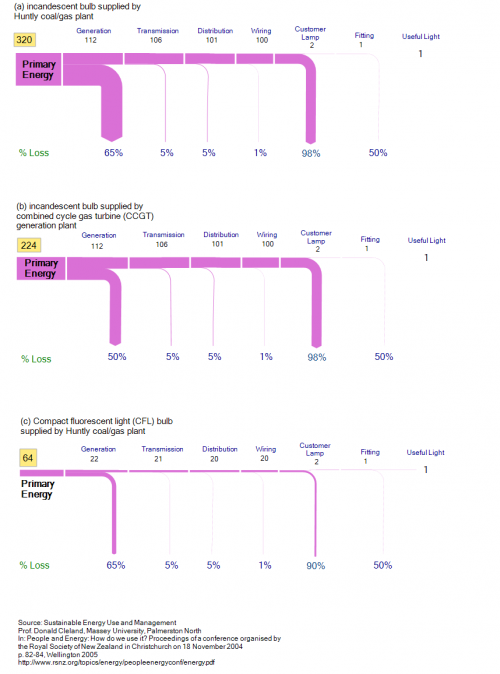
An article titled “Sustainable energy use and management” by Prof. Donald Cleland from Massey University in Palmerston North, New Zealand (published in: People and Energy: How do we use it? Proceedings of a conference organised by the Royal Society of New Zealand in Christchurch on 18 November 2004, p. 82-84, Wellington 2005) features three neat Sankey diagrams as an example for (un)sustainable energy use.

It is a comparison of how much energy is being used to power a lamp. The Sankey diagrams does not work with absolute values, but rather are scaled to one unit of “useful light”. You should read them “upstream” (from right to left) for better understanding. The first two diagrams (a and b) are regular incandescent bulbs. The third one (c) is a compact fluorescent light (CFL) bulb.

The bulb in the first scenario (a) is powered with energy from a coal/gas plant, which has an efficiency of only 35%. Further losses occur during transmission and distribution and at the bulb itself (98%).

In the second diagram (b) a combined cycle gas turbine (CCGT) power station provides the energy. It has a 50% efficiency.

The third one (c) uses energy from a common coal/gas plant again, but the customer uses a CFL bulb.

“A CFL is about 5 times more efficient so the losses reduce from 98% to 90%. In other words, a 20 W CFL produces about the same light as a 100 W incandescent bulb. Translated through the supply chain this means that the primary energy use is reduced to 64 units per unit of light, even if [a coal/gas plant] is still used. This is an 80% reduction in energy use. The benefit of a demand-side technology addressing the most inefficient part of the supply-chain is clear.”

Thus, the same amount of useful light can be produced at 64 units of energy in contrast to 320 units of energy.

Note: In the original publication the Sankey diagrams are not to scale to each other, so that the arrows for the primary energy values (320 units in the first, 224 units in the second, and 64 units in the third one) on the left all show the same magnitude. By bringing all three flow diagrams to the same scale, the significant difference between them becomes even more visible.

Engine Efficiency of Cars

The U.S. Department of Energy (DOE) is funding research projects that target the increase of efficiency of car engine.

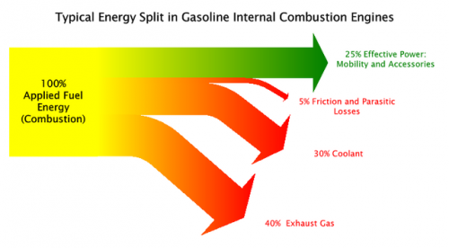
The Sankey diagram shown in this post on the Green Car Congress blog visualizes that only 25% (green arrow) of the energy from combustion is used as “effective power” for mobility and accessories, while 40% of the energy is lost in exhaust gas.

Projects are being carried out at John Deere, Caterpillar, Detroit Diesel and Mack Trucks, to name just a few.

“Seven of the twelve projects focus on advanced combustion technology with a heavy focus on HCCI (Homogeneous Charge Compression Ignition). There is also an diesel-compressed-air hybrid truck powertrain under development. The remaining projects deal with technologies to convert waste heat from engines to electrical or mechanical energy.”

The inefficient energy use of car engines and other vehicles are the main reason for the transport sector being (next to energy generation and transmission) the sector where most energy is being lost (see this post).