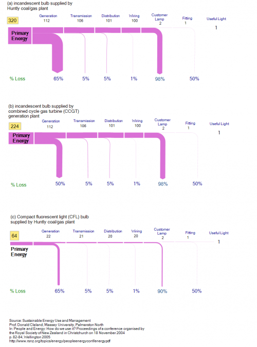
An article titled “Sustainable energy use and management” by Prof. Donald Cleland from Massey University in Palmerston North, New Zealand (published in: People and Energy: How do we use it? Proceedings of a conference organised by the Royal Society of New Zealand in Christchurch on 18 November 2004, p. 82-84, Wellington 2005) features three neat Sankey diagrams as an example for (un)sustainable energy use.
It is a comparison of how much energy is being used to power a lamp. The Sankey diagrams does not work with absolute values, but rather are scaled to one unit of “useful light”. You should read them “upstream” (from right to left) for better understanding. The first two diagrams (a and b) are regular incandescent bulbs. The third one (c) is a compact fluorescent light (CFL) bulb.
The bulb in the first scenario (a) is powered with energy from a coal/gas plant, which has an efficiency of only 35%. Further losses occur during transmission and distribution and at the bulb itself (98%).
In the second diagram (b) a combined cycle gas turbine (CCGT) power station provides the energy. It has a 50% efficiency.
The third one (c) uses energy from a common coal/gas plant again, but the customer uses a CFL bulb.
“A CFL is about 5 times more efficient so the losses reduce from 98% to 90%. In other words, a 20 W CFL produces about the same light as a 100 W incandescent bulb. Translated through the supply chain this means that the primary energy use is reduced to 64 units per unit of light, even if [a coal/gas plant] is still used. This is an 80% reduction in energy use. The benefit of a demand-side technology addressing the most inefficient part of the supply-chain is clear.”
Thus, the same amount of useful light can be produced at 64 units of energy in contrast to 320 units of energy.
Note: In the original publication the Sankey diagrams are not to scale to each other, so that the arrows for the primary energy values (320 units in the first, 224 units in the second, and 64 units in the third one) on the left all show the same magnitude. By bringing all three flow diagrams to the same scale, the significant difference between them becomes even more visible.

1 Comment
Very interesting information and good pictures!
Comments are closed.