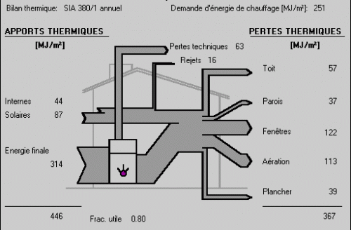
A few months ago I had found this b/w Sankey diagram on the website of the Institut de Génie Thermique (IGT) de la Haute Ecole d’Ingénierie et de Gestion du Canton de Vaud (HEIG-VD) in Switzerland, showing the energy or heat balance (bilan thermique) of an average family home.
It visualizes the sources of heat as Sankey flows into the building (in MJ per square metre) with the largest chunk being the combustible for the heating system, other inputs are from solar radiation and internal sources. On the right side it shows how and where heat is being lost: windows (fenétres) 122 MJ/m², ventilation (aéreation) 113 MJ/m² or roof (toit) 57 MJ/m². Also, the technical losses from the heating equipment (pertes techniques, shown as Sankey arrow from the heater to the top) are quite significant (57 MJ/m²).
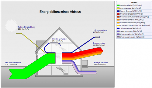
A similar Sankey diagram in German was presented on the e!Sankey forum recently.
This diagram submitted by one of their users is explained as follows:
In the diagram the group of flows in red colors are heat losses due to transmissions through walls, windows, doors, etc. The dark blue arrow shows heat loss through ventilation. The stacked purple/mauve flow represents heat losses at equipment and pipes.
While a little more detailed in the number of flows, it shows the same general situation: In many houses “a lot of the heat gets lost due to heat leaks (thermal bridges) or insufficient external insulation.”


1 Comment
A similar sample from Estonia can be found here. phineas
Comments are closed.