If you enjoy browsing for tidbits of interesting information on the web, I highly recommend the collection of fact sheets on the website of the Center of Sustainable Systems (CSS) at the University of Michigan. This series of 2-page papers on topics, such as energy, water, waste, transportation or buildings, targets at the ordinary citizen and presents scientific information with bulleted list of interesting facts, nicely illustrated with diagrams, and sometimes recommendations for individual behaviour (“What You can Do”).
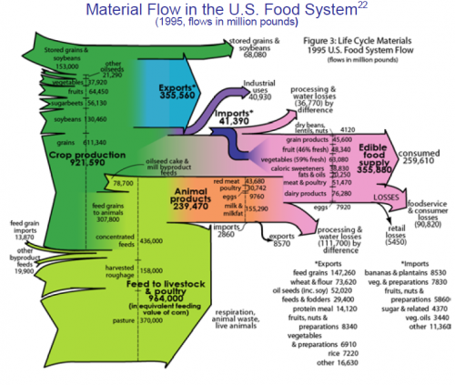
The fact sheet on the U.S. Food Chain shows the material flows for providing food in a Sankey diagram. Data is from 1995, the flow quantities are in million pounds.
The inputs from the left are limited to crops, feed and pasture. Other inputs such as water, fertilizers, etc. are omitted. The actual quantity of food consumed by U.S. citizens is shown on the pink arrow (355,880 million pounds). Exports of food are shown in blue and are about the same size (355,560 million pounds). A large portion of material into the food chain goes into “respiration, animal losses and live animals” (the latter probably being fed back into the food chain at a certain point, I assume, so consider them a foodstock. ,-)
There is much more to find in this Sankey diagram. So why not take a few minutes of your lunch break to explore it and read the full fact sheet. And while your at it, why not eat a locally grown apple while doing so …

