Tag: food

Digesting Food: Mass Balance Sankey

I am sure some of you know this situation: Stepping on the scales in the morning, still half asleep, just to find out you have gained a kilogram or so… but did I really eat that much yesterday?

Well, Ivan Muñoz from the Centre for Environmental Strategy (CES) at the University of Surrey approached this question from a more scientific perspective to create ‘A simple model to include human excretion and waste water treatment in Life Cycle Assessment of food products’. In LCA you are trying to explain all processes along the product life cycle in detail and, if possible, with a closed mass balance. When you look at the ‘use phase’ of a food product life cycle, where the food is being consumed it doesn’t disappear, it is just transformed in the human body.

The researcher and his group have determined a mass balance of 1 kg of boiled broccoli. It is visualized with two different Sankey diagrams.

One is a mass balance including water. The “first diagram reveals that human digestion is mainly concerned with water, from a mass point of view” (p. 13)

No units or absolute values are given, but one can see that wet matter (water) is the main constituent of the food ingested. It leaves the body as water through the lungs (exhalation), as urine and with faecal solids (light blue arrows). In fact, the human body could be considered a huge water extraction facility…

The other Sankey diagram just focuses on dry matter and oxygen, explicitly excluding the water in the broccoli from the mass balance.

Here we can observe that some 40% or so of the food dry matter are actually solids from non-biodegradable organics (fibres). See the arrow with the appropriate color 😉 . The remainder leaves the body as faecal liquids. In this Sankey diagram the human body rather is an emission source of greenhouse gases (GHG), solid waste and liquid waste.

Apparently in both diagrams no mass is maintained within the system…

The researchers also did an “endosomatic energy balance” and found that some 63,4% of the broccoli is “energy actually used in metabolism” while 36,6% of the energy is “energy in excretion products (lost energy)” (p. 15)

Now you might say ‘Who gives a … dime?”, but I found this to be a really fascinating topic. It is probably also the first Sankey diagram ever to be used to visualize human digestion.
Ate your muesli this morning?

I have talked about a cereals Sankey diagram by INRIA Grenoble a couple of weeks ago in this post.

Here are two more Sankey diagrams from the underlying article ‘Etude des flux de céréales à l’echelle locale: Exemples en Rhône-Alpes, en Isère et dans le SCOT de Grenoble’ by J. Courtonne, J. Alapetite, P. Longaretti, D. Dupré.

These are the mass flows for cereals production in France (2007/2008) in Mt (1000 tons)

Here is the same cereals process chain “translated” into a water footprint. Unit is million cubic metres of water consumed.

A very clear structure in both diagrams with three columns: grains production, transformation and final products. Choice of color corresponds to the topic.

eco-data.fr: Cereals Sampe

A research group from INRIA Grenoble engineering school has set up a website for visualization of environmental data. Sankey diagrams are one available visualization option. The below is a sample provided on the website.

The Sankey diagram shows flows along the cereals production chain in France from the 2007/2008 harvesting campaign. Quantities are in 1000 tonnes.

Different grains are shown on the left: wheat (‘blé’), hard wheat (‘blé dur’), maize, barley (‘orge’) and others. Two large end nodes for unprocessed grain exports and use as animal feed (‘consommation animale’). There are further exports as intermediate and processed products. Only a comparatively small fraction is consumed by humans in France as bread, pasta, biscuits.

Could not detect use as energy crops, it is maybe hidden in the ‘industrial use’ flow. Anyway, an interesting application case for Sankey diagrams.

Norway Food Supply Sankey

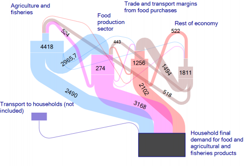
From a book ‘Environmental and climate analysis for the Norwegian agriculture and food sector and assessment of actions’ by John Hille, Christian Solli, Karen Refsgaard, Helge Berglann, Knut Krokann published on ResearchGate.

Download the full book on ResearchGate.

Not sure about the unit of flows.The unit of flows is kT CO2-eq./year (see comment by Christian Solli). The Sankey diagram shows embodied carbon in food and agricultural products and the overall carbon footprint caused by the demand of food in Norwegian households, and consequently along the supply chains in agriculture/fisheries sector. [Updated by phineas, May 06]

This is very similar to Jason Pearson’s Economy Maps for visualizing environmental impacts.

Intra EU Horse Meat Trade

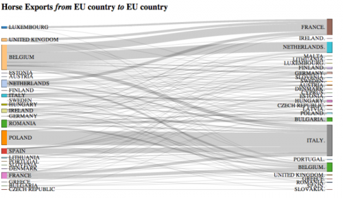
Blog reader Johannes send me a note and suggested to feature the below diagram. Thanks for that.

Tony Hirst from OUseful.info created it after seeing a map-based diagram for horse meat trade flows on the Guardian Data Blog. Tony used Mike Bostock’s D3s Sankey Plugin that allows creating this type of diagrams directly from data in Excel/CSV files. In his post he describes how he proceeded to build this Intra EU Horse Meat Trade diagram. Somewhat techie, but nevertheless makes an interesting read.

Overall trade quantity was more than 60.000 tonnes in 2012. Largest exporters are Belgium and Poland (left side), largest importers are Italy and France (right side). Data is from Eurostats.

The above is a only a static picture, but you can go here to play around with the interactive version. Data labels and quantities are available in the interactive version when you hover ths mouse over certain bands. You can also move the nodes up and down vertically and group the countries differently.

This special type of Sankey diagram is also refered to as distribution diagram and (…hate to say it in light of the current scandal) a Spaghetti diagram. Fineo and Parsets (see software list) can also be used for this type of diagrams where statistical data is grouped into categories (here: exporting and importing countries) and bands/streams/spaghettis are shown between the categories to represent the relationships between them.

Here is my May 2012 post on distribution diagrams with d3.js.

Coffee Sankey Diagram

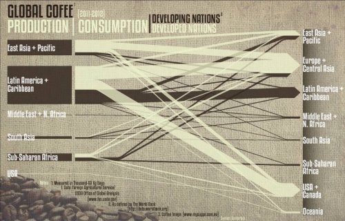
After all these Sankey diagrams for energy flows, flows of carbon, phosphorus, and the like here is a special one for all those of you, who are coffee addicts – like me. Saman Zomorodi on his blog ‘Saman’s System, Sites and Buildings’ features a coffee flow Sankey diagram in this post.

This is an infographic for global coffee production. Producers are on the left side, coffee consumers are on the right. The dark brown flows are for developing nations, while the milk coffee color ones are for developed nations. No quantities given in the diagram, so we don’t learn the actual absolute figures.

However, “this allows the reader to actually see where coffee is being made and how far it actually travels to another world region. As evident in the diagram, almost all coffee is produced in the developing nations, while the majority of it is consumed in the developed nations. This relationship underscores the unproportional amount the developed world consumes, while the developing nations have to pay many hidden costs.”

The original image is 2MB and I had to resize it with a loss in quality. Visit Saman’s blog to download a highres version of the diagram.…

Yet another Sankey map overlay

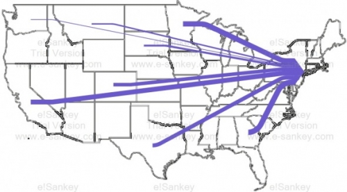
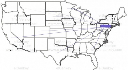
John Cochran blogs about his coursework at University of Virgina. His project on ‘Urban Metabolisms’ has this Sankey diagram of food being transported to New York City. Data is from The Federal Highway Administration (USDOT) Freight Analysis Framework.

The first Sankey diagram shows transports to New York (excluding the Northeastern States and transports within NY). The food supplied by other US states becomes relatively insignificant:


The second one includes food transports within NY state (still excluding the Northeastern States):


John, however has not been satisified with the results of his work. He writes (scroll down to his September 21, 2011 notes):

“Neither produced effective graphics, but what they did demonstrate was the inability of the information to be able to represent food going to New York. (…) As a result, the data “revealed” that we already have a very local food system, when in reality this is not the case; instead, it does indicate how many extra miles are traveled for food around the location of purchase. (…) The images below demonstrate just how disproportionate the amount of miles traveled in New York are to the miles traveled bring food to New York from the rest of the country.”

It remains unclear whether the flows displayed in the diagram are for payload (e.g tonnes of food) or payload distance (e.g. tonne-kilometres). Also, it is not mentioned, whether, for example, water and drinks (typically sourced locally) are included.

I think the idea of thie Sankey map overlay is great, but the issue of spatial representation of (dense) data points has not been adequately adressed. A zoomed NY state would maybe help.

Cool! Cyclifier 3D Sankey Diagram on Food

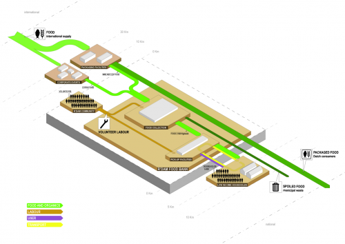
Found on cyclifier.org, a project run by Dutch 2012Architecten: This 3D Sankey diagram by Anna Brambilla visualizes flows of food from producers to the Rotterdam foodbank and onto low income households.


Source: http://www.cyclifier.org/project/foodbank (License: Share-Alike)

The image is explained as follows:

“Processes and actors are identified by labeled platforms with sub-processes shown as stacked platforms. The system boundary is shown as an extruded block indicating that it is one piece within a larger network. Starting from the edges of the cyclifier, distances are marked in intervals to indicate the distances traveled by inputs and outputs. Flows are scaled by mass as in sankey diagrams and are color-coded per flow type. Flows to and from the atmosphere are represented as traveling vertically.”

So, we have ‘Food and Organics’ flows (green), transport (yellow), users (purple) and even volunteer labor (brown) represented in the diagram. No numbers or units given though. Since cyclifier.org is interested in promoting “innovations that contribute to local exchange and production”, distances of producers to the foodbank and to the consumers are indicated on a somewhat logarithmic scale.

I just doubt that roughly a third of the output flows from food production is received by the foodbank. This is probaly to be taken symbolically and not for real…

Very cool Sankey diagram, kudos!