Tag: Mexico

Greenhouse Gas Emissions Mexico 2015

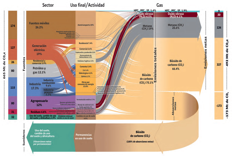
Here is a great Sankey diagram visualizing the greenhouse gas emissions of Mexico in 2015. This graphic comes from the ‘Sexta Comunicación Nacional y Segundo Informe Bienal de Actualización ante la Convención Marco de las Naciones Unidas sobre el Cambio Climático’ published by Secretaría de Medio Ambiente y Recursos Naturales (SEMARNAT) and Instituto Nacional de Ecología y Cambio Climático (INECC).

The Mexican national inventory of emissions of gases and composites withe greenhouse effect (Inventario Nacional de Emisiones de Gases y Compuestos de Efecto Invernadero) is compiled by INECC on a regular basis as part of its reporting as a signatory to the United Nations Framework Convention on Climate Change (UNFCCC). The report is here, you can find the graphic on pages 110/111.

On the left side we see the different sectors of the country and their contribution to the emission of the 665 Mt (megatonnes) of GHG gases in 2015. The unit of measure is Mt CO2 equivalents. For each of the sectors this is further broken down to the activities causing the emissions. Further to the right these emissions are split to the individual underlying gases,. We see a large share (75%) caused by carbon dioxide (bióxido de carbono), methane and nitrous oxides. 492 Mt CO2eq were released to the atmosphere, while 173 Mt CO2eq were sequestered (absorbed by plants and soil).
MapProvision Sankey Overlay

MapProvision is an online service to present data as dynamic layers on an online map. They have now added an Sankey overlay feature.

This screengrab is a from a sample provided by them using World Trade Organization import and export data for 2017.


Here I have selected imports of machinery being imported to Mexico. Flows displayed are based on value of the goods in mio US$ per year. Hovering over the arrows reveals detailed data, a summary of imports for the selected category is shown when hovering over the bracket at the destination.

This comprehensive blog post has more details on how to adapt the Sankey overlay and the different options you have, including color settings and minimum width for Sankey arrows. It also contains an embedded example for fish import to Japan.

Nice work and fun to play around with. Doing Sankey diagrams on a map is particularly challenging in my opinion due to routing issues and because in many cases trade flows between neighbouring countries tend to be high volume, so that the shortest Sankey arrow paths are typically the widest ones (as is the case with the U.S. here).

Diagramas de Sankey? Si Se Puede!

The Mexican National Commission on Energy Saving (Comisión Nacional para el Ahorro de Energía (CONAE) present several success stories (casos exitosos) on their website.

One success story dates back to 1997, and describes how an energy efficiency study of fired heaters (i.e. boilers) was carried out in a Nafta producing facility in the Veracruz state of Mexico. As a result of the study, several suggestions for optimization were implemented. Fuel consumption could be reduced by 23-24 %, while the efficiency of the ovens could be raised by 13% (calentador BA-2001 B) and 16% respectively (calentador BA-2001 A).

Para los hispanoparlantes: el título oficial del proyecto fue “estudio técnico económico e ingeniería conceptual realizada a los calentadores a fuego directo BA-2001 A/B de la planta hidrodesulfuradora de naftas, del C.P.Q. “La Cangrejera”, ubicado en Coatzacoalcos, Veracruz” (otro candidato para el concurso mundial de titulos largos).

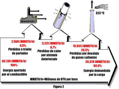
The heat losses are shown as Sankey diagrams. The first describes the optimal situation, with an energy efficiency of 82,4 % “as guaranteed” by the maker of the fired heater.

The two other Sankey diagrams show the energy balance of the heaters A and B before the implementation of the measures. They run with an efficiency of 60,6 % and 62,35 %, a “real world situation of one fired heater” /

The arrows branching off at the top show the heat losses. I like the fancy icons that show how energy is lost through the walls, because of deteriorated or insufficient insulation, and heat energy in the effluent gases. The flows are given in MMBTU/h (millions of BTU per hour).

Unfortunately two of the diagrams are not to scale: The arrow to the right in the second diagram should be roughly 2/3 of the width on the left side. It is about 4/5 (or 80 %) of the width, similar to the width in the first Sankey diagram. This is a visual exaggeration of the inefficiency. However, I refrained from featuring this in my informal “Lying with Sankey diagrams” series. 😉

Edit 05/2015: the web pages are not acessible any more. I had to restore the image from a local copy, and removed references to two other diagrams I had references to. -Phineas