Tag: politics

Brexit Negotiations Outcomes – Outdated!

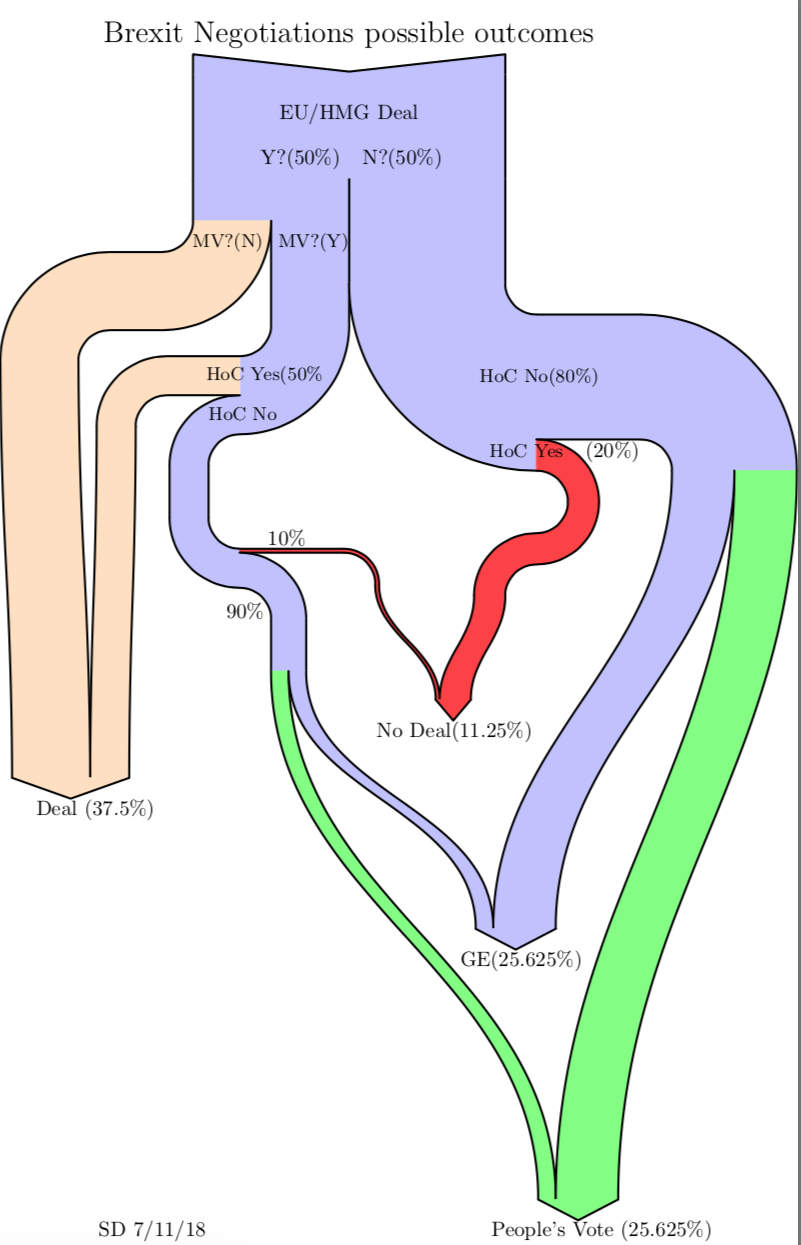
As Boris Johnson makes a dash to Luxembourg today for negotiations with Juncker on Brexit, this Sankey diagram from a blog post ‘Brexit Negotiation Outcomes using a Sankey Diagram’ by Sean Danaher at Progressive Pulse – less than a year old (Nov 9, 2018) – is soooo outdated. In fact the situation was (and still is) so fluid that any attempt to describe it can be outdated within a week or even a day…


This is a decision-tree diagram, just that the estimated probabilities for a decision are shown as weighted paths. Decision paths can merge again when they lead to the same result.

Note: I try to keep this blog non-political. The only other politics related Sankey diagrams are here (Scottish referendum) and here (Trump).

Big Oil Climate Lobbying, InfluenceMap

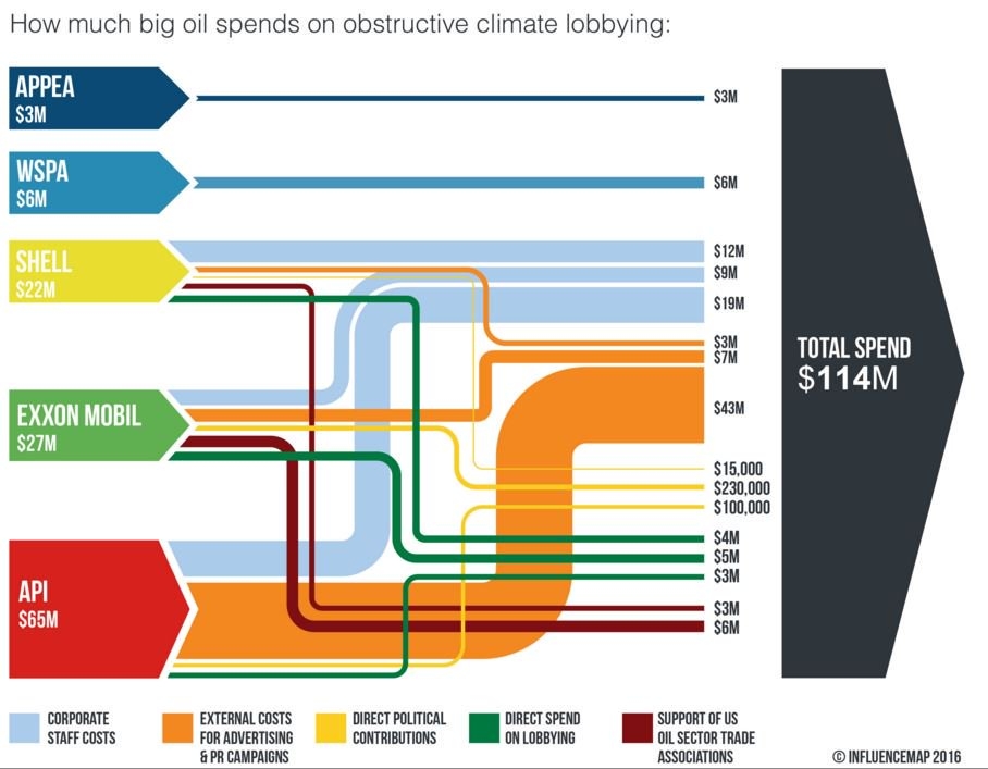
The UK-based non-profit Community Interest Company (CIC) called ‘InfluenceMap’ has produced the below Sankey diagram on obstructive climate lobbying of oil firms and interest groups. These are the spendings in US$ for an unspecified year (possibly 2015).


Source: InfluenceMap, Media Downloads
(via Hypergeometric blog)

Streams are color coded to specify the type of spending (e.g. staff cost, direct lobbying, party donations). Note that the yellow flows (in the range up to 230.000 US$) are not to scale with the others that are on a million US$ range. Some of the elements that represent the sources and the black sum arrow are also overemphasized, showing a height that is larger than the sum of the individual arrow magnitudes. So this is not fully adherent to the principles of a Sankey diagram … but to be fair: they never claimed that it is a Sankey diagram.

This is maybe the first Sankey diagram ever to be featured in the US Senate. Senator [D-RI] Sheldon Whitehouse (yes, that really is his name … you just have to love his “Whitehouse Statement on …” catchphrase) used it in a US Senate testimony in April 2016.

Watch the video how the Whitehouse does quite well explaining the streams of money and to underpin his message with the Sankey diagram. Jump in at 0:25 secs to see Sankey make its Senate appearance…

Trump’s Twitter Attacks Sankeyfied, Axios

Couldn’t help but laugh, despite the seriousness of the topic.

Lazaro Gamio of Axios, a “new media company delivering vital, trustworthy news (…) with expertise, voice AND smart brevity”, has created this Sankey diagram infographic to illustrate the Twitter attacks by Trump and who they were targeting. Shown in a blog post by Axios’ Stef Knight.


via Dataviz blog

Very comical use of Sankey diagrams. I love the red tie and just imagine how it will continue to move out to the right shoulder as POTUS’ Twitter attacks on the media continue. Great!

Mapping Scottish IndyRef Votes

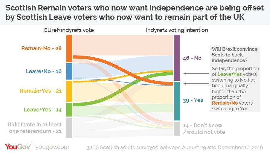
Good use for a distribution diagram shown in the January 2017 Guardian op-ed ‘Why hasn’t Scotland changed its mind on independence?’. It shows Scottish voter behaviour in the first pre-Brexit vote independence referendum (‘IndyRef1’) and intended vote in the second independence referendum (‘IndyRef2’), based on a poll among some 3,200 Scots in Nov/Dec 2016.


(via Coffee Spoons blog, originally from The Guardian, using YouGov data)

The left columns has two categories (Brexit Leave/Remain and first independence vote ‘Aye’/’Nae’), the second only one category. Both columns have the undecided voters fraction in light grey.

The changeovers from one camp to the other are shown emphasized in strong colors. One can see that the ones who voted “No” in the first referendum and that would now vote “Yes” for Scottish independence are compensated by voters who said “Yes” in the first vote, and who would now probably go for a “No”.

There seem to be less undecided voters (down from 21% to 14%), but the overall outcome would at present be the same: 46% No, 39% Yes (Indyref1: 44% No, 35% Yes). Of course a lot has happened since the poll in Nov/Dec 2016 and there is still a long way to go up to IndyRef2.

Swimlane diagram for political parties

Stumbled across a number of swimlane diagrams developed by Andy Tow in 2012.

As he describes on his blog these were created during a “Hackathon de Visualizaciones” in Buenos Aires. Andy used ‘Sankey by tamc’ (see Sankey software list) to create several diagrams like these.

This one is for the Santa Cruz province and covers elections 1983 through 2011. More images like these for the Chaco, San Juan and Jujuy provinces are available. These are sample screenshots from the ‘Electoral Atlas’ (see below).

Each node represents elections, with the height of the block representing the percentage of votes/seats received. The “leading” party is always at the top. So the bands between two blocks are basically electoral behaviour and (may) visualize political shifts. When two bands join, there seems to be a coalition.

In this special type of Sankey diagram the nodes are of greater importance. The bands represent quantities, however there is a temporal rather than directional aspect to the flows.

This is similar to the Political Parties in Slowakia diagram and to these.

Check the interactive version of the ‘Electoral Atlas’ by Andy Tow, where you can hover the mouse over the diagram to highlight details.

History of Parties and Armies

A company named HistoryShots offers some fine diagrams, that show the development of political parties in the U.S. and two historical graphs of the civil war (1861 to 1865) that remind of Sankey diagrams. Prints of these maps can be purchased from their site.

The ‘History of the Confederate Army’ and ‘The History of the Union Army’ how armies were formed, regrouped or significantly lost men in battles. The width of the ‘arrow’ with an implicit direction along the time line (shown at the bottom of the chart) represents the number of men. Additionally, the diagram is split into three main geographical areas (Western Theater, Eastern Theater and Trans Missisipi Theater).

History of the Union Army (by HistoryShots)

These diagrams are inspired by the famous Minard chart, which shows the loss of men on Napoleon’s march to Moscow and during the retreat.

The other two graphs are in the ‘Political’ section of the HistoryShots webpage, and show the development of political parties in the U.S. from 1730 to 1892 and from 1892 to 2005 respectively. On these graphs the widths of the “bands” don’t represent votes or seats. The popularity of each party is shown as the amplitude on the unlabeled x-axis.

History of Political Parties (by HistoryShots)

Democrats and Republicans are like sinus and cosinus waves over time, a picture that continues on the 1892 to 2005 map. Or one might also be reminded of the intertwined DNA double helix structure…

Note: I presented a similar diagram for the development of political parties in Slovakia 1990 to 2008 here on the blog before.

A different power Sankey diagram…

Kevin Deegan-Krause, an Associate Professor of Political Science at Wayne State University has contacted me with a fascinating idea and a unique example of a Sankey diagram. He writes: “I accidentally “reinvented” the Sankey wheel quite awhile ago for a rather odd usage: political party ebb and flow in E. Europe.”

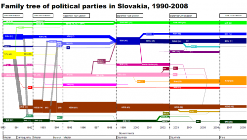
This diagram he presented in a recent post on his Pozorblog shows how parliament seats were allocated to the different parties in the Slovakian parliament from 1990 to 2008, and how seats were shuffled during the six elections that took place during that time.

“As with energy, the number of party seats in parliament is a closed system and there are flows from some to others. This is a highly modified usage, of course, as we do not know in a precise way “where” votes go from one election to the next, so we just fudge at the day of election and just start over (or have invisible reallocations).”

Have a look, for example at the brown brown arrow: The HZDS party has clearly been on the loosing track. On the other hand SMER (shown in orange), a party that emerged as a spin-off from SDL (pink) in 2000, could gain a significant number of seats in the 2002 elections, when SDL couldn’t make it into Slovakian parliament any more. Others pretty much remained stable in their number of seats over the whole observation period.

I am not sure if Kevin uses the “official” colors of the parties (wouldn’t mind tossing my vote for the pink party 😉 ), but a color clustering would also allow to visualize if left, or right, or liberal, or whatever political direction gets stronger or weaker. It would also be a possibility to see, if there is an overall trend in a certain group of countries, such as Eastern Europe, or the apparent growth of socialism in South America.

I am calling for votes on how to name this special type of Sankey diagram. If the first Sankey diagram was for steam power, why not a power Sankey diagram? 😉