Was browsing through my bookmarks and saved images and found the below diagram. Blame it on my mood today, but this one calls for bashing.
Published in a 2010 report by Australian Government, Department of Resources, Energy and Tourism. ‘Energy Efficiency Opportunities. Energy–Mass Balance: Transport’ figure 11 on page 26 this so-called Sankey diagram looks like a aerial view of my nephews playing room with his building blocks spread on the floor… While I generally appreciate a Sankey diagram being used in a government report on energy consumption or loss in transport, I think this one is poorly executed.
If you look at the numbers you will even see that they don’t add up correctly at the ‘Motive Power’ node.
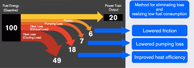
The diagram shows how energy from fuel is lost in different stages of a vehicle motor (engine, power train, transmission) with approximately 21% of the energy being used as power at the wheels. This value is just an example, and not for one specific vehicle. But 20% efficiency seems to be more or less the average in a passenger car.
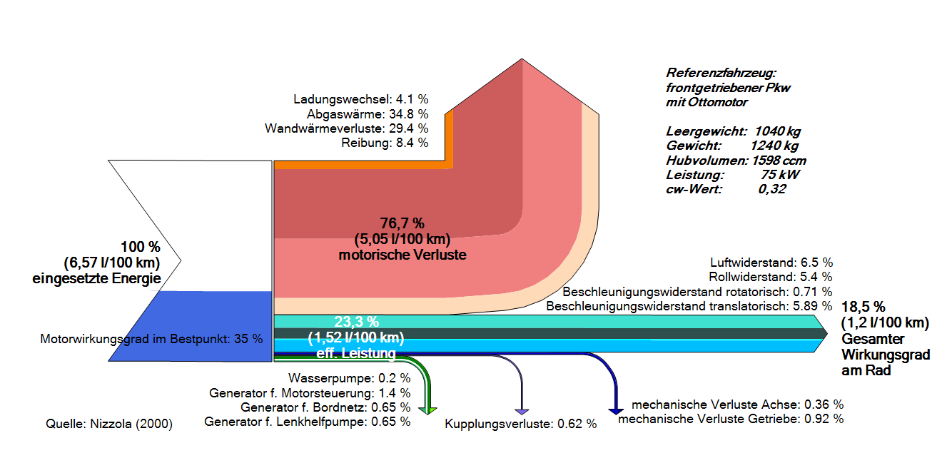
I remembered I had seen another Sankey diagram on the e!Sankey forum with the same topic.
This one is in German but you may be able to understand the main items. The red arrow are losses at the motor. The stacked turquoise-blue arrow to the right (18.5%) is energy-at-wheel. All in all there are many more details, but still the diagram remains rather “compact”.
I am sure there are more Sankey diagrams on energy losses in vehicles out there. Let me know if you find other examples to compare.


