Christian Behrens from the Department of Design at Potsdam University of Applied Sciences in Germany put up a website on Information Design Patterns. It features “design patterns that describe the functional aspects of graphical components for the display, behavior and user interaction of complex infographics”.
The website is modestly called an “application prototype” of a pattern browser, and is part of his Master Thesis titled “The Form of Facts and Figures”.
All patterns are tagged and can be searched. For each type he presents a fact sheet with description, usage, required data, and rationale. Christian provides an own example for each pattern, and a “real-world example” from an external source. Additionally, related diagram types are listed.
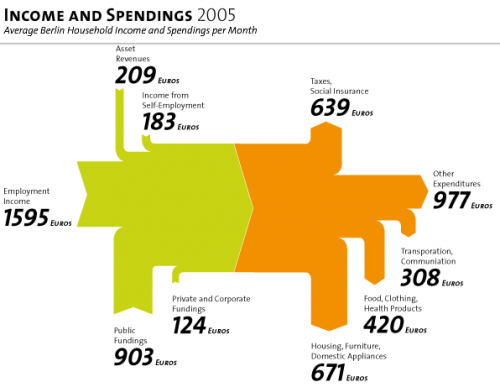
The Sankey diagram is A 5.1. The example shows the average income and spendings of a Berlin household in 2005. Salary, asset revenues and public subsidies make up for the total income, shown in green. The income is spent on taxes, housing, food, clothing and other, shown as orange arrows.
I do miss a number stating the total (3015 Euro, roughly 4500 US$) as a label for the magnitude in the middle, but nevertheless this is a superb example of information presentation with a Sankey diagram. Just try to imagine the same information shown as two pie charts…
Enjoy browsing the Information Design Patterns website.

1 Comment
Comments are closed.