Embodied Emissions of Products in the EU

Embodied emissions (similar to embodied energy) is an interesting perspective on the environmental impact of products we use. It takes into account the full life-cycle of the product and aggregates the emissions produced from raw material extraction, from the actual manufacturing, from the transports along the supply chain, and from the disposal of the product after use.

In many cases ’emissions’ is reduced to greenhouse gas emissions (GHGs) and the impact on climate change caused along the product’s life cycle. In this case we could colloquially also call it the ‘carbon rucksack’ of the product.

Kate Scott from the Sustainability Research Institute, School of Earth and Environment, University of Leeds (UK) in her article ‘Extending European energy efficiency standards to include material use: an analysis’ suggests the European Union should – in addition to its energy efficiency policies – add consideration of material efficiency of products to their climate change strategy. GHGs are considered a lead indicator for material efficiency, as “material-intensive manufactured products … offer significant scope for emissions reductions along product supply chains.

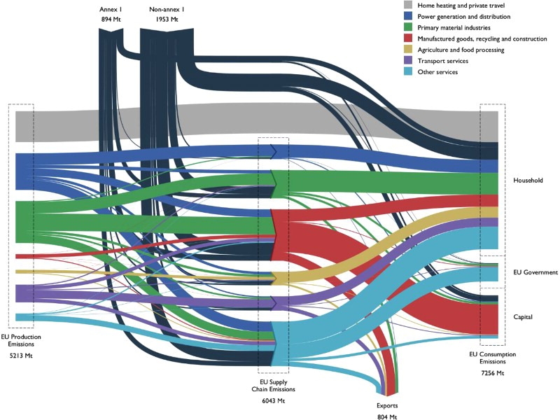
This Sankey diagram of supply chain emissions associated with global product flows of the EU is presented.


Source: Kate Scott, Katy Roelich, Anne Owen & John Barrett (2018) Extending European energy efficiency standards to include material use: an analysis, Climate Policy, 18:5, 627-641, DOI: 10.1080/14693062.2017.1333949 distributed under Creative Commons Attribution License.

The diagram doesn’t show much detail as to the individual stream and relies heavily on color coding. Only group sums are shown. Data is for the year 2007. Flows are in Mt (megatonnes) CO2-equivalents embodied as emissions in the products.

“Production emissions in the EU in 2007 were 5,213 MtCO2e, with the width of each flow on the left-hand side of Figure 1 representing production emissions by sector, the conventional accounting approach. In the same year, the EU’s consumption-based emissions, the right-hand side of Figure 1, were 39% higher, at 7,256 Mt due to the EU’s trade balance. Emissions embodied in EU imports were 2,847 Mt and emissions embodied in their exports were 804 Mt, meaning that the EU is a net importer of 2,043 MtCO2e (imports–exports).”

The black streams from the top represent embodied GHG emissions from raw materials, finished products or product components imported into the EU.

Read the full article here.
LatAm BEN – Ecuador

Here’s the continuation of my mini-series on Sankey diagrams showing energy balances of Latin American countries. After my recent post on the Balance Energetico Nacional (BEN) of Bolivia the neighbouring Peru would be next. However, I have presented a Sankey diagram on energy flows in Peru on this blog before. So today, here is the BEN for Ecuador. It is published every year by the Ministerio Coordinador de Sectores Estratégicos.


Data is for 2016. The unit of flows is ‘kbep’ (kilo barrels of oil equivalents / miles de barriles equivalentes de petróleo). The appearance is very similar to the BEN Bolivia I showed here.

Again the flows are not to scale, which is a pity. Smaller flow quantities (in the range of 0 to 1000 kbep) are shown as arrows with a minimum width, which is fair, because otherwise we wouldn’t see much more than a hairline for ‘Solar’ or ‘Eólica’. However, if you look at the light grey flow of 17,533 kbep derivates exports branching out after the refineries node, it has the same width as the arrow representing 3,024 kbep of own use (consumo própio) – although it should be 5 times wider. The orange arrow depicting 4,433 kbep of natural gas on the other hand is wider than the one 17,533 kbep derivates exports…

I really like the graphical aspects of the Sankey diagram, and I admire the effort made here to come up with an annual Balance Energetico Nacional. In my opinion, not showing the flows to scale thwarts the whole effort, and makes using this diagram type superfluous. I know that doing such a Sankey diagram to scale is sometimes challenging, in particular when there is a very large dominating flow (like here the 139,046 kbep petroleum exports), but nevertheless, the message you are otherwise conveying with the figure is simply misleading.

Just as for Bolivia I will again have to draw this one myself …

Adyen Income Statement Sankeyfied

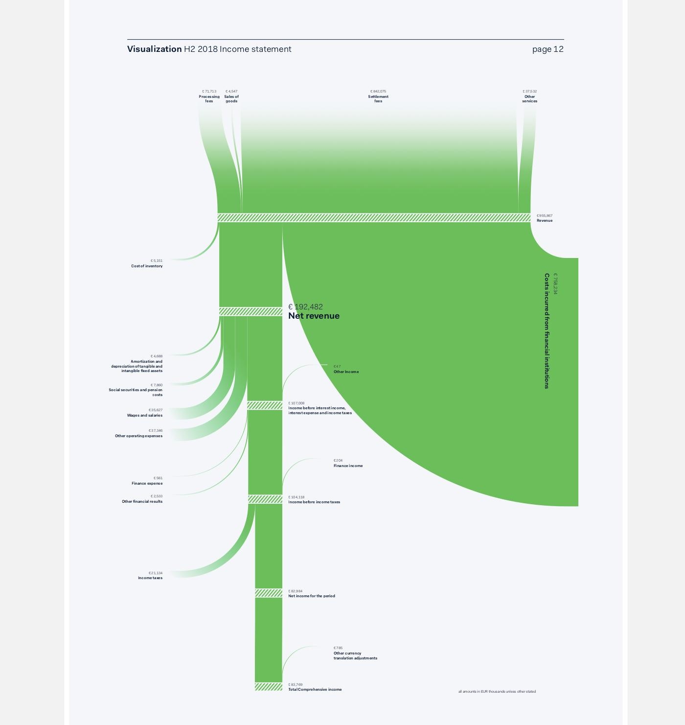
Amsterdam-based graphic designer Nadieh Bremer (a winner of a 2017 Information is Beautiful award) has created this Sankey diagram for the H2 2018 shareholder report of Adyen.

Definitely a novelty in a financial report (at least I have never seen a Sankey diagram in a such a publication).


via Twitter @NadieBremer

Apart from the fact that it is beautifully crafted and clean, it is also quite a tweak of the d3.js Sankey library … After all, this is not the typical d3.js Sankey diagram (with left-to-right orientation, only with boring grey bands, or even arrows superimposing each other where they curve). Here we have a top-to bottom flow, with streams branching out to the left and to the right, flows smoothly curving in to join the main streams, saturated color, and an interesting hatching pattern on the nodes.

Nadieh writes on her decision to use a dedicated software: “The main reason was the fact that the final numbers could change (slightly) until just days before the publication, making it quite a chore to have to remake these if they were all crafted in Illustrator.
Furthermore, by programming the logic of these visuals, I could prepare 90% of the required effort a month before the deadline by using the numbers from the previous report. When I finally received the final numbers, it was only a matter of changing the underlying data, and some small tweaks to get these final visuals ready.”

World GHG Emissions 2012

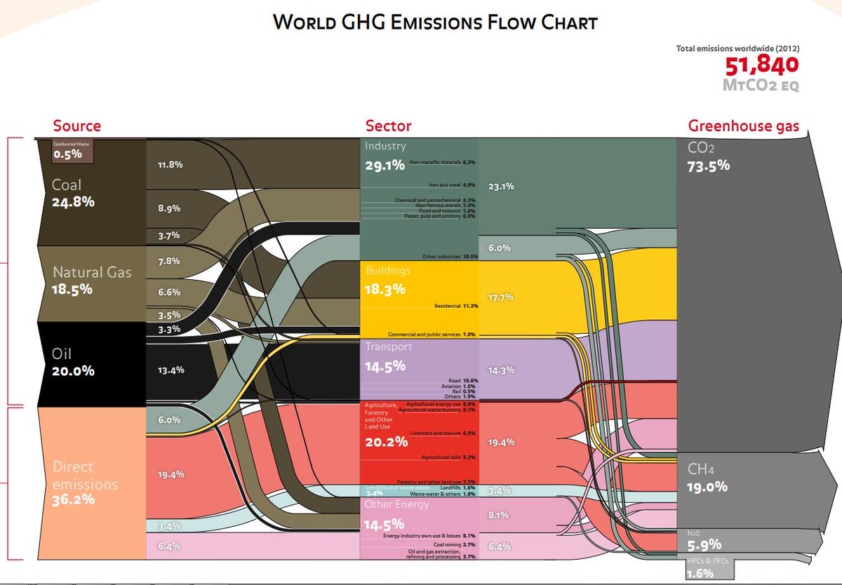
This “dense” or “block-style” Sankey diagram might look familiar to some. Indeed it is based on the greenhouse gas (GHG) emissions Sankey diagram for 2000 published by the World Resources Institute WRI (see this post). Consulting firm Ecofys (now Navigant) has updated the data and refined it, but kept the overall appearance of the figure.


via @ChrisChambers64

Total emissions of climate gases were 51,840 Mt Co2-eq. Carbon dioxide and methane contributed more than 90%. The industry sector is the largest emittor, followed by agriculture and land use.

Very clear and compact Sankey diagram, conveying the most important information about GHG emission sources.

European Plastics Packaging Waste Study

Deloitte Sustainability in a 2017 report titled ‘Blueprint for plastics packaging waste: Quality sorting & recycling’ showed the results of “a quantitative and a qualitative analysis of the main packaging resins (PET, HDPE, LDPE, PP) based on the flows in France, Germany, Italy, Spain and the UK, which represent 70% of the plastic waste generated in Europe”.

The plastic waste streams for the year 2014 are shown as a Sankey diagram on page 16.


The collection rate that year on a European average was at 37% and the recycling rate at 13%. Most of the packaging waste goes to incineration and landfill.

The study also looks at improvement potential in plastics waste collection and recycling. The plastic packaging waste streams for a possible 2025 scenario with a collection rate of 74% and a recycling rate of 55% is also shown as Sankey diagram for comparison.

Household Waste Recyling in Spain

An interesting blog post titled ‘Cuando las cuentas no cuentan’ (which I would figuratively translate as ‘When the numbers don’t match’) by Sergio Sastre over at the ‘Residuos Profesional’ blog.

Looking in detail at the official municipal solid waste recycling numbers for all 17 autonomous communities in Spain, published by the Environment Ministry (Ministerio para la Transición Ecológica – MITECO) for 2016, Sergio and his team found that there are discrepancies in the data, and that data quality needs improvement.

The overall recycling rate for municipal solid waste (MSW) in Spain is 33.6% … still far from the 2020 goal to reach a 50% recycling rate.

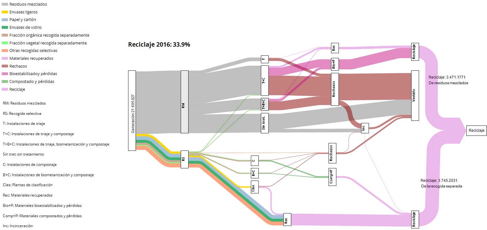
This Sankey diagram shows the breakdown of waste streams.

Flows are in tonnes per year. Of the overall 21.7 million tonnes of MSW generated in Spain, only some 7.2 million tonnes were recycled in 2016 (pink streams). A large chunk if household waste is mixed (grey stream, residuos mezclados, RM), while only a quarter is collected separately (colored streams in the lower part of the figure, recogida selectiva, RS).

Some material can be recovered from the mixed waste stream at sorting facilities and in composting plants or biogas digestors.