Tag: transport

Yet another Sankey map overlay

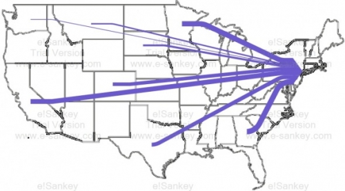
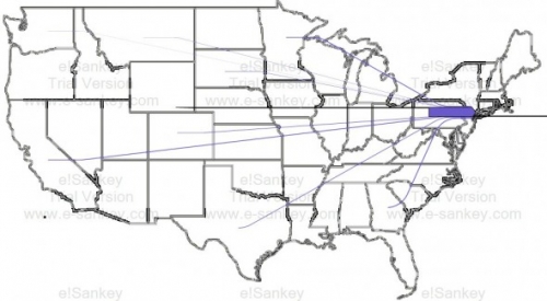
John Cochran blogs about his coursework at University of Virgina. His project on ‘Urban Metabolisms’ has this Sankey diagram of food being transported to New York City. Data is from The Federal Highway Administration (USDOT) Freight Analysis Framework.

The first Sankey diagram shows transports to New York (excluding the Northeastern States and transports within NY). The food supplied by other US states becomes relatively insignificant:


The second one includes food transports within NY state (still excluding the Northeastern States):


John, however has not been satisified with the results of his work. He writes (scroll down to his September 21, 2011 notes):

“Neither produced effective graphics, but what they did demonstrate was the inability of the information to be able to represent food going to New York. (…) As a result, the data “revealed” that we already have a very local food system, when in reality this is not the case; instead, it does indicate how many extra miles are traveled for food around the location of purchase. (…) The images below demonstrate just how disproportionate the amount of miles traveled in New York are to the miles traveled bring food to New York from the rest of the country.”

It remains unclear whether the flows displayed in the diagram are for payload (e.g tonnes of food) or payload distance (e.g. tonne-kilometres). Also, it is not mentioned, whether, for example, water and drinks (typically sourced locally) are included.

I think the idea of thie Sankey map overlay is great, but the issue of spatial representation of (dense) data points has not been adequately adressed. A zoomed NY state would maybe help.
Carbon Footprint Sankey of Wine Transport

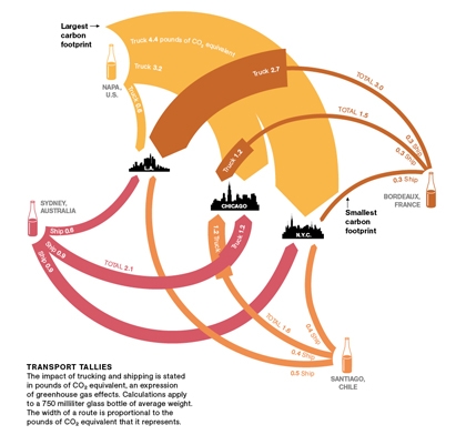
Dr. Vino on his blog presents a Sankey diagram of wine that was originally shown in National Geographic. To be exact, it is a diagram of greenhouse gas emissions associated only with the transport of wine from certain wine producing areas (Australia, Bordeaux, Napa Valley, Chile) to consumers in three U.S. cities (Los Angeles, Chicago, and N.Y.C). So the title should rather read as “Carbon Footprint of Wine Transport”. Neverhteless, an interesting Sankey diagram:

The rounded Sankey arrows are definitely not very common, but are used nicely here. The arrow magnitudes represent weighted emissions potentially contributing to climate change, measured in pounds of CO2-equivalents. The values are for an average 0.75l bottle being shipped. When an arrow get’s wider at a certain point (e.g. Bordeaux to L.A.), this means a change in transport mode (e.g. from ship to truck). The comments to Dr. Vino’s post are well worth reading to understand the diagram better. I am not sure whether it has been taken into account where the wine, typically being shipped in tanks, is filled into glass bottles (adding to the weight, and consequenty to the transport related emissions).

So from this Sankey diagram we can learn that Californian wine being consumed in New York has the highest (transport) carbon footprint, while the French rouge being savoured in the same city comes with the smallest footprint.

BTW, I heave heard that there are studies that look into the life cycle assessment and carbon footprint associated with wine production, e.g this one. Would be interesting to find a carbon footprint Sankey Diagram that combines both wine production, transport, and end-of-life climate change impacts, in order to compare the different phases and their carbon footprint.

Santé!

Transport Sankey Diagram

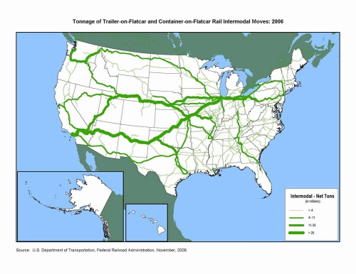
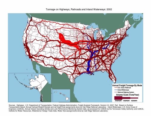
A reader of the blog pointed me to some Sankey diagrams available on the U.S. Department of Transport (DOT) Federal Highway Administration (FHWA) website. Sankey arrows are shown as a U.S. map overlay.


The first transport Sankey diagram shows the net tons of goods being transported on flatcars (either as trailer-on-flatcar, or container-on-flatcar) on the U.S. railway systems. The transport volume quantities are clustered into four groups shown with four different arrow widths. It is nice to see how in the eastern part you still have many railroad tracks, but with significantly less transport on them, while to the west coast you basically have 3 main lines, two of which carry more than 25 mio tons of freight per year.

The second one represents freight transport on railroad (bright red), inland waterways (blue) and national highways (dark red). Values also in million tons per year. I am not sure whether flows are to scale, or if transport quantities are also clustered into groups as in the first diagram. I can distinguish at least five different arrow magnitudes, even though only three sizes are given in the legend. A great transport Sankey diagram, as it shows that the East has most of the cargo, and has a much denser transport infrastructure. The reason why railroad transport on this second Sankey diagram differs so much from what is shown the first one, is probably due to the transport of bulk materials not shown in the intermodal transport quantity map.

Flows are not directional in both diagrams, so I assume that quantities for both directions have simply been added.

Can anybody confirm that the massive stream out of Wyoming by rail is coal?

Updated Ireland Energy Sankey Diagrams

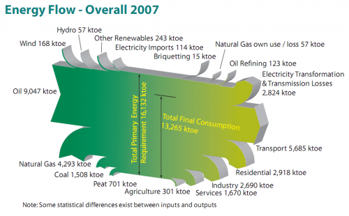
Colm from carbontracking.com in a comment to this blog post on Energy Flows in Ireland pointed me to an updated version of this Sankey diagram for 2007.

Sustainable Energy Ireland has published the report “Energy Ireland – Key Statistics 2008”.

This is the updated overall energy flow Sankey diagram from the report.

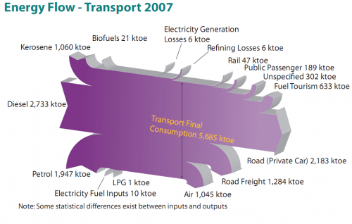
And here is another interesting one from the same report. It features the fuels used for transportation in Ireland with a breakdown by vehicle type.

All flows are in ktoe (1000 tonnes of oil equivalent, 1 ktoe = 41868 GJ). The flows seem to be mostly to scale, although there must be a problem with the flow ‘Refining Losses 6 ktoe’ which seems wider than the ‘Rail 47 ktoe’ flow, for example. Private cars consume most energy of all vehicle types (2184 out of 5685 ktoe or 38.4 %) , followed by trucks (road freight) and airplanes.

I won’t be commenting on the 3D design of the Sankey diagrams, which is definitely … eye-catching. Colm asked which software has been used to create these, but another reader had already pointed out in a comment that it is based on SankeyHelper, but has undergone retouching in Illustrator.