Month: April 2007

Sankey – the movie. Or: moving Sankey diagrams

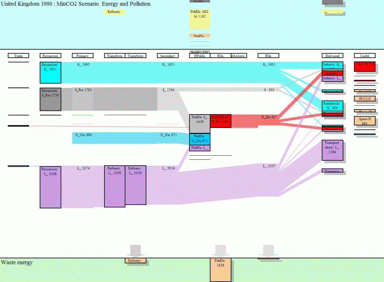
Mark Barrett, director of a UK-based energy consultancy Senco, has developed several energy models.

The SEEScen model (Society, Energy and Environment Scenario model)…

…incorporates 11 energy end uses (motive power, lighting, heating etc.) across 15 sectors. Some of these end uses have physical models; for example, domestic space heating and cooling are estimated with a model of a house which allows the effects of parameters such as insulation and internal temperatures to be examined.

Sankey diagrams for several years have been put together to make a short “film” how energy requirements may change over the years, and what shifts might be expected between different ways of energy generation.

To view this animation click on the image (there are some seconds between the frames, be patient).

To be able to see the details, download the Flash move or the GIF from the SEEScen webpage. Make sure you watch the film in the original size.The website www.senco.co.uk has gone offline (?), go to Mark Barrett’s page instead.

This is a neat idea, and it gives a whole new dimension to Sankey diagrams! On a side note: as far as I am informed, there are only two software tools capable of handling timelines in Sankey diagrams, S.DRAW and SankeyVis.…
What is Sankey?

I do acknowledge that the term ‘Sankey diagram’ is not as common as a ‘pie chart’, and that many people don’t know it, even if they have a rough idea of this type of diagram. One might just call a Sankey diagram a ‘mass flow diagrams’ or ‘flow chart’, or ‘energy efficiency chart’. Or a ‘heat loss diagram’, as I have seen it once.

So, then: what is Sankey?

In times where “to google” is synonymously used for “to search”, a visit to Google will give you a first idea. I also recommend a query at Googlism, a site that has some very subtle answers to the above question (I very much like “Sankey is 7 or 7” and “Sankey is aboard” 😉 )

But seriously: Sankey is originally both a name of a locality in England, as well as a family name. Famous Sankey’s include Ira D. Sankey, a gospel singer and composer (1840-1908) and magician Jay Sankey. And of course the lesser known Captain H.R. Sankey, the first to publish an energy efficiency chart, and the reason why we call Sankey diagrams Sankey diagrams. I will try to aggregate some information on this personality, to honor his invention.

A nice one from Poland

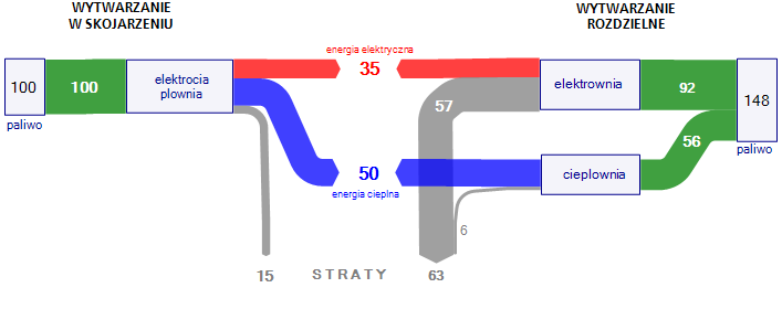
On my quest for more interesting Sankey diagrams I stumbled across a wykres Sankeya on a web page from Poland, which I reproduced here using ifu’s e!Sankey tool.

It shows the advantage of energy cogeneration plants over energy production in separate plants. From a base value of 100 a yield of 85% can be reached in cogeneration plants (35% electric energy, 50% heat energy – the original text accompanying the diagram says 30% electric energy, 55% heat energy) with 15% losses. To get the same energy amount from separate energy generation plants, the required energy feedstock is 1.48 times higher, with losses more than four times higher (63:15), especially originating from the generation of electricity.

While I am far from fostering one or the other technology with this post, I think this Sankey diagram merits special attention, because it is actually a 2-in-1 diagram (both with flow direction left-to-middle and right-to middle) and a baseline scenario comparison. A very nice idea!

Lying with Sankey diagrams (1)

I have decided to present in a loose sequence some diagrams I have found on the web that are obviously wrong. Or -let’s put it in other words- don’t reflect the numbers appropriately. Well, we all know that this happens quite often, and if you plan to do that purposely this book might be of use for you…

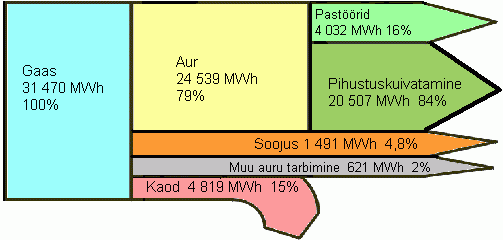
So, here is the first sample from an Estonian energy portal page:

I kind of like this Sankey diagram, because it is simple, colorful, and even though I don’t speak Eesti, I more or less get the meaning of it.

However, have a look at the gray flow labeled “Muu auru tarbimine” which supposedly represents 2% of the overall energy. Shouldn’t it be much thinner, compared to the other flows? I think this ‘not-to-scale’ representation is owed to the fact that in a diagram set up with a conventional drawing tool (is it Power Point they used?) would be very hard to draw and the label couldn’t be placed inside. So they decided to make it “small” but at the same time “lying” with this diagram.

It is also quite funky how the purple arrow for “Kaod” has an arrow line pretty much to scale, but the arrow head is much fatter!
Ah well, and the percentage values don’t add up to 100% and the percentage values for the green flows (“Pasöörid” and “Pihustuskuivatamine” – I love that word!) are percentiles of the yellow “Aur” flow in contrast to the other percent indications.

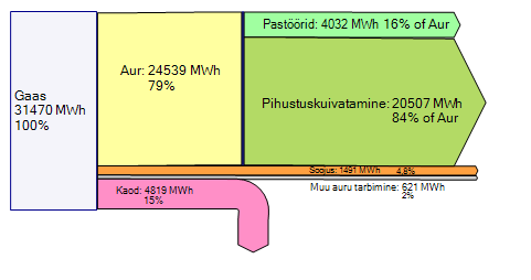
Here is the same Sankey diagram but with the values to scale, automatically created with a Sankey diagram software. I have adjusted the percentiles in accordance with the absolute values given.

Do you have an interesting Sankey diagram to share? Send it to phineas@sankey-diagrams.com

Greenhouse Gas Emissions in the U.S.

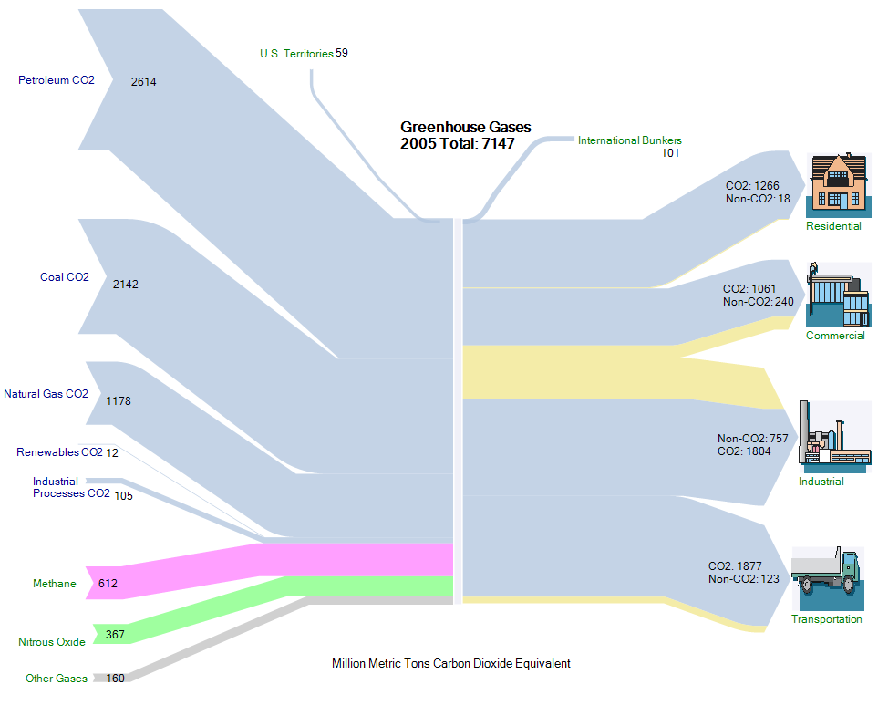
The Energy Information Administration (EIA) of the U.S. Department of Energy (DOE) publishes an annual report on the Greenhouse Gas Emissions in the US economy. The executive summary of the 2005 report shows a Sankey diagram on page xv.

This Sankey diagram shows on the left side the different sources of CO2 (mainly combustibles), and on the right hand side the industrial sectors (residential, commercial, industrial and transport) that contribute to the CO2 release. Emissions are in million ton CO2-equivalents.

The original Sankey diagram from the report has been reproduced with the e!Sankey software, and is shown below. Footnotes have been omitted, for full detail please refer to the original source.

Tracing Substances in Material Flow Systems

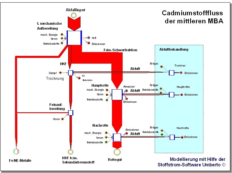
One important issue in material flow models is tracing of certain substances, such as heavy metals or toxins. While the overall material flow quantity is less relevant, the focus is on comparatively smaller quantities.

The Sankey diagram below shows the Cadmium (Cd) flows in an composting plant (mechanic-biological treatment plant, MBT). It was created by ifeu Institute in Heidelberg with the material flow management software Umberto.

In the modeling software Umberto, the Sankey diagrams are an optional way of displaying calculated material flows.

Sankey Diagrams for Material Flow Management

Mario Schmidt, a professor at Pforzheim’s University of Applied Sciences has published a paper on Sankey diagrams and their use in material flow management. The article, entitled “Der Einsatz von Sankey-Diagrammen im Stoffstrommanagement”, has two main sections: In the first part the author reviews how and where this type of diagrams have been used since they first appeared in a publication by Capt. Riall Sankey. This section also contains numerous samples: Sankey diagrams displaying the energy efficiency of the steam engine and of a 1911 a race car, material flow diagram from the iron and steel industries and many others. In the second part Schmidt elaborates on the methodology of Sankey diagrams and explains how extensions to the original Sankey diagrams (e.g. for cost flows or for material stocks) can be made.

The article is in German (sorry folks!), but according to Schmidt he’s working on an English publication…

Java applet to explore Sankey energy diagram interactively

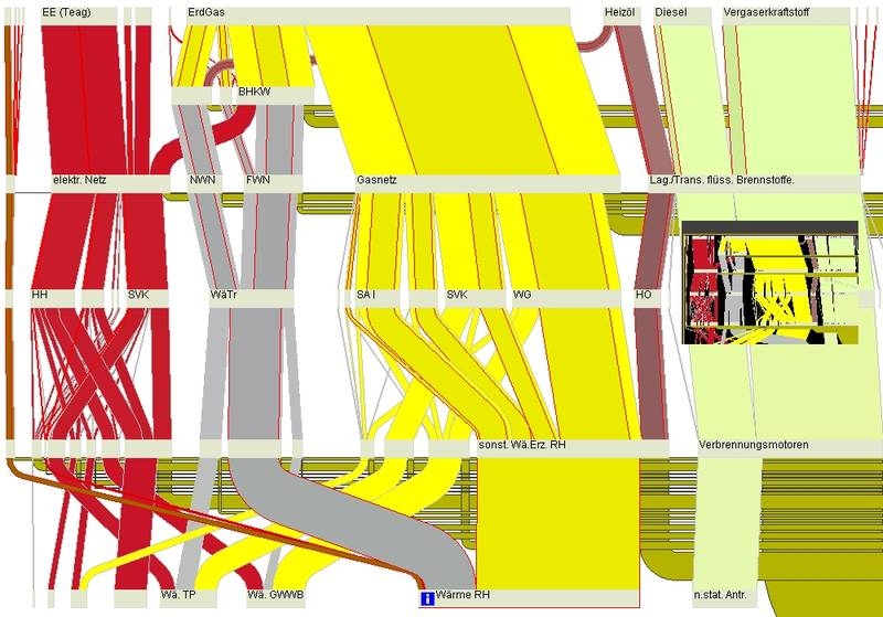
Researchers of the “energy flow” project at Weimar’s Bauhaus University have developed a Java applet to explore a Sankey energy diagram interactively.


The accompanying explanation says:

We present a system that allows users to interactively explore complex flow scenarios represented as Sankey diagrams. Our system provides an overview of the flow graph and allows users to zoom in and explore details on demand. The support for quantitative flow tracing across the flow graph as well as representations at different levels of detail facilitate the understanding of complex flow situations.

The energy flow in a city serves as a sample scenario for our system. Different forms of energy are distributed within the city and they are transformed into heat, electricity, or other forms of energy. These processes are visualized and interactively explored. In addition our system can be used as a planning tool for the exploration of future scenarios by interactively manipulating different parameters in the energy flow network.

The Java-based online version (in German) allows the visitor to interactively explore the Sankey diagram. They can zoom in, move the nodes, or call additional data for individual layers.