Month: July 2008

Traffic Load Visualization using Sankey

Just discovered this neat Sankey diagram provided in the e!Sankey 2.0 trial version as a sample file. It shows the number of vehicles passing a (virtual?) intersection within a given time frame.

Not sure if traffic planners could make use of such a visualization, but it is yet another nice idea of how Sankey diagrams (originally used only to visualize energy efficiency) are being used for other purposes.

New version of e!Sankey

Good news upon my return from a summer break: e!Sankey 2.0 has been released by German software maker ifu Hamburg on July 15. I had participated in their beta testing in June, so I was well aware of what they would present…

The new version comes in two different flavours: a standard version and a “pro” version, which differs from the standard version by offering a ‘LiveLink’ for Excel files and material stocks visualization.

A full list of new features has been published in their BBS. Some are nice to have, such as the 40+ fill patterns or background colour for the diagram. Others are off real added value (at least in my eyes), such as rotating of labels, or padding at processes.


The implementation of the interface to Microsoft Excel (so-called LiveLink) is a big push and definitely justifies the price difference of 60 Euro (110 US$) for the e!Sankey 2.0 pro version. You can copy & paste values from Excel into the quantity field for a flow, establishing a dynamic reference to the cell in the background (cells should be named, so that their postion can be changed without losing the reference to the e!Sankey diagram). If the value in the Excel file is changed, the flow quantity is automatically updated, and the diagram adapted accordingly. Read more about the Excel LiveLink.

A 30-day trial version can be downloaded here.

I will play around with e!Sankey 2.0 pro (after I have dug through my inbox 🙁 ) and present some more Sankey diagrams within the next days…

Canadian Energy Flows

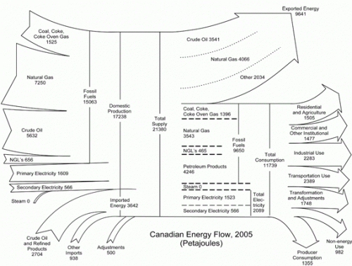
Statistics Canada in its “Report on Energy Supply-demand in Canada” for 2005 shows two Sankey diagram in the annex (HTML version of the two Sankey diagrams). They show the energy flows for Canada 2005 and 2004 in Petajoules per year.

I have featured similarly structured diagram for other countries here before: Japan, Scotland, Ireland, and the United States.

Out of 21380 PJ of total energy produced in Canada and imported, some 9641 PJ (45%) are exported, while 11739 PJ (55%) are national consumption. If you have the impression that the proportions are not 45:55, you are right, they are more like 39:61! From a graphical perspective this Sankey has more peculiarities worth a mention: the magnitude of the Sankey arrow changes and just before the arrow head they become narrower. The flows labeled “Steam” and “Adjustments” seem to have been added at a later stage as they don’t merge into the other arrow. Steam is represented on the production side as well as in the breakdown of energy carriers with a small, but not unsignificant width, however the quanity is given as zero.

Sun Energy Reloaded (or: Make it Look Nicer)

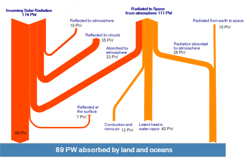
This diagram of sun radiation being absorbed and reflected when hitting earth (from Solar Energy Facts website) is a rather weak remake of the original Nasa diagram.

I find the floating powerpointish arrows kind of disturbing, and with the arrow magnitudes not to scale, would even call it misleading. Took the time to prepare two new versions of it (actually I am beta testing the new version 2.0 of e!Sankey at the moment – so this was a nice little test case).

The first version sticks more to the original idea of the diagram shown above, but the arrow magnitudes are corrected and to scale.

The second version is closer to the original ‘Breakdown of the incoming Solar Energy’ diagram by User A1 that can be found on Wikicommons. The latter one has the flow for energy being absorbed by atmosphere (33 PW) branching off as the first arrow horizontally.