Month: May 2009

U.S. Oil Import Sankey Movie

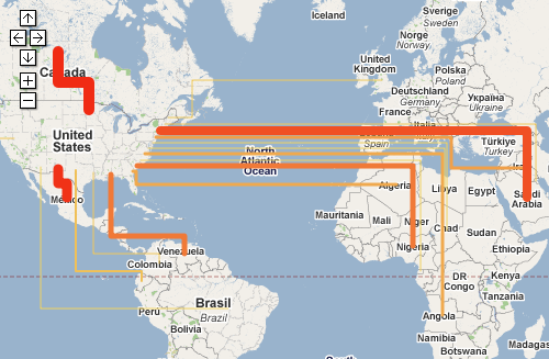
Renown Rocky Mountain Institute (RMI) founded in 1982 by Lovins and Lovins have an interactive oil imports map on their MOVE project webpage.

You can see the oil imports to the United States from January 1973 to August 2008 on a map that depicts the flow quantities as Sankey arrows linking the country of origin and the U.S. If you switch to the unit “Dollar”, you can see the value of the oil imported depicted as Sankey arrows.

One can play the the whole 35-year period as a movie, or use the slider on the time line to see individual months. The data used is from publicy accessible EIA/DOE statistics.

The United States is still 60 % dependent on imported oil. MRI’s MOVE project seeks possibilities to reduce foreign crude oil dependencies. The goal is to “get completely off oil by 2050, led by business for profit.”

Go to the RMI movie page and try it yourself. When I did the Lybia Oil Export map last year I wasn’t aware of this Sankey movie, which is of course much nicer.
New Zealand Energy Flows 2007

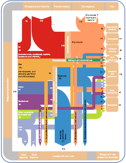
To compensate for the rather awkward Sankey diagram from NZ in my last post, here is a more colorful, and more recent one from Aotearoa. It shows the energy flows of New Zealand in 2007. The Ministry of Economy published a report “Energy in Brief”, which also contains this Sankey diagram:

The diagram shows the main flows in gross PJ (1 petajoule = 1015 J) and is “to approximate scale”. Flows below 2.5 PJ are neglected.

Energy produced domestically from various sources comes from the left, imports of coal and oil enter in the leftmost column from the bottom and the top. The energy flows pass through transformation and conveyance phases, to be finally shown in the different use sectors. Losses in transformation and conveyance are visualized with downward arrows, while losses in the end use are not considered.

There are some design flaws, especially when you look at the arrow curves. Also the fact that flows are only “to approximate scale” is in my opinion not acceptable [an arrow representing a flow of 3 PJ has the same width as one for 6 PJ, and both are only half the width of the 30 PJ flow]. But the overall impression is much better than in the version 10 years before.

Click here for a larger version of the diagram (PDF).

Confusankey Diagram

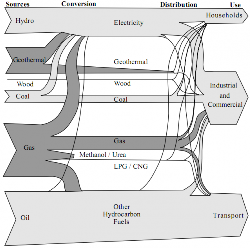
From the deepest and darkest parts of my bookmark list, here is a Sankey diagram for energy flows in New Zealand in 1997. I found it in a PDF document on this website of the Ministry of Economic Development (maori: Manatû Ôhanga).

The text under the diagram reads: “This energy flow diagram summarises New Zealand’s energy use. Primary energy sources are at the left. The flow of these through conversion processes to consumers is pictured, with final end-use classified by consumer type. The width of the bands is approximately to scale.”

Well, almost everything that can go wrong in information visualization goes wrong in this diagram… No quantities or units are given. Flows that are “approximately to scale” narrow down along the way. [The only explanation I have for this, is that this a novel way to account for transmission losses.] Streams meet, but don’t seem to merge. No idea what the spaghetti flows are good for…
In defense of the authors of this diagram I can say that in 1997 there probably weren’t any Sankey diagram software tools around.

I have a nicer one for NZ, which I will present in of my next blog posts. Better energy flow Sankey diagrams from other countries can be seen here, here or here.

Water Flows in Electro Plating

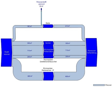
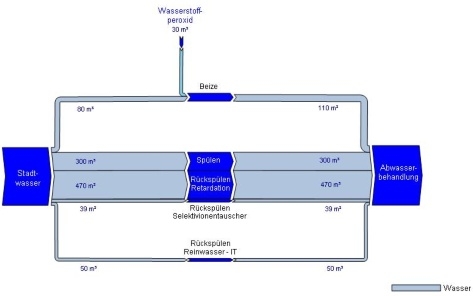
Austrian consulting company Stenum has revamped their Sankey Editor 2008 website a little bit, and they added new sample Sankey diagrams. The ones shown below are for the water flows of an electro-plating factory before and after optimization.

before:

after:

The diagram is in German, but I can understand as much as this: All flows are in cubic metres. Apart from the hydrogen peroxide flow entering from the top the flows shown all run from the source (water supply) to the sink (waste water treatment), the nodes in the middle (flushing, backflushing?) are the actual breakdown of the water flows. These nodes are adapted to the arrow width – a nice feature.

On top of that, blue seems the right choice for both water and H2O2 flows.