Month: July 2009

Sankey Diagram for Regasifier Plant

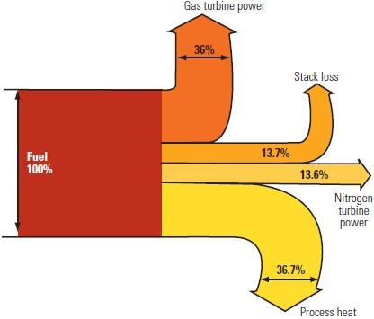
This post on the Power Industry News blog features a Sankey diagram “for a dual Brayton cycle regasifier plant [that] shows how the fuel is consumed”. The article describes possibilities of improving the energy efficiency of the liquefied natural gas (LNG) reevaporation process.

I quite liked the Sankey diagram for its simplicity, being to scale and color coding. The fact that the arrows for “process heat” and “stack loss” branch out in a slightly curvy way larger than 90° is uncommon, but hey, it gives the whole thing a special touch.
Sankey Diagram in Visual Reports

I was very delighted to see a blog post on visual reports on Arup’s fieldofactivity.com blog with an embedded video that has Sankey diagrams.

Arup Australasia’s Digital Innovation Team is working on interactive reporting technologies. They say that “… not everyone reads technical reports, so this is the beginning of what’s next – visual reports.”

Check out the video, it is interesting, and watch out for the Sankey diagram seconds 0:15 to 0:21

What we see is a Sankey diagram unfolding in an animated sequence. One step further would be animated Sankey diagrams, like the research project I posted about that came up with a Java/Quicktime animation on energy flows, and this Sankey animatedGIF on CO2 and energy from 1990 to 2015.

Any other animated Sankey diagrams out there…?…

Gold Flows in United States

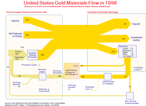
This Sankey diagram was posted as a sample on the e!Sankey Forum. It shows the gold flows in the United States in 1998. The original data is from ‘Flow Studies for Recycling Metal Commodities in the United States’ (edited by Scott F. Sibley. U.S Geological Survey, Reston, VA (2004)). Values are in metric tons of contained gold.

The left part of the diagram shows domestic supply of primary and secondary gold, as well as imports to the U.S., the right part distribution and use of gold. The U.S. is a net gold exporter. 318 metric tons gold bullion went to Fort Knox (presumably) that year. 276 metric tons were fabricated into products, mainly jewelry. At the same time 175 metric tons of new and old gold scrap were recycled. Along with the 282 metric tons out of primary production they are fed back into the production cycle.

The diagram has gold/light brown colored Sankey arrows that go along well with the topic. A text label has been forgotten in the left part.

Energy Loss Simulation for Students

Heading off for the week-end, but wanted to share a fun game for students I recently discovered on the website of Nelson Thornes, educational publisher from the U.K.

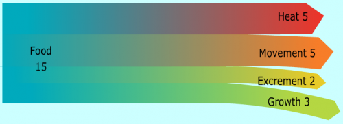
This Flash simulation teaches students “how we lose energy to the environment” and “what is the effect of maintaining a constant body temperature”.

Go ahead and try it: You have to choose whether you are a herbivore or a carnivore, whether you are cold-blooded or hot-blooded, and your activity level.
Here is the image that was created for me (couldn’t choose mixed diet though, so opted for meat).

When you’re done, just click on the button labeled “Sankey” and you will get a Sankey diagram that shows how the energy from your food is used for movement, growth, body off-heat and …. well, see for yourself!

A great idea, and a good idea to teach students about energy transformation and loss, and to get them acquainted to Sankey diagrams as alternative to pie charts.

(Images reproduced with permission of Nelson Thornes from http://www.nelsonthornes.com)

Updated Ireland Energy Sankey Diagrams

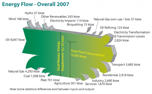
Colm from carbontracking.com in a comment to this blog post on Energy Flows in Ireland pointed me to an updated version of this Sankey diagram for 2007.

Sustainable Energy Ireland has published the report “Energy Ireland – Key Statistics 2008”.

This is the updated overall energy flow Sankey diagram from the report.

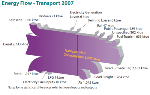
And here is another interesting one from the same report. It features the fuels used for transportation in Ireland with a breakdown by vehicle type.

All flows are in ktoe (1000 tonnes of oil equivalent, 1 ktoe = 41868 GJ). The flows seem to be mostly to scale, although there must be a problem with the flow ‘Refining Losses 6 ktoe’ which seems wider than the ‘Rail 47 ktoe’ flow, for example. Private cars consume most energy of all vehicle types (2184 out of 5685 ktoe or 38.4 %) , followed by trucks (road freight) and airplanes.

I won’t be commenting on the 3D design of the Sankey diagrams, which is definitely … eye-catching. Colm asked which software has been used to create these, but another reader had already pointed out in a comment that it is based on SankeyHelper, but has undergone retouching in Illustrator.

More Merry-Go-Sankey Diagrams

After writing about VisioGuy’s radial Sankey diagram idea, I went through my bookmarks and collection of Sankey diagrams in search of further candidates for this special class of circular flow graphs.

Here are two goodies… 😉

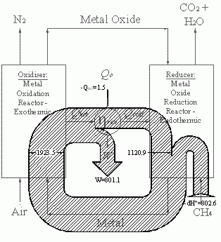
Below is a black/white Sankey diagram of energy fluxes in a chemical loop combustion cycle from an Imperial College website. It is similar to the radial one Chris designed, however it is not exactly circular. Not all of the entries and exits of the cycle are shown as Sankey arrows. The exit of the arrow labeled W is to the center (would one call this anticentrifugal?). The methane input makes a U-turn before entering the loop.

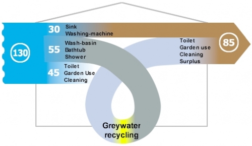
The other Sankey diagram is from this website of a U.K. based company, and shows greywater recycling. The average consumption of freshwater per person / per day in the UK was 130 litres in 1996.

The water from wash-basins, shower and bathtub could go through a recycling stage and be reused for flushing and watering the garden. The designer gave it a roller coaster style loop, which sure doesn’t add to the information content of the graphic, but immediately draws the reader’s attention to the recycling. I am not sure where the third flow coming from the right goes to. It represents the potential savings of 45 litres/day, but kind of disappears behind the loop.

I’ll post more of these as I come across them.

United States Annual Energy Review 2008

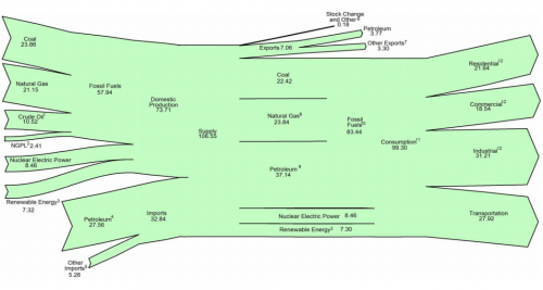
U.S. Energy Information Admmoinstration (EIA) now has the 2008 Annual Energy Review (AER) on their website. It contains Sankey diagrams for the nation’s overall energy flows (almost a “classic”) and four additional separate Sankey diagrams for petroleum, natural gas, coal and electricity.

This is the U.S. Energy Flow diagram for 2008:

Check the original PDF file with the accompanying footnotes for further details. Overall energy consumption in 2008 was 99 Quadrillion BTUs (preliminary value, slightly down from the 101 Quadrillion BTUs in 2007.

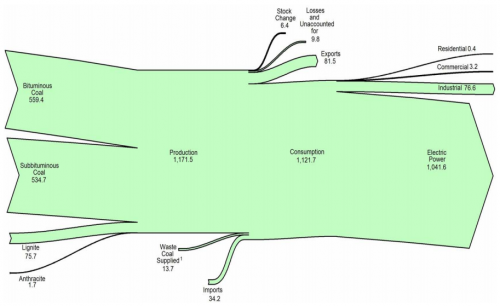
Among the other diagrams in the report, I chose to show the one for coal. 1121 mio. short tons have been consumed in the U.S. in 2008, mainly (1041 mio short tons) for electric power generation. The U.S. is a net coal exporter.

The diagram has a weird sinking downward feeling, caused by the fact that the main left-to-right orientation axis is not maintained. Looking at this it makes me want to shout out: “Hey coal Sankey, cheer up, life isn’t that black…!” 😉

The original full AER report (7.5 MB) can be found here.

Matlab routine for simple Sankey diagrams

Just came across a new piece of software for simple Sankey diagrams.
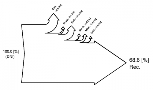
DrawSankey.m is a routine for Matlab that allows to produce diagrams like these:

DrawSankey.m is from the Industrial Energy Systems Laboratory (LENI) at Swiss EPFL in Lausanne. Find more information on their Wiki.

I haven’t tested it myself yet, but this definitely looks like an interesting add-on for Matlab users. I have added drawSankey.m to the Sankey software list.