Month: September 2009

Oxy Combustion vs. Air Combustion

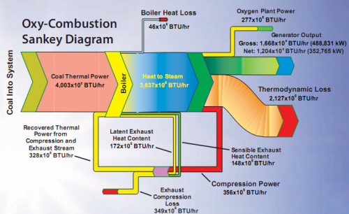
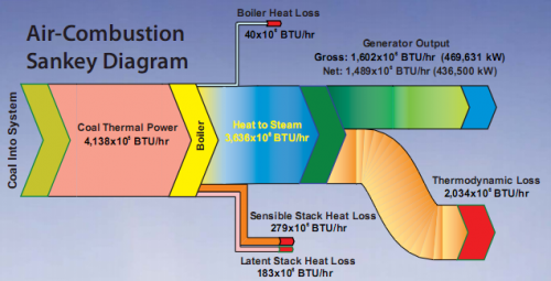
The National Energy Technology Energy Laboratory’s (NETL) website has a lot of interesting stuff, so I dug up these two Sankey diagrams showing energy flows of a typical (air) combustion and of oxy-combustion in power plants.

The Sankey diagrams were presented in May 2008 at the Seventh Annual Conference on CCS in Pittsburgh, PA on a poster titled ‘Strategies for Improving Efficiencies in Oxy-Combustion Retrofits’. See the PDF here.

The first diagram shows how heat losses occur at the boiler and at the stack. Only a part of the energy flow at the power generator can be used, while a large chunk is thermodynamic loss.

In the second diagram, heat from the boiler and compression is recovered and fed back.

A colorful one for the weekend…
1939 Graphic Presentation Book

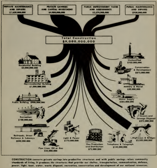
This post on the Visual Think Map blog (new addition to my blogroll) guided me to the fantastic 1939 book ‘Graphic Presentation’ by Willard C. Brinton. It is available in full as a PDF on archive.org.

The book with more than 50 chapters features literally hundreds of graphics…

Chapter 8 (pp. 73 to 80) deals with “Flow Charts”, and has the above Sankey diagram on sources of funds and spendings in construction.

The chapter has an emphasis on ‘Cosmographs’ (a brand name at that time, apparently by IBM) and how they are made. I will dedicate one of the next blog posts to cosmographs I think. In the meantime, enjoy browsing Brinton’s book.

B4E: Energy loss is synonym of ‘non-quality’

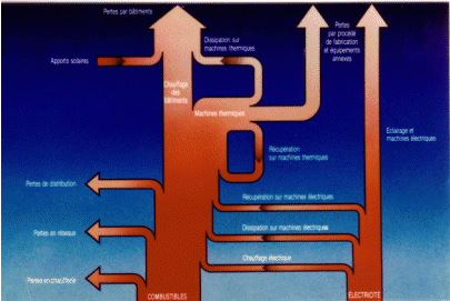
French La Courneuve based engineering consultancy B4E shows the following Sankey diagram on their energy diagnostics page.

Unfortunately the resolution is not good enough to determine any detail. I can understand as much as that they present fuels (“combustibles”) and electric energy (“electricité”) as the main energy sources. From these two sources the use of energy and losses (“pertes”) in a company is visualized in a bottom-to-top layout. No numbers are given, so this is just a schematic visualization.

As they say in the text: energy loss is synonym of ‘non-quality’

‘Worst Sankey Diagram’ Award Suggested

Following my last post, which led to quite a number of comments, one reader of this blog has suggested to create a ‘Worst Sankey Diagram’ award.

While I personally kind of like the idea, I am not sure whether we can find as many ‘bad’ Sankey diagrams, in order to make this a real competition… Wouldn’t a ‘Best Sankey Diagram’ award be more reasonable? This is what I am going after in my search for Sankey diagrams, that I can present here on the blog. After all I want to show how useful and powerful this type of diagram is for specific visualizations.