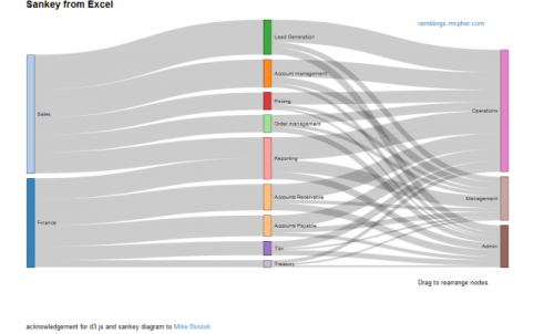
Bruce from http://ramblings.mcpher.com writes about “how to free your Excel data from your desktop and take advantage of web capabilities such as Docs, Maps, Earth, Gadgets, Visualizations and a whole bunch of other services”. His last contribution is on Sankey Diagrams from Excel, for which he uses d3.js and some work previously done by Mike Bostock.
While I don’t fully agree with Bruce’s definition of Sankey diagrams (“What are Sankey Diagrams? They are designed to show the movement in a network over time.”), this sure is good stuff and great work. You can download the VBA code from his page directly.
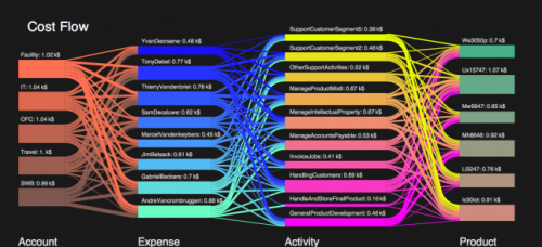
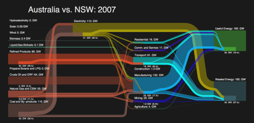
Distribution Diagrams (aka ‘Spaghetti Diagrams’) can be created directly from Excel. The interactive version (follow link above image on this page) allows to rearrange the nodes within the same column, and individual bands are highlighted on mouse over.
Why don’t these fully qualify as Sankey diagrams, in my opinion? Why would I rather call them distribution diagrams? It is exactly the fact that these are not directed flows, but rather quantities that are distributed over categories (or dimensions). There is no time relation in them, neither are there flows “from” (e.g. Finance) “to” (e.g. Reporting) or the other way round. These are bands hooked between nodes rather than arrows leading from one node to another. Each category could be represented by a pie chart as well … which would be more boring, of course. No unit given for the value of the flow (I guess it could be US$), but this is not even necessary, as the sum of the bands add up to 100% (like in a pie chart). For those of you interested, I recommend to read on the Parsets page.
Have added Excel to Sankey (based on d3.js) to the software list.
